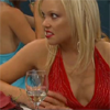
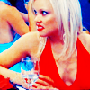
Another tutorial to add to the pack. Tutorial #4.

>>

Photoshop only (Selective colouring involved). Sorry PSP users.
1. Grab your picture, credit goes to Tartydoris for my lovely Holly Brisley cap. Crop, resize, whatever that suits you.
2. We want to have a little sharp nice touch, but we don't want to make it look like a razor so, we go to Filter>Sharpen>Unsharp Mask and put in these following settings:
Amount: 25
Radius: 0.7
Threshold: 0
Click 'OK'.
3. Add a new curves adjustment layer, (Layer>Adjustment Layer>Curves) and put in the following settings:
RGB
Input: 60, Output: 100.
Input: 160, Output: 208
4. Add a new selective colour adjustment layer, (Layer>Adjustment Layer>Selective Colour) and put in the following settings:
Reds
Cyan: -100
Magenta: 2
Yellow: 60
Yellows
Cyan: 20
Magenta: 20
Yellow: -20
Neutrals
Cyan: 30
Magenta: -15
Yellow: -50
5. Add a new hue/saturation adjustment layer, (Layer>Adjustment Layer>Hue/Saturation) and up the saturation to 20. This gives the icon more depth with colour, you can leave this step out if you want or you set the saturation level to a different amount, just play around to see what suits yourself.
6. Add a new selective colour adjustment layer and put in the following settings:
Reds
Cyan: -100
Magenta: 100
Yellow: 100
Blacks: -30
Yellows
Cyan: -100
Magenta: -60
Yellow: -20
Neutrals
Cyan: 20
Magenta: -10
Yellow: -25
7. Add a new curves adjustment layer, this layer will give the icon more contrast and make it less washed-out if you want to leave it out, it's fine. Put in the following settings:
RGB
Input: 43, Output: 21
Input: 156, Output: 160
Input: 194, Output: 211
8.This step is optional it just calms the reds and yellows on the skin. Add a new selective colour adjustment layer, and put in the following settings:
Blues
Cyan: 100
Magenta: 100
Yellow: -20
Black: 100
Neutrals
Cyan: 20
Magenta: -2
Yellow: -20
Set that layer to 70% Opacity.
9. Add a new hue/saturation adjustment layer. Put in the following settings:
Master
Saturation: 10
Reds
Saturation: -10
Yellows
Saturation: -20
Lightness: 20
Cyans
Saturation: 10
10. We want more contrast. This step usually gives all the contrast you need. Select>All. Edit>Copy Merged. Edit>Paste. There should now be a new layer of your icon on the layer pallet. Set it to soft-light.
11. Yay! You're done. Please, please, please go through the adjustment layers and change settings if you have to, the tutorial may not work on everything. My starting base was pretty yellow and icky to begin with so try adding some layers or use varations (Image>Adjustments>Varations) and play around there with your STARTING base so you're ready, don't overdo it though. Enjoy!