[tutorial] Three tutorials for Photoshop & PSP
Ok, these are my first tutorials. I hope you like them, they cover three different styles. They are all for Photoshop CS, but tutorial #1 is translatable to PSP and probably to other programs as well. Tutorial #2 and #3 use curves and selective color. It will be easier if you already have some experience with layers blending.
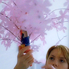
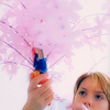
TUTORIAL #1 Lost in Translation
FROM THIS
TO THIS
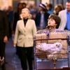
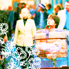
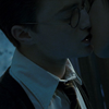
TUTORIAL #2 Harry Potter and the Sorcerer's Stone
FROM THIS
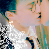
TO THIS
TUTORIAL #3 Harry Potter and the Order of the Phoenix
FROM THIS
TO THIS
TUTORIAL #1 Lost in Translation
----> We start with:
1) Duplicate your base and set to screen. I set the opacity to 40%, because this particular image is already bright.
2) Duplicate your base, bring it to the top and set to soft light and again, set the opacity to 40%. This must make the color stronger and glossy.
3) Create a new flood fill layer color #E3F9FF and set it to color burn.
4) Create a new flood fill layer color #EDD2EF, set it to soft light.
5) Create a new flood fill layer color #001720, set to exclusion, change the opacity to 73%. This is because this icon has lots of white and the exclusion layer makes it look weird. If you don't have so much white, your icon may look better with the exclusion layer at 100%.
6) Duplicate your base , bring it to the top and set it to softlight. Use the filter> blur> gaussian blur ( radius 2,2 ). Lower the opacity to 40%. The gaussian blur gives this elegant blur and is a good way to add some 'softness' to your icons.
7) Create a new flood fill layer color #FFEBFE, set it to soft light, lower opacity to 28%.
8) Create a new Hue/Saturation layer, increase Saturation in +28.
9) Duplicate your base, bring to top, set to softlight, opacity at 20%.
10) Create a new flood fill layer color #001720, set to exclusion, opacity 11%.
----> We have it now:
Ok, this one was specially to my friend papyds, who requested it. I guess it is not exactly like the one I had previously made, but it looks very similar. Hey, honey! Hope you like it! And, I think, this tutorial is pretty translatable to most photo editors. It uses no selective color layers and no curves.
TUTORIAL #2 Harry Potter and the Sorcerer's Stone
----> We start with:
1) Duplicate your base twice. Set the second one to opacity 20%. Of course, it will depend on your icon, but for this coloring, it's better be very illuminated.
2) New Hue/Saturation layer. Increase Saturation to +41.
3) New color balance layer:
MIDTONES -60 +50 +44
*Preserve Luminance checked.
4) New Selective color layer:
REDS -100 / +31 / +86 / +93
YELLOWS +77 / +28 / +100 / -7
CYANS +100 / -37 / +97 / +15
The selective color layer is used here much to bring out the tones of cyan and some areas of yellow. Again, depending on your icon, you may want to make other colors stronger. Play around with the settings and if everything goes wrong, just delete the layer and start all over again! :) You only learn if you try...
5) New Hue/Saturation Layer, increase saturation to +31.
6) Apply a scratchy texture ( mine is from toybirds ). Set it to screen.
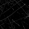
Your icon is ready! But if you want to make it more elaborate, you may use text or brushes.The flower brush I used is also from toybirds.
----> We have it now:
TUTORIAL #3 Harry Potter and the Order of the Phoenix
----> We start with:
1) Duplicate the base three times, set all of them to screen and apply filter> blur> guassian blur ( radial 2,2 ) to the last one. The number of screen layers may vary according to your original base.
2) Create a new color layer in green #65EE35 and set to softlight.
3) Create a new color layer in brownish tan #E6BF88 and set to softlight.
4) Create a color balance layer:
MIDTONES +55 -67 +68
HIGHLIGHTS -11 -53 -16
SHADOWS 0 +47 +22
5) Create a new selective color layer:
REDS -91 / -63 / -72 / +60
YELLOWS -6 / +20 / -36 / -28
GREENS +94 / -8 / -81 / +8
CYANS +100 / -30 / -96 / -58
NEUTRALS -8 / +7 / +4 / -8
BLACKS 0 / 0 / 0 / +8
The adjustment of the black channel was just to make their hair look darker. The particularities of color in your icon will decide the adjustments of your layer. As you are adjusting the colors, take a close look at your work - you may decide to vary some numbers to achieve the appropriate color.
6) Create a new Hue/Saturation layer and increase the saturation to +33.
7) Create a new color layer in navy blue #000F23 ans set it to exclusion, opacity 20%. This is normally done to 'soften' the colors and make it more opaque.
8) Create a new curves layer:
RGB - I: 112 O: 141
RED - I: 131 O: 150
BLUE - I: 120 O: 134
*remember to create a new point*
This curve is more to 'cool' a little bit the reddish of the icon and brighten it.
9) Create a new Hue/Saturation layer. Increase saturation to +8.
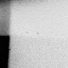
10) Finalize your icon with a texture to add some 'profundity' to it. I used this one, cropped from a huge file from peoplemachines. Paste it to your icon and set it to darken. If you want the icon to look darker, set to multiply. I used again the flower brush by toybirds.
----> We have it now:
My organization skills suck, so the tutorials are not pretty-and-neat, with all the pictures and a more detailed step-by-step. I am sorry, but I guess it is not so difficult to follow as it is ( although I know I could've made it much easier... ). But these are my first ones, I hope to learn a little more! :) Please comment if you find them useful.
Hugs, Renata.
TUTORIAL #1 Lost in Translation
FROM THIS
TO THIS


TUTORIAL #2 Harry Potter and the Sorcerer's Stone
FROM THIS
TO THIS


TUTORIAL #3 Harry Potter and the Order of the Phoenix
FROM THIS
TO THIS


TUTORIAL #1 Lost in Translation
----> We start with:

1) Duplicate your base and set to screen. I set the opacity to 40%, because this particular image is already bright.
2) Duplicate your base, bring it to the top and set to soft light and again, set the opacity to 40%. This must make the color stronger and glossy.
3) Create a new flood fill layer color #E3F9FF and set it to color burn.
4) Create a new flood fill layer color #EDD2EF, set it to soft light.
5) Create a new flood fill layer color #001720, set to exclusion, change the opacity to 73%. This is because this icon has lots of white and the exclusion layer makes it look weird. If you don't have so much white, your icon may look better with the exclusion layer at 100%.
6) Duplicate your base , bring it to the top and set it to softlight. Use the filter> blur> gaussian blur ( radius 2,2 ). Lower the opacity to 40%. The gaussian blur gives this elegant blur and is a good way to add some 'softness' to your icons.
7) Create a new flood fill layer color #FFEBFE, set it to soft light, lower opacity to 28%.
8) Create a new Hue/Saturation layer, increase Saturation in +28.
9) Duplicate your base, bring to top, set to softlight, opacity at 20%.
10) Create a new flood fill layer color #001720, set to exclusion, opacity 11%.
----> We have it now:

Ok, this one was specially to my friend papyds, who requested it. I guess it is not exactly like the one I had previously made, but it looks very similar. Hey, honey! Hope you like it! And, I think, this tutorial is pretty translatable to most photo editors. It uses no selective color layers and no curves.
TUTORIAL #2 Harry Potter and the Sorcerer's Stone
----> We start with:

1) Duplicate your base twice. Set the second one to opacity 20%. Of course, it will depend on your icon, but for this coloring, it's better be very illuminated.
2) New Hue/Saturation layer. Increase Saturation to +41.
3) New color balance layer:
MIDTONES -60 +50 +44
*Preserve Luminance checked.
4) New Selective color layer:
REDS -100 / +31 / +86 / +93
YELLOWS +77 / +28 / +100 / -7
CYANS +100 / -37 / +97 / +15
The selective color layer is used here much to bring out the tones of cyan and some areas of yellow. Again, depending on your icon, you may want to make other colors stronger. Play around with the settings and if everything goes wrong, just delete the layer and start all over again! :) You only learn if you try...
5) New Hue/Saturation Layer, increase saturation to +31.
6) Apply a scratchy texture ( mine is from toybirds ). Set it to screen.

Your icon is ready! But if you want to make it more elaborate, you may use text or brushes.The flower brush I used is also from toybirds.
----> We have it now:

TUTORIAL #3 Harry Potter and the Order of the Phoenix
----> We start with:

1) Duplicate the base three times, set all of them to screen and apply filter> blur> guassian blur ( radial 2,2 ) to the last one. The number of screen layers may vary according to your original base.
2) Create a new color layer in green #65EE35 and set to softlight.
3) Create a new color layer in brownish tan #E6BF88 and set to softlight.
4) Create a color balance layer:
MIDTONES +55 -67 +68
HIGHLIGHTS -11 -53 -16
SHADOWS 0 +47 +22
5) Create a new selective color layer:
REDS -91 / -63 / -72 / +60
YELLOWS -6 / +20 / -36 / -28
GREENS +94 / -8 / -81 / +8
CYANS +100 / -30 / -96 / -58
NEUTRALS -8 / +7 / +4 / -8
BLACKS 0 / 0 / 0 / +8
The adjustment of the black channel was just to make their hair look darker. The particularities of color in your icon will decide the adjustments of your layer. As you are adjusting the colors, take a close look at your work - you may decide to vary some numbers to achieve the appropriate color.
6) Create a new Hue/Saturation layer and increase the saturation to +33.
7) Create a new color layer in navy blue #000F23 ans set it to exclusion, opacity 20%. This is normally done to 'soften' the colors and make it more opaque.
8) Create a new curves layer:
RGB - I: 112 O: 141
RED - I: 131 O: 150
BLUE - I: 120 O: 134
*remember to create a new point*
This curve is more to 'cool' a little bit the reddish of the icon and brighten it.
9) Create a new Hue/Saturation layer. Increase saturation to +8.
10) Finalize your icon with a texture to add some 'profundity' to it. I used this one, cropped from a huge file from peoplemachines. Paste it to your icon and set it to darken. If you want the icon to look darker, set to multiply. I used again the flower brush by toybirds.

----> We have it now:

My organization skills suck, so the tutorials are not pretty-and-neat, with all the pictures and a more detailed step-by-step. I am sorry, but I guess it is not so difficult to follow as it is ( although I know I could've made it much easier... ). But these are my first ones, I hope to learn a little more! :) Please comment if you find them useful.
Hugs, Renata.