[tutorial] Quidditch Caps, Strong coloring
Under request, I am posting this tutorial. Be warned beforehand that it will not work in any base and that no matter how your base actually looks, you'll definetly have to make modifications in the tut. This is more a tutorial on how to achieve certain sorts of effects and hopefully you will be able to make pretty icons using the techniques it contains. At least, that's what I expect with it, kids! :)
Here is what we have for today:
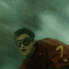
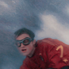
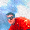
from this ugly base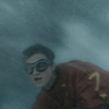
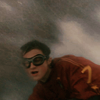
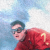
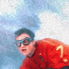
to this flashing icon!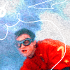
For Photoshop users, selective colors involved. Not Translatable.
So, here is is what you have as a result! And you never thought you could work those awful screencaps of quidditch games!
And here two more icons with the same technique, some slight differences:
sample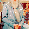
sample
Keep in mind: the color layers should match you ideal color. For Dumbledore's icon, for instance, I had softer tones, because the base was already in a very good color to work with. The opacity of the texture layers will vary GREATLY. Check the possible effects on your base - try different blends in the layers: ( multiply, color burn, soft light, etc. ) because you may find very interesting results. And, the selective color layers will also vary, depending on the colors you want to stress. Again, for Dumbledore's icon, I used selective colors working the cyans and blues.
So, how was it? Useful? Confusing? Crappy? Drop me a comment!
You can use the icons for your own enjoyment, but be a good kid and credit cokeandmint! ;)
Here is what we have for today:
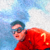
from this ugly base
to this flashing icon!
For Photoshop users, selective colors involved. Not Translatable.
- Get the base, crop, don't sharpen.
- Duplicate the base and set to soft light. Do not bother if it looks too dark now.
- Duplicate again, set to soft light, opacity 50%
=
- Make a new Color Fill Layer #F6BB1D soft light, at 48% of opacity. This layer will "warm" the colors. =
- Make a new Color Fill Layer #F13F6D overlay, at 35% . This layer will increase the reds. =
- Make a new Color Fill Layer #C5FFCF soft light, 100%. This layer is to "open" the colors and illuminate the icon. =
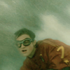
- Add a new Color Balance layer, to work on the whole of the icon and fix the excess of colors: +2 -/ 31 / +25. =
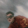
. See the results? The image is quite clear now. This is the kind of effect you don't achieve with screened layers or curves. The icon is clear, but the colors are kept. - Make a new Selective color. For this icon, we particularly want to brighten up the reds. You'll see that I will be adding magenta, taking off cyans and increasing yellows. At the same time, we well work on the neutrals to diminish the reds and create a good and beautiful contrast, pulling out the cyans of the background.
REDS : -100/ +20 / +100 / 0
YELLOWS : - 100 / 0 / - 53 / - 29
NEUTRALS : 15 / 04 / -11 / 7
=
- Now, let's work the magic. Place this
texture by peoplemachines over the icon and set to overlay. Wow! Very good, isn't it? You will notice that, depending on the relationship of this layer and the icon, you may get several different results. Depending on your base you'll need to lower the opacity of this layer ( in bases already too bright ) or you may even try other options such as color burn, soft light. Check which looks best with your icon and what is the effect you prefer. Color burn, for instance, will make the icon darker ( if you want to create the impression that the sky is stormy, that will work out just fine ).
=
- Next, we will work again with a selective color layer and make Potter's Gryffindor red show brighter than ever! For that instance, we will change the sets only of the red channel:
REDS: -100 / +20 / + 100 / 0
=
- Let's add a Hue/Saturation layer to make color stand out even more - set it up to +30. =
- Go back to you texture layer, duplicate it, bring to the top, set to color burn, opacity 75%. This step is sort of optional, but I added it to create a kind of intensity in the colors and to make more evident the 'scratchy' look of the texture. Again, if your base is too bright already, this probably will make it look odd.
=
- Final touch! Adding this oh-so-beautiful lines. Get this texture

by loveicon and crop it to fit your icon. Then, apply it to the top of the icon and set to screen. I duplicated this layer because the background of the icon was too clear, and I wanted the lines to look bold.
So, here is is what you have as a result! And you never thought you could work those awful screencaps of quidditch games!
And here two more icons with the same technique, some slight differences:
sample
sample
Keep in mind: the color layers should match you ideal color. For Dumbledore's icon, for instance, I had softer tones, because the base was already in a very good color to work with. The opacity of the texture layers will vary GREATLY. Check the possible effects on your base - try different blends in the layers: ( multiply, color burn, soft light, etc. ) because you may find very interesting results. And, the selective color layers will also vary, depending on the colors you want to stress. Again, for Dumbledore's icon, I used selective colors working the cyans and blues.
So, how was it? Useful? Confusing? Crappy? Drop me a comment!
You can use the icons for your own enjoyment, but be a good kid and credit cokeandmint! ;)