Challenge #5 - Round #8 - Results
I'm really sorry, but we have to say goodbye to this participant:

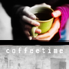
by xtess with 4 votes
People's choice:

by eternalphoenix_ with 5 votes
Voting Tally
If your icon number is not listed here, then it means that you have received no votes! Congratulations!
1.+5
2.-2+2
3.-1
4.-4
- = lesser quality vote(s)
+ = favorite icon vote(s)
Elliminate:
02: Icon is too simple, tiny text look a bit out of place, it contrast too much with the whole icon, not really good placed, because in this place look distracting.
02. the coloring is not right and the tiny text is not attractive
#o3 - Good cropping, but text doesn't fit (the white doesn't really stand out here) + coloring could be a bit more attractive.
04 - too dark, the odd b&w mixed with color didn't quite work, oversharpened text
04 - colouring is not good, grunge texture doesn't fit this icon, black border is excess
4: The icon is creative, but I don't think that making part of the image b/w was a good idea, grey fingers look unnatural. Plus, the black border is too heavy and distracting, maybe if it was white or grey, the composition would look much better.
4 - font doesn't fit, colorful part and then b/w part look weird
Keep:
01. great composition and use of text
#o1 - creative icon and the added sky fits perfectly.
1 - original idea, nice composition
01 - Good use of texture, composition is nice, and text really fit the icon.
01- good coffee colouring, blue stock image use and very beautiful composition
02 -- nice crop and color
2: The tiny text is a bit blurry, but the close cropping is great and I like the violet coloring.
Good luck to everyone in next round :)

by xtess with 4 votes
People's choice:

by eternalphoenix_ with 5 votes
Voting Tally
If your icon number is not listed here, then it means that you have received no votes! Congratulations!
1.+5
2.-2+2
3.-1
4.-4
- = lesser quality vote(s)
+ = favorite icon vote(s)
Elliminate:
02: Icon is too simple, tiny text look a bit out of place, it contrast too much with the whole icon, not really good placed, because in this place look distracting.
02. the coloring is not right and the tiny text is not attractive
#o3 - Good cropping, but text doesn't fit (the white doesn't really stand out here) + coloring could be a bit more attractive.
04 - too dark, the odd b&w mixed with color didn't quite work, oversharpened text
04 - colouring is not good, grunge texture doesn't fit this icon, black border is excess
4: The icon is creative, but I don't think that making part of the image b/w was a good idea, grey fingers look unnatural. Plus, the black border is too heavy and distracting, maybe if it was white or grey, the composition would look much better.
4 - font doesn't fit, colorful part and then b/w part look weird
Keep:
01. great composition and use of text
#o1 - creative icon and the added sky fits perfectly.
1 - original idea, nice composition
01 - Good use of texture, composition is nice, and text really fit the icon.
01- good coffee colouring, blue stock image use and very beautiful composition
02 -- nice crop and color
2: The tiny text is a bit blurry, but the close cropping is great and I like the violet coloring.
Good luck to everyone in next round :)