Challenge #5 - Round #4 - Results
I'm really sorry, but we have to say goodbye to this participants:

by spriink with 5 votes

by purple_wings with 4 votes
People's choice:

by smelltheflowers with votes
Mod's choice:

by eternalphoenix_ with votes
great use of little pieces and coloring is also great :)
Voting Tally
If your icon number is not listed here, then it means that you have received no votes! Congratulations!
1.-3
2.-4
3.-5
4.-1/+4=+3
5.+1
6.-3
7.-3
8.-2/+1=-1
9.+2
10.-3
- = lesser quality vote(s)
+ = favorite icon vote(s)
Elliminate:
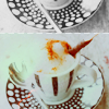
10: image seems a bit too burnt, the splash of color in the middle didn't really compliment the icon that much.
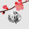
04: The flower on top was a bit off theme with the coffee, doesn't really blend in well with it there.
01: The texture in the backround wasn't a nice touch with the icon, the font wasn't the best choice.
#o3 nice coloring, but the yellow brush doesn't match with the icon;
#o2 bad realization of a good plan, the contrast is not good;
#o8 empty composition, i dont like the text position;
03. the coloring is dark and the stars/light textures do not fit the icon
07. the light texture is really bright and the text is not attractive
06. the icon is too dark and the tiny text doesn't look nice with the icon
01 -- the text is rather boring and the background texture is weird
02 -- coloring is washed out, and the green blob to the left is distracting
06 -- unoriginal crop, color, and use of tiny text; overall icon is too dark
2: I like the cropping, but the coloring is too light: the coffee blends with the background and the light texture seems out of place or maybe if you used warmer colors, it would compliment the icon more.
3: The icon is too busy: the decorative elements are overpowering and don't match each other. Maybe if you used only light texture without that large yellow thingy, it would be a lovely icon.
10: Great composition, but unfortunately, the icon is oversharpened and the background is grainy.
07 The font doesn't really flatter the icon. It's a dirty kind of font, I think a clean cut one would've fit more.
03. The brush used is taking focus away from the main theme and the yellow doesn't exactly fit the rest of the coloring.... or the texture.
08. The coloring makes the icon look too saturated and the text is misplaced. The latter was probably intended that way, though it would've been nice to actually read the text.
#06: The icon is too dark and could use more contrast. The black tiny text looks out of place.
#07: Nice crop and colouring but the font choice doesn't suit the picture.
#03: The contrast is too high. The stars do not fit the image.
1 - The background texture doesn't complement the image, and the text is positioned too far up.
2 - Coffee cup blends into the background too much. Green blob on the right detracts from the image.
10 - Oversharpened. Light texture should be more subtle.
Keep:
9 - Terrific use of texture. Lovely coloring.
#04: Lovely, original idea. Great choice of colours.
05. Very creative, I love it.
4: Very creative, I like the "simplicity" of the icon, it's very interesting that there are only two objects on the icon. And the b/w coloring looks great with the bright flower brush
04 -- SO ORIGINAL composition, gorgeous execution
04. very unique! it's a gorgeous icon.
#o9 gorgeous icon - beautiful mixture of a color, crop, tiny text and textures.
08: gorgeous crop!the soft toned colors really brought the icon life.
Good luck to everyone in next round :)
by spriink with 5 votes

by purple_wings with 4 votes
People's choice:

by smelltheflowers with votes
Mod's choice:

by eternalphoenix_ with votes
great use of little pieces and coloring is also great :)
Voting Tally
If your icon number is not listed here, then it means that you have received no votes! Congratulations!
1.-3
2.-4
3.-5
4.-1/+4=+3
5.+1
6.-3
7.-3
8.-2/+1=-1
9.+2
10.-3
- = lesser quality vote(s)
+ = favorite icon vote(s)
Elliminate:
10: image seems a bit too burnt, the splash of color in the middle didn't really compliment the icon that much.
04: The flower on top was a bit off theme with the coffee, doesn't really blend in well with it there.
01: The texture in the backround wasn't a nice touch with the icon, the font wasn't the best choice.
#o3 nice coloring, but the yellow brush doesn't match with the icon;
#o2 bad realization of a good plan, the contrast is not good;
#o8 empty composition, i dont like the text position;
03. the coloring is dark and the stars/light textures do not fit the icon
07. the light texture is really bright and the text is not attractive
06. the icon is too dark and the tiny text doesn't look nice with the icon
01 -- the text is rather boring and the background texture is weird
02 -- coloring is washed out, and the green blob to the left is distracting
06 -- unoriginal crop, color, and use of tiny text; overall icon is too dark
2: I like the cropping, but the coloring is too light: the coffee blends with the background and the light texture seems out of place or maybe if you used warmer colors, it would compliment the icon more.
3: The icon is too busy: the decorative elements are overpowering and don't match each other. Maybe if you used only light texture without that large yellow thingy, it would be a lovely icon.
10: Great composition, but unfortunately, the icon is oversharpened and the background is grainy.
07 The font doesn't really flatter the icon. It's a dirty kind of font, I think a clean cut one would've fit more.
03. The brush used is taking focus away from the main theme and the yellow doesn't exactly fit the rest of the coloring.... or the texture.
08. The coloring makes the icon look too saturated and the text is misplaced. The latter was probably intended that way, though it would've been nice to actually read the text.
#06: The icon is too dark and could use more contrast. The black tiny text looks out of place.
#07: Nice crop and colouring but the font choice doesn't suit the picture.
#03: The contrast is too high. The stars do not fit the image.
1 - The background texture doesn't complement the image, and the text is positioned too far up.
2 - Coffee cup blends into the background too much. Green blob on the right detracts from the image.
10 - Oversharpened. Light texture should be more subtle.
Keep:
9 - Terrific use of texture. Lovely coloring.
#04: Lovely, original idea. Great choice of colours.
05. Very creative, I love it.
4: Very creative, I like the "simplicity" of the icon, it's very interesting that there are only two objects on the icon. And the b/w coloring looks great with the bright flower brush
04 -- SO ORIGINAL composition, gorgeous execution
04. very unique! it's a gorgeous icon.
#o9 gorgeous icon - beautiful mixture of a color, crop, tiny text and textures.
08: gorgeous crop!the soft toned colors really brought the icon life.
Good luck to everyone in next round :)