Challenge #4 - Round #7 - Results
I'm really sorry, but we have to say goodbye to this participant:

by seriouslywir with 2 votes

by 17laura with 2 votes
Voting Tally
If your icon number is not listed here, then it means that you have received no votes! Congratulations!
1.-3/+2=-1
2.-2
3.-1/+2=+1
4.-1/+3=+2
- = lesser quality vote(s)
+ = favorite icon vote(s)
Elliminate:
01 - too blurry icon and it is not enough processing
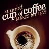
1: The icon is oversaturated, the coffee is unnaturally red, the light texture in the cup looks like something fell in it.
1 - icons is too bright and oversharpened. Tinytext and light dots look a bit strange in these places. Icon lacks decoration.
2-a bit too colorfulteaxt blends with the background in white places
2 very hard to tell there's a cup of coffee in there. colors are very garish.
03:- The texture in that icon wasn't doing the image any good/ also the font looks a little unclear at the end.
4-coloring is too dark,bad use of text
Keep:
1-very clear cool tiny text pretty crop
1 very simple and clean. well sharpened. the mini text is a little odd though.
3 - what appeals more is use of text. I like both content and form. In whole icon is nice, neat, with nothing excess.
3-great coloring and use of text!
4: Good choice of lyrics, lovely coloring, eye-catching text placement.
4 - great colours! text is very suitable)
04: I liked the way this icon went simple and the font was done very creative, made the icon come to life :)
Good luck to everyone in next round, cuz it's the last one :)

by seriouslywir with 2 votes
by 17laura with 2 votes
Voting Tally
If your icon number is not listed here, then it means that you have received no votes! Congratulations!
1.-3/+2=-1
2.-2
3.-1/+2=+1
4.-1/+3=+2
- = lesser quality vote(s)
+ = favorite icon vote(s)
Elliminate:
01 - too blurry icon and it is not enough processing
1: The icon is oversaturated, the coffee is unnaturally red, the light texture in the cup looks like something fell in it.
1 - icons is too bright and oversharpened. Tinytext and light dots look a bit strange in these places. Icon lacks decoration.
2-a bit too colorfulteaxt blends with the background in white places
2 very hard to tell there's a cup of coffee in there. colors are very garish.
03:- The texture in that icon wasn't doing the image any good/ also the font looks a little unclear at the end.
4-coloring is too dark,bad use of text
Keep:
1-very clear cool tiny text pretty crop
1 very simple and clean. well sharpened. the mini text is a little odd though.
3 - what appeals more is use of text. I like both content and form. In whole icon is nice, neat, with nothing excess.
3-great coloring and use of text!
4: Good choice of lyrics, lovely coloring, eye-catching text placement.
4 - great colours! text is very suitable)
04: I liked the way this icon went simple and the font was done very creative, made the icon come to life :)
Good luck to everyone in next round, cuz it's the last one :)