Challenge #3 - Round #5 - Results
I'm really sorry, but we have to say goodbye to this participants:
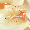
by maesstria with 3 votes
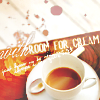
by danimonstre with 3 votes
I'm so sorry, to see you both go :(
People's choce:
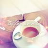
by scheratan with 1 vote
Mod's choice

by elfandali
so creative icon.. even thought i don't really like green bg, but i really love the rest of the stuff..
Voting Tally
If your icon number is not listed here, then it means that you have received no votes! Congratulations!
1.-1-1+1-1-1=-3
2.-1+1-1-1+1=-1
3.+1-1+1=+1
4.-1
5.-3
6.-1+1+1-1=0
- = lesser quality vote(s)
+ = favorite icon vote(s)
Trivia
- 6/9 participants entered round #5
- 2 reminders
- 7 people voted
- 2 eliminations +1 people's choice +1 mod's choice
Elliminate:
1: Very creative, but the icon is too busy and oversharpened. Maybe with other fonts it would look much beter, but those fonts are too distracting.
4: The icon seems blurry and it's lacking of contrast, it's impossible to say where the cup ends and where the saucer begins, because all shadows are gone.
-06. texture doesn't approach to icon. It is looked ugly
-01. The square cutting from a picture is not so well looked.
2 colors chaotic not very harmonic, the brush with heart was either unnecessary either should be a different color
5 very busy, the color of rust is not the perfect match for this picture.
5 - Too cluttered. The text is hard to read, the textures + splatter brushes don't have any relevance to the image. Oversharpened.
2 - The brush in the color is too dark; it shouldn't draw focus away from the image. Also, the light blue texture/multiply layer casts a very unnatural hue over the icon that doesn't go well with the brownish red of the coffee + table.
1. The use of the picture isn't that great. I couldn't tell it was coffee or that the cup is behind the inset.
5. The text is hard to read for the first two words and the cream part stands out. The texture is too overpowering as well.
2 - Oversaturation struck me right away. I'm bothered by the clean white mug turned into blue and the dark blue shadows on the spoon. The burn-lighting is a nice effect and I like the heart and tiny-text, but the colours are just off.
3 - This icon looks faded and too strongly purple. The text is large enough that it should be completely legible, but I can only make out "coffee"-something. Again nice light effects, and an overall dreamy atmosphere, but the icon is still lacking in some nice contrast and bold colours.
#01 -- this layout is odd: the upclose crop of just the foam doesn't really make sense, and then the text is hard to read
#06 -- while the actual picture of the coffee looks nice, the dark green/yellowish background texture does not fit: the coffee pic should have been coloring to match that background, or vice versa
Keep:
#03 -- beautiful color and nice use of textures, though the text is a bit hard to read
6, it makes me think of coffee in a secret garden. Nice clouds and colours in the green background, and still plenty of definition and detail in the smaller central image. I like the distressed effects as well...it just feels cozy and good.
2. Like the texture and coloring.
6 - Good texture use and cropping.
1 the most unique icon I've seen in while
02. brightfull colors, very good brush.
3: The coloring is gorgeous and eye-catching. Good use of light textures. The text seems a bit oversharpened though.
other note from danimonstre:
I also wanted to give my own honourable mention to number 1, even if it doesn't count...it's a very creative close-up on the icon, nice effects and good choice for text. Super Creativity Points, and also kudos for being the only one to use the other image provided.
Good luck to everyone in next round :)

by maesstria with 3 votes

by danimonstre with 3 votes
I'm so sorry, to see you both go :(
People's choce:

by scheratan with 1 vote
Mod's choice

by elfandali
so creative icon.. even thought i don't really like green bg, but i really love the rest of the stuff..
Voting Tally
If your icon number is not listed here, then it means that you have received no votes! Congratulations!
1.-1-1+1-1-1=-3
2.-1+1-1-1+1=-1
3.+1-1+1=+1
4.-1
5.-3
6.-1+1+1-1=0
- = lesser quality vote(s)
+ = favorite icon vote(s)
Trivia
- 6/9 participants entered round #5
- 2 reminders
- 7 people voted
- 2 eliminations +1 people's choice +1 mod's choice
Elliminate:
1: Very creative, but the icon is too busy and oversharpened. Maybe with other fonts it would look much beter, but those fonts are too distracting.
4: The icon seems blurry and it's lacking of contrast, it's impossible to say where the cup ends and where the saucer begins, because all shadows are gone.
-06. texture doesn't approach to icon. It is looked ugly
-01. The square cutting from a picture is not so well looked.
2 colors chaotic not very harmonic, the brush with heart was either unnecessary either should be a different color
5 very busy, the color of rust is not the perfect match for this picture.
5 - Too cluttered. The text is hard to read, the textures + splatter brushes don't have any relevance to the image. Oversharpened.
2 - The brush in the color is too dark; it shouldn't draw focus away from the image. Also, the light blue texture/multiply layer casts a very unnatural hue over the icon that doesn't go well with the brownish red of the coffee + table.
1. The use of the picture isn't that great. I couldn't tell it was coffee or that the cup is behind the inset.
5. The text is hard to read for the first two words and the cream part stands out. The texture is too overpowering as well.
2 - Oversaturation struck me right away. I'm bothered by the clean white mug turned into blue and the dark blue shadows on the spoon. The burn-lighting is a nice effect and I like the heart and tiny-text, but the colours are just off.
3 - This icon looks faded and too strongly purple. The text is large enough that it should be completely legible, but I can only make out "coffee"-something. Again nice light effects, and an overall dreamy atmosphere, but the icon is still lacking in some nice contrast and bold colours.
#01 -- this layout is odd: the upclose crop of just the foam doesn't really make sense, and then the text is hard to read
#06 -- while the actual picture of the coffee looks nice, the dark green/yellowish background texture does not fit: the coffee pic should have been coloring to match that background, or vice versa
Keep:
#03 -- beautiful color and nice use of textures, though the text is a bit hard to read
6, it makes me think of coffee in a secret garden. Nice clouds and colours in the green background, and still plenty of definition and detail in the smaller central image. I like the distressed effects as well...it just feels cozy and good.
2. Like the texture and coloring.
6 - Good texture use and cropping.
1 the most unique icon I've seen in while
02. brightfull colors, very good brush.
3: The coloring is gorgeous and eye-catching. Good use of light textures. The text seems a bit oversharpened though.
other note from danimonstre:
I also wanted to give my own honourable mention to number 1, even if it doesn't count...it's a very creative close-up on the icon, nice effects and good choice for text. Super Creativity Points, and also kudos for being the only one to use the other image provided.
Good luck to everyone in next round :)