Challenge #3 - Round #4 - Results
I'm really sorry, but we have to say goodbye to this participant:

by iluvbeingme23 with 3 votes
I'm so sorry, to see you go :(
People's choce:

by scheratan with 2 votes
Mod's choice

by cdg
really nice coloring and texture and text use.. simply love :)
Voting Tally
If your icon number is not listed here, then it means that you have received no votes! Congratulations!
1.+1
2.-2
3.-1+1-1-1=-2
4.+2
5.-2
6.-1
7.-1-1+1+1=0
8.+1-1-1-1-1=-3
- = lesser quality vote(s)
+ = favorite icon vote(s)
Trivia
- 9/10 participants entered round #4
- 3 reminders
- 7 people voted
- 1 elimination +1 people's choice +1 mod's choice
Elliminate:
2: The text feels awkard where it is placed and the placing of the smaller cups makes the entire icon feel off balance when looking at.
2 - I like the dynamic style of this icon, but the colours are very washed out for our being given bright red cups to work with--that was their charm. If the Asian lettering had a translation I would also understand this icon a little better, but as it is I fail to see what it has to do with the subject.
3: The texture feels blurry and the coloring is a bit too harsh with the softer background used in the icon.
3: Nice concept, but the icon is oversaturated and overtextured and it look a bit oversharpened (maybe because of the oversaturation?).
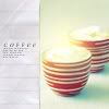
3 - Contrast/coloring of the cups is too high. The light textures are very distracting and cover up the best part of the image which would be the coffee cups. The grungy style of the wrinkled paper type brush/scratchy texture doesn't work with this particular light texture - two different styles that don't compliment one another.
5 - The textures don't fit with the icon. The blue on the left clashes with the pinkish-red of the cups. The light texture is too random, interfering with the flow of the icon, causing there to be no real focal point.
5. The textures used overpower the original image.
6: The icon is lacking of creativity. The decorative elements don't match each other and don't compliment the icon.
7 - The yellowish lighten layer makes the shadows look unnatural. Text is hard to read.
#07 -- unoriginal cropping, the wannabe-border is awkward, and the text is terrible
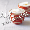
8 - I like the brighter colours here much more, as well, and the texture like a wrinkled-paper effect. But the text doesn't flow very well--perhaps if it read "wonderful life" or "life is wonderful" instead it would flow better. The cropping is great, but the text is too large and it begins to obstruct in this icon.
08 -- virtually no coloring and confusing, unoriginal text
8. The choice of words doesn't make sense and the fonts used don't work well together
8 - The coloring doesn't stand out for me and the text takes away too much focus. Inverting the order is also confusing.
Keep:
1. Clever wording, love the font used for empty. Nice coloring and the little bit of pink is a nice touch.
3, it's different and very vivid and beautiful. It has almost an impressionistic fine art look, and the light spot effect just add a little extra something. The eye keeps going from the front-left to the back-right and right around the icon, it has a nice smooth flow. Very creative, yay!
4 - Great coloring; very vivid and appealing.
04 -- i love the coloring and texture and text. everything is gorgeous. :)
7: The icon stands out. The concept is very unusual, I like the choice of decorative elements.
7 - This icon gives off the feeling of an old newspaper ad from the 50's. The text is clever, though I would have either placed it someplace else or not put the border over it. Fantastic none-the-less!
8: I love the placement of the text and the softness of the colors which has everything meld and blend together nicely.
Good luck to everyone in next round :)
by iluvbeingme23 with 3 votes
I'm so sorry, to see you go :(
People's choce:

by scheratan with 2 votes
Mod's choice

by cdg
really nice coloring and texture and text use.. simply love :)
Voting Tally
If your icon number is not listed here, then it means that you have received no votes! Congratulations!
1.+1
2.-2
3.-1+1-1-1=-2
4.+2
5.-2
6.-1
7.-1-1+1+1=0
8.+1-1-1-1-1=-3
- = lesser quality vote(s)
+ = favorite icon vote(s)
Trivia
- 9/10 participants entered round #4
- 3 reminders
- 7 people voted
- 1 elimination +1 people's choice +1 mod's choice
Elliminate:
2: The text feels awkard where it is placed and the placing of the smaller cups makes the entire icon feel off balance when looking at.
2 - I like the dynamic style of this icon, but the colours are very washed out for our being given bright red cups to work with--that was their charm. If the Asian lettering had a translation I would also understand this icon a little better, but as it is I fail to see what it has to do with the subject.
3: The texture feels blurry and the coloring is a bit too harsh with the softer background used in the icon.
3: Nice concept, but the icon is oversaturated and overtextured and it look a bit oversharpened (maybe because of the oversaturation?).
3 - Contrast/coloring of the cups is too high. The light textures are very distracting and cover up the best part of the image which would be the coffee cups. The grungy style of the wrinkled paper type brush/scratchy texture doesn't work with this particular light texture - two different styles that don't compliment one another.
5 - The textures don't fit with the icon. The blue on the left clashes with the pinkish-red of the cups. The light texture is too random, interfering with the flow of the icon, causing there to be no real focal point.
5. The textures used overpower the original image.
6: The icon is lacking of creativity. The decorative elements don't match each other and don't compliment the icon.
7 - The yellowish lighten layer makes the shadows look unnatural. Text is hard to read.
#07 -- unoriginal cropping, the wannabe-border is awkward, and the text is terrible
8 - I like the brighter colours here much more, as well, and the texture like a wrinkled-paper effect. But the text doesn't flow very well--perhaps if it read "wonderful life" or "life is wonderful" instead it would flow better. The cropping is great, but the text is too large and it begins to obstruct in this icon.
08 -- virtually no coloring and confusing, unoriginal text
8. The choice of words doesn't make sense and the fonts used don't work well together
8 - The coloring doesn't stand out for me and the text takes away too much focus. Inverting the order is also confusing.
Keep:
1. Clever wording, love the font used for empty. Nice coloring and the little bit of pink is a nice touch.
3, it's different and very vivid and beautiful. It has almost an impressionistic fine art look, and the light spot effect just add a little extra something. The eye keeps going from the front-left to the back-right and right around the icon, it has a nice smooth flow. Very creative, yay!
4 - Great coloring; very vivid and appealing.
04 -- i love the coloring and texture and text. everything is gorgeous. :)
7: The icon stands out. The concept is very unusual, I like the choice of decorative elements.
7 - This icon gives off the feeling of an old newspaper ad from the 50's. The text is clever, though I would have either placed it someplace else or not put the border over it. Fantastic none-the-less!
8: I love the placement of the text and the softness of the colors which has everything meld and blend together nicely.
Good luck to everyone in next round :)