clez
in
clez_icons
Tutorial: Hannibal King (Blade: Trinity)
Yes, it’s tutorial time again. This one was requested by scifispice80, after she asked if I knew any good ways to clear up screencaps. So I tried to explain my iconning method to her over IM, and… well it was sort of disjointed. Ergo, tutorial.
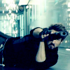
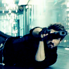
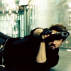
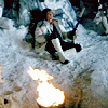
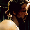
GOING FROM:

to
(In PSP 8, in ten/eleven easy steps; no curves or pesky selective colour)
STAGE 1:
Crop your base from the screencap (obviously bigger screencaps will lead to better quality in the long run) and resize (Shift+S). Ensure Smart Size is selected when you resize.
STAGE 2:
Duplicate your base - set to screen. If it’s too bright (because we have another step coming up to brighten it again), then lower the opacity. I usually lower to 50% if it’s too bright here. For this icon, I did indeed lower my opacity to 50%. Obviously, if your base was really dark to begin with, feel free to duplicate this screen layer, but be careful not to make it too bright at this point.
-
STAGE 3:
Make a new layer. Set the layer to Exclusion and lower the opacity to 10%. Fill with #103C6B.
-
STAGE 4:
Make a new layer. Set the layer to Soft Light. Leave the opacity at 100%. Fill with #84BEE7. I know it looks a bit “ew” at this stage, but don’t worry XD
-
STAGE 5:
Copy Merged (Ctrl+Shift+C) and past as a New Layer (Ctrl+L). Set the layer to Burn. Lower the opacity until you have a nice contrast. For this icon, I lowered the Burn opacity to 50%. At this stage, I always hide the Exclusion layer from Stage 3 (click on the eye beside the layer, and it will miraculously disappear); it doesn’t make much of a difference in the long run, and you can leave it if you really want to, but this is just what I always do.
-
STAGE 6:
Copy the Burn layer, and change the setting to Soft Light; I usually up the opacity of this to 100%, for some nice contrast. If, at this point, your colours start to look a little weird, mess with the opacities of the other layers, usually the Soft Light from Stage 4, or the Screen layer from Stage 2. For this icon, I lowered the Soft Light from Stage 4 to 80% (this is why it is important not to Merge All in Stage 5!).
-
STAGE 7:
Merge All. (Layers - Merge - Merge All (Flatten)).

STAGE 8:
Duplicate your new base. Apply Automatic Colour Balance to this new layer. My settings are: Strength 30, Temperature 3662 - ensure Remove Colour Cast is checked. If your icon now looks way too orange, lower the opacity, depending on your preference. For this icon, I left it at 100% opacity, because the icon was originally too green/blue for my tastes.
-
STAGE 9:
Merge All again.

STAGE 10:
Duplicate the new base again. Sharpen this top base, and then lower the opacity, again according to your preferences. For this icon, I lowered the opacity of the sharpened layer to 60%. Merge again! XD
-
STAGE 11:
This stage is optional, and again, according to preference. If your icon doesn’t have your preferred amount of contrast, play with Brightness and Contrast a little (Shift+B). My settings are usually very simple: Brightness 0, Contrast 5. For this icon, I went ahead and added a little contrast, just for kicks ;)
-
DONE! :D
Other icons made using this method:
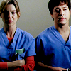


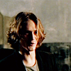

All of these icons are snaggable, with credit of course! XD
So! I hope that was nice and easy for you to follow, and ultimately helpful :D As always, I would love to see what you come up with, and I would just love to hear back from you if you tried it :D Comments are love XD
GOING FROM:
to
(In PSP 8, in ten/eleven easy steps; no curves or pesky selective colour)
STAGE 1:
Crop your base from the screencap (obviously bigger screencaps will lead to better quality in the long run) and resize (Shift+S). Ensure Smart Size is selected when you resize.
STAGE 2:
Duplicate your base - set to screen. If it’s too bright (because we have another step coming up to brighten it again), then lower the opacity. I usually lower to 50% if it’s too bright here. For this icon, I did indeed lower my opacity to 50%. Obviously, if your base was really dark to begin with, feel free to duplicate this screen layer, but be careful not to make it too bright at this point.
-
STAGE 3:
Make a new layer. Set the layer to Exclusion and lower the opacity to 10%. Fill with #103C6B.
-
STAGE 4:
Make a new layer. Set the layer to Soft Light. Leave the opacity at 100%. Fill with #84BEE7. I know it looks a bit “ew” at this stage, but don’t worry XD
-
STAGE 5:
Copy Merged (Ctrl+Shift+C) and past as a New Layer (Ctrl+L). Set the layer to Burn. Lower the opacity until you have a nice contrast. For this icon, I lowered the Burn opacity to 50%. At this stage, I always hide the Exclusion layer from Stage 3 (click on the eye beside the layer, and it will miraculously disappear); it doesn’t make much of a difference in the long run, and you can leave it if you really want to, but this is just what I always do.
-
STAGE 6:
Copy the Burn layer, and change the setting to Soft Light; I usually up the opacity of this to 100%, for some nice contrast. If, at this point, your colours start to look a little weird, mess with the opacities of the other layers, usually the Soft Light from Stage 4, or the Screen layer from Stage 2. For this icon, I lowered the Soft Light from Stage 4 to 80% (this is why it is important not to Merge All in Stage 5!).
-
STAGE 7:
Merge All. (Layers - Merge - Merge All (Flatten)).
STAGE 8:
Duplicate your new base. Apply Automatic Colour Balance to this new layer. My settings are: Strength 30, Temperature 3662 - ensure Remove Colour Cast is checked. If your icon now looks way too orange, lower the opacity, depending on your preference. For this icon, I left it at 100% opacity, because the icon was originally too green/blue for my tastes.
-
STAGE 9:
Merge All again.
STAGE 10:
Duplicate the new base again. Sharpen this top base, and then lower the opacity, again according to your preferences. For this icon, I lowered the opacity of the sharpened layer to 60%. Merge again! XD
-
STAGE 11:
This stage is optional, and again, according to preference. If your icon doesn’t have your preferred amount of contrast, play with Brightness and Contrast a little (Shift+B). My settings are usually very simple: Brightness 0, Contrast 5. For this icon, I went ahead and added a little contrast, just for kicks ;)
-
DONE! :D
Other icons made using this method:
All of these icons are snaggable, with credit of course! XD
So! I hope that was nice and easy for you to follow, and ultimately helpful :D As always, I would love to see what you come up with, and I would just love to hear back from you if you tried it :D Comments are love XD