Session 02: Round 04: results
Unfortunately we have to say good bye to one of our participant.
Eliminated:
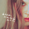
sjlnechnaia with -7 votes
I'm very sorry, hope to see you at the come back round!
People's choices:
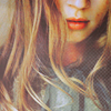
electrical_s with +5 votes
banner
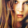
llean with +5 votes
banner
Mod's choice:

meow_kiss
banner
beautiful coloring and the texture makes the icon look magical <3
TALLIES:
01|----+++
02|-
03|-++
04|--+++
05|+++++
06|-++++++
07|-------
08|----+
COMMENTS:tell me if you need translation
ELIMINATIONS:
#1 - The texture overcrowded the icon and you look attention in the blank space, not clemence.
1 - it looks like this icon needs smth more to spice it up
01 - texture is excess, icon needs more contrast
#1 - too huge grey texture on the bottom of icon
#2 - очень желтое лицо, немного виден перешарп
03 - There's too much contrast to Clemence's hair, it makes it blinding to look at.
04 - The cut out wasn't done well, it looks messy and Clemence doesn't look right. The texture doesn't give enough colour in the icon. Some more colour would have been nice.
#4 - не очень красиво смотрятся размазанные волосы, нет рук, текст расположен неудачно
006 - crop is distracting and icon is a bit too sharp
007 - colouring is too pale plus icon looks strange with this white text
7 - coloring is too red and pale, her nose is blue
7 - колоринг не нравится, слишком бледный и зелёный какой-то.
07 - too much red color, tiny-text is contrasting
#007 - The icon is too pink & the text is too pixely.
#007 - too pale colors, Clem looks really weird with this cold tints, the texture(?) or brush doesn't fit the icon
#7 - weird coloring, text is too white :/
#008 - good idea, but too dark colors, not really good composition, the frame or the use of form is really careless
#008 - THe icon is very plain & the B&W lacks contrast.
#8 - The icon is dark and small.
8 - не очень нравится чб колоринг, не хватает контраста.
FAVOURITES:
01 - Good use of texture and colouring.
001 - I love the colouring - amazing:)
1 - красивый колор, нравится текстура
#003 - Great use of texture
#3 - beautiful colors, light textures very nicely fit with icon
4 - very original, looks great!
04 - the most creative icon here!
#04 - amazing composition, lovely text-use and textures fit aamzingly!
#05 - nice colors, good crop and amazing use ot textures
005 - crop is gorgeous and this delicate texture fits perfectly.
#5 - очень хороший кроп
#5 - Great coloring!!!
#005 - Amazing crop & colouring
06 - The crop is creative and the text placement is good although it's very hard to read what it says.
#6 - lovely cropping and coloring. Nice use of text.
6 - lovely crop, coloring is so adorable, like text using
06 - good colouring and cute tiny-text use
6 - классный кроп. текст не портит пик.
6 - красивые цвета и удачное расположение текста
#8 - nice frame, maybe there should be more work on levels/curves; but overall icon looks fine
Eliminated:

sjlnechnaia with -7 votes
I'm very sorry, hope to see you at the come back round!
People's choices:

electrical_s with +5 votes
banner

llean with +5 votes
banner
Mod's choice:

meow_kiss
banner
beautiful coloring and the texture makes the icon look magical <3
TALLIES:
01|----+++
02|-
03|-++
04|--+++
05|+++++
06|-++++++
07|-------
08|----+
COMMENTS:tell me if you need translation
ELIMINATIONS:
#1 - The texture overcrowded the icon and you look attention in the blank space, not clemence.
1 - it looks like this icon needs smth more to spice it up
01 - texture is excess, icon needs more contrast
#1 - too huge grey texture on the bottom of icon
#2 - очень желтое лицо, немного виден перешарп
03 - There's too much contrast to Clemence's hair, it makes it blinding to look at.
04 - The cut out wasn't done well, it looks messy and Clemence doesn't look right. The texture doesn't give enough colour in the icon. Some more colour would have been nice.
#4 - не очень красиво смотрятся размазанные волосы, нет рук, текст расположен неудачно
006 - crop is distracting and icon is a bit too sharp
007 - colouring is too pale plus icon looks strange with this white text
7 - coloring is too red and pale, her nose is blue
7 - колоринг не нравится, слишком бледный и зелёный какой-то.
07 - too much red color, tiny-text is contrasting
#007 - The icon is too pink & the text is too pixely.
#007 - too pale colors, Clem looks really weird with this cold tints, the texture(?) or brush doesn't fit the icon
#7 - weird coloring, text is too white :/
#008 - good idea, but too dark colors, not really good composition, the frame or the use of form is really careless
#008 - THe icon is very plain & the B&W lacks contrast.
#8 - The icon is dark and small.
8 - не очень нравится чб колоринг, не хватает контраста.
FAVOURITES:
01 - Good use of texture and colouring.
001 - I love the colouring - amazing:)
1 - красивый колор, нравится текстура
#003 - Great use of texture
#3 - beautiful colors, light textures very nicely fit with icon
4 - very original, looks great!
04 - the most creative icon here!
#04 - amazing composition, lovely text-use and textures fit aamzingly!
#05 - nice colors, good crop and amazing use ot textures
005 - crop is gorgeous and this delicate texture fits perfectly.
#5 - очень хороший кроп
#5 - Great coloring!!!
#005 - Amazing crop & colouring
06 - The crop is creative and the text placement is good although it's very hard to read what it says.
#6 - lovely cropping and coloring. Nice use of text.
6 - lovely crop, coloring is so adorable, like text using
06 - good colouring and cute tiny-text use
6 - классный кроп. текст не портит пик.
6 - красивые цвета и удачное расположение текста
#8 - nice frame, maybe there should be more work on levels/curves; but overall icon looks fine