anty_: Tutorial #001: "Feels like a Dream"
Since I owe darling watermirror120 a tutorial, I'll post this one before I accidentally delete all my psd. files or something 8D
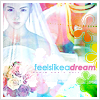
We'll be making this crappy icon here:
For this tutorial, I assume you all know how to do the basic stuff in Photoshop 7.0. I've never seen any other graphics software except PS7 so I don't know if this would work in other programs.
I started with this cap, taken from FFShrine
Layer 1
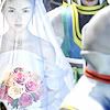
I cropped it and touched it up a bit. You can do this through whatever methods you're familiar with, as long as it doesn't get too bright. Mine was a result of 3 layers of Screen 100%, 1 layer of Linear Burn 85% and 1 layer of Soft Light 100%. Merge the layers (Ctrl+Shift+E). ((I have a feeling no one will be able to understand this...))
Layer 2
--->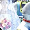
I added a bluey gradient by crumblingwalls. Set it on Soft Light 35%
Layer 3
--->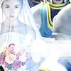
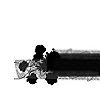
Fancy blocky thingy brush by 77words, the colour is #FFFFFF (a.k.a white) and I resize it a bit so we can fit it onto the icon. It's just there so we can put text on it later XD
Layers 4, 5 and 6
---->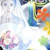
Hee, I'm combining these layers in this tutorial cos I'm lazy. But remember to always but your brushes on different layers mmmkay? XD But you already knew that. Anyhow, those cute flower brushes are by cdg_brushes. All three are different colours (#9BD943 green, #EEC62E yellow and #EE6A2E orangey-red in case you want to know)
Yes -- it looks horrible and the brushes look out of place at the moment, but we'll fix that soon with the colouring 8D
Layers 7 & 8
+
---->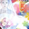
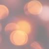
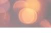
Apply those nifty 200x200 light texture from awmpdotnet on Pin Light 100%. Move it around to see where it fits best and stuff 8D Now the icon looks kinda decent, but waaay too dark and too reddish, soooo....
Layer 9
--->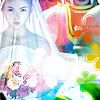
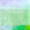
That texture is one of colorfilter's, just with it's hue and saturation (press ctrl+shift+U to get that fun little bar to pop up 8D) changed around a bit to fit this icon :B ((the texture looked like this originally, just in case you're wondering XD)) Anyhow, I set that layer on Colour Burn 100%. Still as ugly as hell, but the next step will remedy that 8D
Layer 10
--->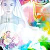
Duplicate Layer 9, then set it on Overlay. Fiddle around with the opacity until it looks right ((I settled with 50%)). Erase some of the part that's covering your subject, you might want to rotate it around a bit as well.
Almost finish.. though now the icon looks a bit too blueish, so...
Layer 11

-->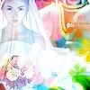
Another light texture from awmpdotnet, also set on Pin Light 100% . Rotate and move it around, erase bits and pieces to your liking.
That's the icon finished! I added a 3px solid white border then a 1px solid grey border as well as some text as a finishing touch.
My final result:

I hope this was helpful ((or at the very least, understandable XDD)) I'd love to see what you guys come up with ^^
We'll be making this crappy icon here:

For this tutorial, I assume you all know how to do the basic stuff in Photoshop 7.0. I've never seen any other graphics software except PS7 so I don't know if this would work in other programs.
I started with this cap, taken from FFShrine
Layer 1

I cropped it and touched it up a bit. You can do this through whatever methods you're familiar with, as long as it doesn't get too bright. Mine was a result of 3 layers of Screen 100%, 1 layer of Linear Burn 85% and 1 layer of Soft Light 100%. Merge the layers (Ctrl+Shift+E). ((I have a feeling no one will be able to understand this...))
Layer 2

--->

I added a bluey gradient by crumblingwalls. Set it on Soft Light 35%
Layer 3

--->

Fancy blocky thingy brush by 77words, the colour is #FFFFFF (a.k.a white) and I resize it a bit so we can fit it onto the icon. It's just there so we can put text on it later XD
Layers 4, 5 and 6

---->

Hee, I'm combining these layers in this tutorial cos I'm lazy. But remember to always but your brushes on different layers mmmkay? XD But you already knew that. Anyhow, those cute flower brushes are by cdg_brushes. All three are different colours (#9BD943 green, #EEC62E yellow and #EE6A2E orangey-red in case you want to know)
Yes -- it looks horrible and the brushes look out of place at the moment, but we'll fix that soon with the colouring 8D
Layers 7 & 8

+

---->

Apply those nifty 200x200 light texture from awmpdotnet on Pin Light 100%. Move it around to see where it fits best and stuff 8D Now the icon looks kinda decent, but waaay too dark and too reddish, soooo....
Layer 9

--->

That texture is one of colorfilter's, just with it's hue and saturation (press ctrl+shift+U to get that fun little bar to pop up 8D) changed around a bit to fit this icon :B ((the texture looked like this originally, just in case you're wondering XD)) Anyhow, I set that layer on Colour Burn 100%. Still as ugly as hell, but the next step will remedy that 8D
Layer 10

--->

Duplicate Layer 9, then set it on Overlay. Fiddle around with the opacity until it looks right ((I settled with 50%)). Erase some of the part that's covering your subject, you might want to rotate it around a bit as well.
Almost finish.. though now the icon looks a bit too blueish, so...
Layer 11

-->

Another light texture from awmpdotnet, also set on Pin Light 100% . Rotate and move it around, erase bits and pieces to your liking.
That's the icon finished! I added a 3px solid white border then a 1px solid grey border as well as some text as a finishing touch.
My final result:

I hope this was helpful ((or at the very least, understandable XDD)) I'd love to see what you guys come up with ^^