Challenge #6 - Round #5 - Belfast - Results
I'm really sorry, but we have to say good bye to this following participants.
Eliminated:
by cruzh with 7 votes
by allllure with 6 votes

by augustfalcon with 5 votes
by orange_serenity with 5 votes
People's choice:

by jeter021992 with 5 votes
Mod's choice:

by lihana
Voting Tally
If your icon number is not listed here, then it means that you have received no votes! Congratulations!
1.-1/+1=0
2.-6
3.-5
4.-2/+1=-1
5.+2
6.-1
7.-1
9.-2
10.-1/+2=+1
11.-5
12.-7
13.-2
14.+5
- = lesser quality vote(s)
+ = favorite icon vote(s)
Trivia
- 14/17 participants entered round #5
- 3 reminders
- 12 people voted
- 4 eliminations + 1 people's choice + 1 mod's choice
Eliminate:
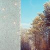
o2. The icon looks too dark.
12. the cropping is not appropiate, and the texture doesn't match the icon.
o9. The coloring is too blue.
2-coloring is too dark you can't see the picture enough
3-the light texture that was used is too big and looks out of place and the style of text as well as the overly of it looks bad
12-bad crop not enough interesting color and the texture takes up too much of the picture
#13 - The texture doesn't fit with the icon
#12 - the texture in half of the icon gives a strange effect and the coloring is dark, there's no shining...
#02 - The texture gives a dark color
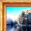
11 - The frame doesn't match the icon, it looks awkward
12 - The texture takes up too much room, and the crop & color of the picture is boring
2 - The icon is too dark
03. The text isn't placed well, the textures overcrowd the icon
11. The border distracts from the actual picture
12. The grey texture is unnecessary, the cropping isn't winning
#11: the texture / border overpowers the icon, you are totally distracted by it
#12: poor colouring (it makes the trees look somehow dead, which doesn't really fit the original picture)
#13: the paper texture doesn't fit the subject of the icon, distracts from the picture itself
#03 - the soft light on the text doesn’t suit the image or the colouring, the positioning of the text makes it slightly difficult to read.
#04 - the white shape doesn’t really suit the rest of the icon, and the white colour is a bit too contrasting.
#09 - the text is quite faint, almost inconspicuous due to the placement on uneven background
11. the gold border is not attractive and doesn't fit the image
3. the icon is sharp and the text doesn't look right
10. the coloring is a bit strange and the bottom pattern doesn't fit well.
#2 - The coloring is too dark.
#4 - The small text and white space is just distracting.
#7 - The coloring is too muted.
#12: poor cropping, you can't see much of the image, and the colouring is washed-out. The grey further makes it a drab icon.
#1: virtually nothing has been done to the icon to make it special. The colouring is boring and standard, as is the cropping.
#11: the frame is too large, and too fake-looking. The icon looks too sterilized.
#02: too dark
#03: the font doesn't fit the icon
#06: a bit dark and blurry
#12 - The coloring is very bland.
#03 - The text is positioned awkwardly.
#09 - The coloring is too blue.
To keep:
10 - Nice use of textures and brushes, plus a lovely coloring.
#14: great coloring, fits perfect with the picture
#14: beautiful colouring, and great use of texturing. Really sets itself apart from all the other icons.
#5 - Wonderful text placement and coloring.
14. love the coloring & the simplicity
#14 - the colouring is really rich and just beautiful!
#10: great use of texture and nice, old-ish looking colouring
01. Nice coloring and cropping
5 - I like the coloring, and the text/font looks really nice
#14 - I love coloring. It seems like autumn and it's great because the photo was too blue.
10-beautiful coloring great use of texture
o4. The cropping is perfect and the text is well possitioned.
Good luck to everyone in next round.
Eliminated:
by cruzh with 7 votes
by allllure with 6 votes
by augustfalcon with 5 votes
by orange_serenity with 5 votes
People's choice:
by jeter021992 with 5 votes
Mod's choice:
by lihana
Voting Tally
If your icon number is not listed here, then it means that you have received no votes! Congratulations!
1.-1/+1=0
2.-6
3.-5
4.-2/+1=-1
5.+2
6.-1
7.-1
9.-2
10.-1/+2=+1
11.-5
12.-7
13.-2
14.+5
- = lesser quality vote(s)
+ = favorite icon vote(s)
Trivia
- 14/17 participants entered round #5
- 3 reminders
- 12 people voted
- 4 eliminations + 1 people's choice + 1 mod's choice
Eliminate:
o2. The icon looks too dark.
12. the cropping is not appropiate, and the texture doesn't match the icon.
o9. The coloring is too blue.
2-coloring is too dark you can't see the picture enough
3-the light texture that was used is too big and looks out of place and the style of text as well as the overly of it looks bad
12-bad crop not enough interesting color and the texture takes up too much of the picture
#13 - The texture doesn't fit with the icon
#12 - the texture in half of the icon gives a strange effect and the coloring is dark, there's no shining...
#02 - The texture gives a dark color
11 - The frame doesn't match the icon, it looks awkward
12 - The texture takes up too much room, and the crop & color of the picture is boring
2 - The icon is too dark
03. The text isn't placed well, the textures overcrowd the icon
11. The border distracts from the actual picture
12. The grey texture is unnecessary, the cropping isn't winning
#11: the texture / border overpowers the icon, you are totally distracted by it
#12: poor colouring (it makes the trees look somehow dead, which doesn't really fit the original picture)
#13: the paper texture doesn't fit the subject of the icon, distracts from the picture itself
#03 - the soft light on the text doesn’t suit the image or the colouring, the positioning of the text makes it slightly difficult to read.
#04 - the white shape doesn’t really suit the rest of the icon, and the white colour is a bit too contrasting.
#09 - the text is quite faint, almost inconspicuous due to the placement on uneven background
11. the gold border is not attractive and doesn't fit the image
3. the icon is sharp and the text doesn't look right
10. the coloring is a bit strange and the bottom pattern doesn't fit well.
#2 - The coloring is too dark.
#4 - The small text and white space is just distracting.
#7 - The coloring is too muted.
#12: poor cropping, you can't see much of the image, and the colouring is washed-out. The grey further makes it a drab icon.
#1: virtually nothing has been done to the icon to make it special. The colouring is boring and standard, as is the cropping.
#11: the frame is too large, and too fake-looking. The icon looks too sterilized.
#02: too dark
#03: the font doesn't fit the icon
#06: a bit dark and blurry
#12 - The coloring is very bland.
#03 - The text is positioned awkwardly.
#09 - The coloring is too blue.
To keep:
10 - Nice use of textures and brushes, plus a lovely coloring.
#14: great coloring, fits perfect with the picture
#14: beautiful colouring, and great use of texturing. Really sets itself apart from all the other icons.
#5 - Wonderful text placement and coloring.
14. love the coloring & the simplicity
#14 - the colouring is really rich and just beautiful!
#10: great use of texture and nice, old-ish looking colouring
01. Nice coloring and cropping
5 - I like the coloring, and the text/font looks really nice
#14 - I love coloring. It seems like autumn and it's great because the photo was too blue.
10-beautiful coloring great use of texture
o4. The cropping is perfect and the text is well possitioned.
Good luck to everyone in next round.