Challenge #6 - Round #1 - Edinburgh - Results
I'm really sorry, but we have to say good bye to this following participants.
Eliminated:

by summerxmist with 11 votes

by diablo_dancer with 11 votes
People's choice:

by lihana with 2 votes

by jeter021992 with 2 votes
Mod's choice:
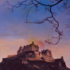
by carmineador
i like the deep blue color on the sky, and the whole icon is really well done..
Voting Tally
If your icon number is not listed here, then it means that you have received no votes! Congratulations!
1.-/1+1=0
2.-1
4.-1
5.-3
6.-1
8.-11
10.-1/+1=0
11.+1
12.-1/+3=+2
13.+1
15.+1
16.-1
17.-2
18.+2
20.-1
21.-12/+1=-11
22.-1+1
24.-1/+2=+1
26.-2/+2=0
27.-5
28.-3
- = lesser quality vote(s)
+ = favorite icon vote(s)
Trivia
- 28/30 participants entered round #1
- 3 reminders
- 16 people voted
- 2 eliminations + 2 people's choice + 1 mod's choice
Eliminate:
o5 - The icon is too dark
21 - The icon is too dark and the text doesn't compliment the icon
o8 - The icon looks very dark and the text position isn't appropiate for the icon
#24 - Too much contrast and the text (font-choice+placement) don't compliment the icon.
#10 - Coloring is too bright and light dots don't fit in.
#o8 - Too dark coloring, cropping + text don't compliment the icon
#21: too dark; can't even tell what that is.
#26: coloring is too bland; not enough color is used
#28: text doesn't really match with icon.
05 - The image is too dark and the bird brush(?) added doesn't flatter.
08 - The font choice doesn't go with the image.
21 - Coloring is too dark.
# 21 - Too dark and the color of the font don't fit.
# 22 - Too blue and the light texture is maybe too red.
# 27 - The use of light texture don't fit.
04 Text font doesn't fit this icon, the colours seem a little bit "burned"
08 The cropping isn't eye catching, text isn't placed well
21 The texture makes hard to distinguish the actual picture, text font dosn't fit this icon
#8 - The font used is quite difficult to read when the text is so small, and the solid area behind the text stands out a bit too much
#16 - there is a bit too much contrast and the bright white background stands out a bit too much and also makes the rest of the icon look over saturated. The tiny text brush is a bit too faint and looks slightly out of place
#27 - the blue background is quite grainy and the light texture is a little too bright and looks randomly placed so that there appears to be no main focus to the icon
#21: the icon is too dark, you can't really see the picture anymore
#08: it's a bit blurry, and the text (color, position) doesn't fit
#17: text is too prevailing which doesn't do the icon any good
21 - the icon is way too dark, and the text looks strange
28 - the coloring is boring, and it's a strange choice of words
05 - the coloring is too dark, and there's too much purple/pink
#28: The coloring seems very dull and the text looks very bland.
#21: The coloring is very dark and it's difficult to tell what the picture is even of.
#o8: The image is slightly blurry and the coloring with the brush behind the text seems really pixely.
#1: The white note texture at the top doesn't suit the icon.
#8: The font doesn't suit the picture.
#20: The texture doesn't work.
#12: Text is unreadable. Icon is one big colored blur.
#21: Color of text is far too intense on this dark icon. Besides it is used in a not matching way. Icon is too dark.
#27: Bad use of texture. Light spots look like a weird kind of gun fire. Coloring is too dark and contrast-less.
#02: Colouring is bleak and icon looks cluttered by effects and textures. It's unclear what the side box is.
#21: Icon is too dark to make out the image, and the text doesn't match.
#08: Icon looks over-saturated, somewhat blurry, and the text doesn't suit it.
08. the coloring is too dark and the text takes up so much space and is unattractive
17. the light texture is too dramatic and the text doesn't fit well with the icon
27. the white blots/spots don't fit the icon at all
#08: The brown colors are overpowering and the image is a little blurry. The text would be better without the grey behind it.
#21: It's much too dark, especially for a photo with a lot of detail like this one. The text is also too bright in comparison.
#27: The light texture is too large and out of place. The grainy texture against the blue makes the photo look dirty; one with less of a brown tint would go better.
21-icon is too dark, can't really tell what is going on in the picture
26-Coloring is too read it takes away from the castle you can't see the fetures of it anymore
6-icon is too sharpened and the coloring is too orange
To keep:
1-love the simple coloring and the little paper with text at the top
#24: It's quite vibrant without being oversaturated and the text placement goes well with the crop.
26. nice cropping and the grainy affect is really cool
#26: Colouring and texturing are really neat, and complement the image well. The effects (black off to the side) are also different and make a nicely balanced image.
#22: Coloring matches the magic-concept. Light blob fits in perfectly.
#11: Lovely colouring and texture
#13: The coloring is fabulous. I love it. The use of tiny text and the brush on the left side is perfect and completes the icon. Great work. :)
18 - the coloring is really pretty, and i like the font and placement of 'edinburgh'
#12: the coloring is really beautiful, and also the text is very nice!
#21 - it’s really eyecatching, the white text against the dark background really works well, font is perfect and overall just a really creative, well made icon!!
18 I like the colours and the use of light textures on this icon
# 12 - the use of text is amazing!!! Also I love the light texture used.
15 - The coloring is lovely!
#24: like coloring is well done; text matches icon; and i like the extra sparkle detail in the sky.
#12 - beautiful coloring + cropping!
10 - Tha colouring is very lovely and compliments perfectly the texture
Good luck to everyone in next round.
Eliminated:
by summerxmist with 11 votes
by diablo_dancer with 11 votes
People's choice:
by lihana with 2 votes
by jeter021992 with 2 votes
Mod's choice:
by carmineador
i like the deep blue color on the sky, and the whole icon is really well done..
Voting Tally
If your icon number is not listed here, then it means that you have received no votes! Congratulations!
1.-/1+1=0
2.-1
4.-1
5.-3
6.-1
8.-11
10.-1/+1=0
11.+1
12.-1/+3=+2
13.+1
15.+1
16.-1
17.-2
18.+2
20.-1
21.-12/+1=-11
22.-1+1
24.-1/+2=+1
26.-2/+2=0
27.-5
28.-3
- = lesser quality vote(s)
+ = favorite icon vote(s)
Trivia
- 28/30 participants entered round #1
- 3 reminders
- 16 people voted
- 2 eliminations + 2 people's choice + 1 mod's choice
Eliminate:
o5 - The icon is too dark
21 - The icon is too dark and the text doesn't compliment the icon
o8 - The icon looks very dark and the text position isn't appropiate for the icon
#24 - Too much contrast and the text (font-choice+placement) don't compliment the icon.
#10 - Coloring is too bright and light dots don't fit in.
#o8 - Too dark coloring, cropping + text don't compliment the icon
#21: too dark; can't even tell what that is.
#26: coloring is too bland; not enough color is used
#28: text doesn't really match with icon.
05 - The image is too dark and the bird brush(?) added doesn't flatter.
08 - The font choice doesn't go with the image.
21 - Coloring is too dark.
# 21 - Too dark and the color of the font don't fit.
# 22 - Too blue and the light texture is maybe too red.
# 27 - The use of light texture don't fit.
04 Text font doesn't fit this icon, the colours seem a little bit "burned"
08 The cropping isn't eye catching, text isn't placed well
21 The texture makes hard to distinguish the actual picture, text font dosn't fit this icon
#8 - The font used is quite difficult to read when the text is so small, and the solid area behind the text stands out a bit too much
#16 - there is a bit too much contrast and the bright white background stands out a bit too much and also makes the rest of the icon look over saturated. The tiny text brush is a bit too faint and looks slightly out of place
#27 - the blue background is quite grainy and the light texture is a little too bright and looks randomly placed so that there appears to be no main focus to the icon
#21: the icon is too dark, you can't really see the picture anymore
#08: it's a bit blurry, and the text (color, position) doesn't fit
#17: text is too prevailing which doesn't do the icon any good
21 - the icon is way too dark, and the text looks strange
28 - the coloring is boring, and it's a strange choice of words
05 - the coloring is too dark, and there's too much purple/pink
#28: The coloring seems very dull and the text looks very bland.
#21: The coloring is very dark and it's difficult to tell what the picture is even of.
#o8: The image is slightly blurry and the coloring with the brush behind the text seems really pixely.
#1: The white note texture at the top doesn't suit the icon.
#8: The font doesn't suit the picture.
#20: The texture doesn't work.
#12: Text is unreadable. Icon is one big colored blur.
#21: Color of text is far too intense on this dark icon. Besides it is used in a not matching way. Icon is too dark.
#27: Bad use of texture. Light spots look like a weird kind of gun fire. Coloring is too dark and contrast-less.
#02: Colouring is bleak and icon looks cluttered by effects and textures. It's unclear what the side box is.
#21: Icon is too dark to make out the image, and the text doesn't match.
#08: Icon looks over-saturated, somewhat blurry, and the text doesn't suit it.
08. the coloring is too dark and the text takes up so much space and is unattractive
17. the light texture is too dramatic and the text doesn't fit well with the icon
27. the white blots/spots don't fit the icon at all
#08: The brown colors are overpowering and the image is a little blurry. The text would be better without the grey behind it.
#21: It's much too dark, especially for a photo with a lot of detail like this one. The text is also too bright in comparison.
#27: The light texture is too large and out of place. The grainy texture against the blue makes the photo look dirty; one with less of a brown tint would go better.
21-icon is too dark, can't really tell what is going on in the picture
26-Coloring is too read it takes away from the castle you can't see the fetures of it anymore
6-icon is too sharpened and the coloring is too orange
To keep:
1-love the simple coloring and the little paper with text at the top
#24: It's quite vibrant without being oversaturated and the text placement goes well with the crop.
26. nice cropping and the grainy affect is really cool
#26: Colouring and texturing are really neat, and complement the image well. The effects (black off to the side) are also different and make a nicely balanced image.
#22: Coloring matches the magic-concept. Light blob fits in perfectly.
#11: Lovely colouring and texture
#13: The coloring is fabulous. I love it. The use of tiny text and the brush on the left side is perfect and completes the icon. Great work. :)
18 - the coloring is really pretty, and i like the font and placement of 'edinburgh'
#12: the coloring is really beautiful, and also the text is very nice!
#21 - it’s really eyecatching, the white text against the dark background really works well, font is perfect and overall just a really creative, well made icon!!
18 I like the colours and the use of light textures on this icon
# 12 - the use of text is amazing!!! Also I love the light texture used.
15 - The coloring is lovely!
#24: like coloring is well done; text matches icon; and i like the extra sparkle detail in the sky.
#12 - beautiful coloring + cropping!
10 - Tha colouring is very lovely and compliments perfectly the texture
Good luck to everyone in next round.