Challenge #5 - Round #9 - San José - Results
I'm really sorry, but we have to say good bye to this following participants.
Eliminated:

by timex_j with 2 votes
People's choice:
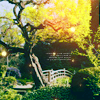
by hel_lansky with 2 votes
Voting Tally
If your icon number is not listed here, then it means that you have received no votes! Congratulations!
1.-3/+1=-2
2.-2/+4=+2
3.-5/+4=-1
4.-2/+3=+1
- = lesser quality vote(s)
+ = favorite icon vote(s)
Trivia
- 4/4 participants entered round #9
- 4 reminders
- 12 people voted
- 1 eliminations + 1 people's choice + 0 mod's choice
Eliminate:
01 - too many decorative elements and yellow color, black part is too heavy for this icon and tiny texy isn't necessary here
#1 - the textures overpower the icon especially in the right-hand corner
01 - The dotted light texture in the corner does not look good at all in this icon, and it is not necessary when you have the other textures.
2 - the icon is oversharpened and the light textures do not suit the image
02. the image is too sharp and the coloring is a bit off, there is too much yellow and green
#03: You can't really make out what's in the pictures because they are so small and, compared to the red blop of the texture, not colourful enough.
03: There are too many pieces of colour separated by blankness... the red in the corner is distracting, and the layout of it just isn't very appealing.
#3 - It's hard to make out what exactly it's a icon of with the photo frames.
#03 - Too much going on in that icon. The two pictures, the light texture on the bigger picture and the color spots on the left of the icon. Besides the first picture could have been a little more colorful or just adding more contrast to that picture. So it isn't really eye-catching.
3 - the texture doesn't really make sense with the image
04) The icon is realy good, and turning it to black and white could result really well if it wasn't for the fact that the original image became to dark and the great focus is the text and not the picture it self.
04 - simply bw-coloring without some light textures and other decoration
To keep:
1 - love the colouring and lighting!
#02 - Nice, soft coloring and good cropping. The tiny text + light texture add a nice extra.
02: Oh, those colours, those effects, the composition - it's all gorgeous! A wonderful icon altogether.
02) The colors are incredibly natural but so wonderfull at the same time. The light red light (lol) looks really pretty and was very well placed
#02: The colouring is very natural and not too dark or too light. The light texture is very well used, as is the tiny text.
#3: wonderful originality and creativity
03 - nice idea wuth window/stamp, icon looks really harmonic
03 - The texture use is fabulous:D
03 - excellent decoration
04. the black and white is simple, yet done really well
#4 - the black and white is very well done and the text fits in perfectly
#4 - The text looks really good on the icon and the icon looks really great as black & white.
Good luck to everyone in next round, cuz it'll be the last one in this challenge :)
Eliminated:
by timex_j with 2 votes
People's choice:
by hel_lansky with 2 votes
Voting Tally
If your icon number is not listed here, then it means that you have received no votes! Congratulations!
1.-3/+1=-2
2.-2/+4=+2
3.-5/+4=-1
4.-2/+3=+1
- = lesser quality vote(s)
+ = favorite icon vote(s)
Trivia
- 4/4 participants entered round #9
- 4 reminders
- 12 people voted
- 1 eliminations + 1 people's choice + 0 mod's choice
Eliminate:
01 - too many decorative elements and yellow color, black part is too heavy for this icon and tiny texy isn't necessary here
#1 - the textures overpower the icon especially in the right-hand corner
01 - The dotted light texture in the corner does not look good at all in this icon, and it is not necessary when you have the other textures.
2 - the icon is oversharpened and the light textures do not suit the image
02. the image is too sharp and the coloring is a bit off, there is too much yellow and green
#03: You can't really make out what's in the pictures because they are so small and, compared to the red blop of the texture, not colourful enough.
03: There are too many pieces of colour separated by blankness... the red in the corner is distracting, and the layout of it just isn't very appealing.
#3 - It's hard to make out what exactly it's a icon of with the photo frames.
#03 - Too much going on in that icon. The two pictures, the light texture on the bigger picture and the color spots on the left of the icon. Besides the first picture could have been a little more colorful or just adding more contrast to that picture. So it isn't really eye-catching.
3 - the texture doesn't really make sense with the image
04) The icon is realy good, and turning it to black and white could result really well if it wasn't for the fact that the original image became to dark and the great focus is the text and not the picture it self.
04 - simply bw-coloring without some light textures and other decoration
To keep:
1 - love the colouring and lighting!
#02 - Nice, soft coloring and good cropping. The tiny text + light texture add a nice extra.
02: Oh, those colours, those effects, the composition - it's all gorgeous! A wonderful icon altogether.
02) The colors are incredibly natural but so wonderfull at the same time. The light red light (lol) looks really pretty and was very well placed
#02: The colouring is very natural and not too dark or too light. The light texture is very well used, as is the tiny text.
#3: wonderful originality and creativity
03 - nice idea wuth window/stamp, icon looks really harmonic
03 - The texture use is fabulous:D
03 - excellent decoration
04. the black and white is simple, yet done really well
#4 - the black and white is very well done and the text fits in perfectly
#4 - The text looks really good on the icon and the icon looks really great as black & white.
Good luck to everyone in next round, cuz it'll be the last one in this challenge :)