Challenge #4 - Winners
Oh, it took us so long to make results, but now we have enough votes
And have a winner ;))
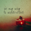
<<< nokitas third place >>>


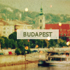
<<< vanity_dream the runner up >>>


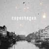
<<< already_used Last Icon Maker Standing >>>
Congratulations to everyone!
Oh, i feel like i need to say something very important to you, but i have no words.
So i'll just say huge thank you to all of you, who are here with me.
Thank you for your participation, for your votes and for your suppert. I love ya all :D
already_used 11 votes
nokitas 5 votes
vanity_dream 8 votes
Part #1:
Fav.:
1 - overall the colors are better than in other two.
#1 - Love the texture usage and how they've placed the text.
01 - awesome sky colouring and long cropping, it really fits this icon
#1 - The icon seems oversharpened and the coloring doesn't compliment the icon.
#2 - It's simple and it works. It looks like a classic storybook picture, and the texture suits the image.
#2 - The black border doesn't match the composition. The light texture in the center of the icon is distracting.
#2 - Gorgeous coloring and I love the simplicity of the icon, indeed, nothing else is needed here.
#2 - It looks like an old photograph: very pretty.
02 - icon looks a little pretty and not interesting, it needs some elements of decoration
03 - interestiong idea, but text is unreadable and it hides the main part of the city look
#3 - This icons is simply stunning. The black and white is crisp, and the light texture adds a lovely contrast. The text is clear and nicely positioned.
Other critiques:
#1 - The texture on the clouds is strange and doesn't match very well.
#1 - The image seems a bit oversharpened while the text is blurry and difficult to read.
#1 - The coloring on this is beautiful; my only problem would be that the white text blends too much into the clouds in some small areas.
#1 - Text doesn't match the image and is hard to read. The colouring is also widely varying.
#2 - The grungy texture is a tad overwhelming and mutes the colors. Good cropping, but too much negative space on the top.
#2 - i like the darkness of the icon but it's kinda dull
#2 - It's too bland, they need textures.
2 - i don't see many changes from the original picture.
3 - too simple and stereotypical
#3 - The colouring is lovely and I love the cropping and how they've placed the text.
#3 - The light textures are extremely distracting.
#3 - the black and white is cool and the text is well done but i don't really like color textures
#3 - The icon is lacking of contrast. It's blurry and overtextured.
#3 - I can't really see the image. The b/w, the scratchy texture, and the text, while nice, are too much combined.
#3 - Text is too hard to read; all the effects seem to serve no purpose other than clutter up the icon. The light blobs are randomly (as opposed to significantly) placed.
Part #2:
Fav.:
01 - great using of textures and cropping is warm and beautiful + great caption
#1 - The composition is amazing. The coloring is so bright and "fresh". The polaroid + post-it textures all work together to complement the image nicely.
#1 - I find it extremely difficult to read the text.
2 - the mixture of black and white tones, and light texture is the advantage of this icon,
#2 - The random blob of yellow is really distracting.
#2 - Icon has lots of effects but the image manages not to be overshadowed by them - I like the off-centre bordering, and the icon is just interesting to look at.
#2 - the black and white and the use of textures is really cool
#2 - Beautiful composition and texture use, though maybe the text could be positioned so it didn't overlap the subject in that one area. ^^;
#3 - Really lovely coloring; however, if the middle part were to be brighter, it would offer greater contrast between light and dark.
#3 - I love the cropping and the text use.
#3 - The coloring creates a very dark and ethereal quality about it.
Other critiques:
1 - the cut of the picture is odd.
#1 - The many layers of the "photograph" layers creates a messy look.
#1 - Very lovely icon, but the text is difficult to read and the light texture is out of place.
#1 - pretty coloring but i'm not a fan of the text, it's too small
#1 - Border on orange post-it is shoddily done, and the image-in-photograph is very popular. Just not sure it's unique enough.
#2 - The icon is lacking of contrast and the black border is overpowering..
#2 - The black around the picture takes away from the rest of the image/textures.
02 - icon looks heavy and a little dirty because of a great amount of textures
03 - icon looks really simple and especially its text
#3 - the icon is too dark
#3 - I like this icon very much; it's got great colouring and texture, but doesn't have a real image that presents the city. If the words weren't there, there would be nothing about this icon that would set it apart from any other scene.
3 - too dark
Part #3:
Fav.:
#1 - The colouring is beautiful, nice crop too.
#2 - I really like how the textures work together to complement the image without overpowering it.
#2 - very cool coloring and cropping
#3 - The colouring is subtle but wonderfully warm and beautiful.
#3 - The coloring. Flawless. Gorgeous icon.
3 - awesome colors, its blur but not too much.
#3 - Gorgeous icon. Good picture choice, eye-catching coloring and perfect texture use.
03 - perfect icon and it doesn't need any decorations, cause it looks great with this colouring and textures
Other critiques:
#1 - Probably not a good picture choice. The rain distracts from an already strangely colored icon.
#1 - The icon seems oversharpened and the coloring doesn't compliment the icon.
#1 - nice image but the building looks too red
#1 - Great crop and color, but the water drops look a tad pixelly at that size.
01 - interesting idea with rainу drops and window, cute colouring. And if it was only one, I would choose this icon, but there is more perfect one.
#1 - Either raindrops or blurriness would have been a good choice, but not both together - it's very interesting, but just too hard to see.
1 - colors are too orange
2 - good icon, too hard to choose, this one is good too. but too pale
#2 - The scene is rather boring; there's nothing to catch the eye, no real focus. It's just a blank landscape.
02 - it's hard to understand what's on icon, because of light textures + black border distracts the icon
#2 - The black border doesn't match the composition. The light texture in the center of the icon is distracting.
#2 - The black dots don't really fit in...and the diagonal green texture at the bottom clashes with the picture.
#2 - It took me forever to decipher what the icon was of.
#3 - Too dark.
#3 - While there is good contrast in the reds and blues of this icon, it seems muted by the texture on top. Great cropping though.
#3 - the icon is too dark
I'll make banners for all of you as soon as possible ;)
And have a winner ;))
<<< nokitas third place >>>
<<< vanity_dream the runner up >>>
<<< already_used Last Icon Maker Standing >>>
Congratulations to everyone!
Oh, i feel like i need to say something very important to you, but i have no words.
So i'll just say huge thank you to all of you, who are here with me.
Thank you for your participation, for your votes and for your suppert. I love ya all :D
already_used 11 votes
nokitas 5 votes
vanity_dream 8 votes
Part #1:
Fav.:
1 - overall the colors are better than in other two.
#1 - Love the texture usage and how they've placed the text.
01 - awesome sky colouring and long cropping, it really fits this icon
#1 - The icon seems oversharpened and the coloring doesn't compliment the icon.
#2 - It's simple and it works. It looks like a classic storybook picture, and the texture suits the image.
#2 - The black border doesn't match the composition. The light texture in the center of the icon is distracting.
#2 - Gorgeous coloring and I love the simplicity of the icon, indeed, nothing else is needed here.
#2 - It looks like an old photograph: very pretty.
02 - icon looks a little pretty and not interesting, it needs some elements of decoration
03 - interestiong idea, but text is unreadable and it hides the main part of the city look
#3 - This icons is simply stunning. The black and white is crisp, and the light texture adds a lovely contrast. The text is clear and nicely positioned.
Other critiques:
#1 - The texture on the clouds is strange and doesn't match very well.
#1 - The image seems a bit oversharpened while the text is blurry and difficult to read.
#1 - The coloring on this is beautiful; my only problem would be that the white text blends too much into the clouds in some small areas.
#1 - Text doesn't match the image and is hard to read. The colouring is also widely varying.
#2 - The grungy texture is a tad overwhelming and mutes the colors. Good cropping, but too much negative space on the top.
#2 - i like the darkness of the icon but it's kinda dull
#2 - It's too bland, they need textures.
2 - i don't see many changes from the original picture.
3 - too simple and stereotypical
#3 - The colouring is lovely and I love the cropping and how they've placed the text.
#3 - The light textures are extremely distracting.
#3 - the black and white is cool and the text is well done but i don't really like color textures
#3 - The icon is lacking of contrast. It's blurry and overtextured.
#3 - I can't really see the image. The b/w, the scratchy texture, and the text, while nice, are too much combined.
#3 - Text is too hard to read; all the effects seem to serve no purpose other than clutter up the icon. The light blobs are randomly (as opposed to significantly) placed.
Part #2:
Fav.:
01 - great using of textures and cropping is warm and beautiful + great caption
#1 - The composition is amazing. The coloring is so bright and "fresh". The polaroid + post-it textures all work together to complement the image nicely.
#1 - I find it extremely difficult to read the text.
2 - the mixture of black and white tones, and light texture is the advantage of this icon,
#2 - The random blob of yellow is really distracting.
#2 - Icon has lots of effects but the image manages not to be overshadowed by them - I like the off-centre bordering, and the icon is just interesting to look at.
#2 - the black and white and the use of textures is really cool
#2 - Beautiful composition and texture use, though maybe the text could be positioned so it didn't overlap the subject in that one area. ^^;
#3 - Really lovely coloring; however, if the middle part were to be brighter, it would offer greater contrast between light and dark.
#3 - I love the cropping and the text use.
#3 - The coloring creates a very dark and ethereal quality about it.
Other critiques:
1 - the cut of the picture is odd.
#1 - The many layers of the "photograph" layers creates a messy look.
#1 - Very lovely icon, but the text is difficult to read and the light texture is out of place.
#1 - pretty coloring but i'm not a fan of the text, it's too small
#1 - Border on orange post-it is shoddily done, and the image-in-photograph is very popular. Just not sure it's unique enough.
#2 - The icon is lacking of contrast and the black border is overpowering..
#2 - The black around the picture takes away from the rest of the image/textures.
02 - icon looks heavy and a little dirty because of a great amount of textures
03 - icon looks really simple and especially its text
#3 - the icon is too dark
#3 - I like this icon very much; it's got great colouring and texture, but doesn't have a real image that presents the city. If the words weren't there, there would be nothing about this icon that would set it apart from any other scene.
3 - too dark
Part #3:
Fav.:
#1 - The colouring is beautiful, nice crop too.
#2 - I really like how the textures work together to complement the image without overpowering it.
#2 - very cool coloring and cropping
#3 - The colouring is subtle but wonderfully warm and beautiful.
#3 - The coloring. Flawless. Gorgeous icon.
3 - awesome colors, its blur but not too much.
#3 - Gorgeous icon. Good picture choice, eye-catching coloring and perfect texture use.
03 - perfect icon and it doesn't need any decorations, cause it looks great with this colouring and textures
Other critiques:
#1 - Probably not a good picture choice. The rain distracts from an already strangely colored icon.
#1 - The icon seems oversharpened and the coloring doesn't compliment the icon.
#1 - nice image but the building looks too red
#1 - Great crop and color, but the water drops look a tad pixelly at that size.
01 - interesting idea with rainу drops and window, cute colouring. And if it was only one, I would choose this icon, but there is more perfect one.
#1 - Either raindrops or blurriness would have been a good choice, but not both together - it's very interesting, but just too hard to see.
1 - colors are too orange
2 - good icon, too hard to choose, this one is good too. but too pale
#2 - The scene is rather boring; there's nothing to catch the eye, no real focus. It's just a blank landscape.
02 - it's hard to understand what's on icon, because of light textures + black border distracts the icon
#2 - The black border doesn't match the composition. The light texture in the center of the icon is distracting.
#2 - The black dots don't really fit in...and the diagonal green texture at the bottom clashes with the picture.
#2 - It took me forever to decipher what the icon was of.
#3 - Too dark.
#3 - While there is good contrast in the reds and blues of this icon, it seems muted by the texture on top. Great cropping though.
#3 - the icon is too dark
I'll make banners for all of you as soon as possible ;)