Challenge #3 - Winners
I know you've been waiting for so long, but i'm sure that all this waiting is so worth it :)
Tie was most of the time, but now we finally have the results :)
Are you ready to see it? follow me then :)
<<< bozhya_korovka third place >>>
<<< mariarita the runner up >>>


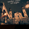
<<< eternalphoenix_ Last Icon Maker Standing >>>
your winning banner, hope you'll like it :D
all the amazing icons made by her:


Congratulations to everyone!
Oh, i feel like i need to say something very important to you, but i have no words.
So i'll just say huge thank you to all of you, who are here with me.
Thank you for your participation, for your votes and for your suppert. I love ya all :D
mariarita 13 votes
eternalphoenix_ 17 votes
bozhya_korovka 12 votes
Part 1:
#1: The texture/circles effect is really neat, great colours.
I love the composition of 1 - the colouring is a tad dark, but its still working for me
2] The coloring, and light texture really go well with the image. :]
2 - The pink coloring is very nice. Good cropping, light texture complements without overpowering.
2. The color is simple, yet pretty and the light textures are really nice
3, dark but not too textured dark, lights look harmonic to the rest of composition, good choice of words.
1 - coloring is just amazing! so bright and awesome colors.
1 - such juicy colors and that frame.. i don't know what it is, but it's awesome
03 - soft and beautiful coloration, good cropping and text use...
02 - very clear and neat icon, warm and pretty way of colouring. And this cropping is more perfect than the others. It looks like a postcard or a painting
03 - I like the crop. text is smartly and expertly placed, and oh, the light texture looks very neat.
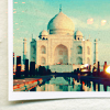
#1 - LOVE the originality of the icon! The coloring is also unique and the tower has been transformed into a magical one xD
02. Cropping is perfect, & the colors are subtle but bring a real interest.
#02: Colouring makes building look old and fairy-tale-like. Effects suit the image nicely.
Part #2:
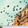
#02: Nice colour, and I like how the icon isn't focused on the building, but on the birds. Nice composition, and neat effects at bottom, but not enough to overwhelm the picture.
03. Contrast is great, & the light texture make it stand out, bringing an eerie feel to it.
#3 - Simple and elegant. The light texture doesn't overpower the image and the b&w-ness looks wonderful with the sort of "going way"/"release" theme of the image.
03 - I love the calm thoughtfulness of the icon. the light is perfectly placed and really fitting, the crop in this one is the work of art.
03 - perfect idea with a night and moon. It's really hard to make such sky effect (I mean clouds, different tints of grey). And of course, this light texture decorates the whole composition:)
03 - the back and white coloration makes the icon looks adorable, great light texture use and good cropping...
3 - light texture looks like bright moon and it's so cool..
3 - dark and amazing icon!
3, reminds me of Night Watch - book, (and movie poster in a way), nice rich black and grey tones, lights have a good position.
o3. I really love black and white with the light texture that looks like a moon, it's really pretty.
2 - Coloring is vivid without being overwhelming. Repeated image and textures add nicely without distracting.
1] The frame, b&w, and the tiny light texture really added to the image, and makes it so pretty.
I guess 1 is the best again - the border is really cool
#3: I like the light texture used and the colours, and the way it looks like the bird is flying off the icon.
Part #3:
#1: Clear, good image, great colours, great effect.
1, again, the picture is cropped very well :)
1] I love how the picture rolls up at the corner, and the coloring.
2 - The soft coloring caught my eye instantly. The overall composition gives it a very serene feeling.
o1. The coloring is so vibrant and gorgeous.
2, its has some sort of fragile beauty, a sly hint of sadness and void, lonliness of the earlier morning hours, its simple beatiful expression of icon to the viewer. Not so much effects had been used, but it doesn't make it worth.
3 - though icon is a bit dark, but colors are so amazing..
1 - great cropping and coloring
02 - wonderful coloration, the icon is simple but very eye catching.
01 - colouring is so warm and neat, good combination of cyan, yellow and light textures. The texture with a photo looks perfect on it. Nothing excess!:)
02 - soft, warm colors, and, well, probably the fact that the other two icons seem less in comparison. the atmosphere in this icon is perfectly captured.
#3 - The sheer coloring of the icon compelled me to vote for it. The darkness combines with the scene in the image creates a gorgeous mood. :)
02. The blurry, dreamy feel of the icon is simply great. It looks simple & fantastic.
#01: Icon is nicely balanced, with beautiful colouring. A classic image.
Poll Do you want Challenge #4?
Tie was most of the time, but now we finally have the results :)
Are you ready to see it? follow me then :)
<<< bozhya_korovka third place >>>
<<< mariarita the runner up >>>
<<< eternalphoenix_ Last Icon Maker Standing >>>
your winning banner, hope you'll like it :D
all the amazing icons made by her:
Congratulations to everyone!
Oh, i feel like i need to say something very important to you, but i have no words.
So i'll just say huge thank you to all of you, who are here with me.
Thank you for your participation, for your votes and for your suppert. I love ya all :D
mariarita 13 votes
eternalphoenix_ 17 votes
bozhya_korovka 12 votes
Part 1:
#1: The texture/circles effect is really neat, great colours.
I love the composition of 1 - the colouring is a tad dark, but its still working for me
2] The coloring, and light texture really go well with the image. :]
2 - The pink coloring is very nice. Good cropping, light texture complements without overpowering.
2. The color is simple, yet pretty and the light textures are really nice
3, dark but not too textured dark, lights look harmonic to the rest of composition, good choice of words.
1 - coloring is just amazing! so bright and awesome colors.
1 - such juicy colors and that frame.. i don't know what it is, but it's awesome
03 - soft and beautiful coloration, good cropping and text use...
02 - very clear and neat icon, warm and pretty way of colouring. And this cropping is more perfect than the others. It looks like a postcard or a painting
03 - I like the crop. text is smartly and expertly placed, and oh, the light texture looks very neat.
#1 - LOVE the originality of the icon! The coloring is also unique and the tower has been transformed into a magical one xD
02. Cropping is perfect, & the colors are subtle but bring a real interest.
#02: Colouring makes building look old and fairy-tale-like. Effects suit the image nicely.
Part #2:
#02: Nice colour, and I like how the icon isn't focused on the building, but on the birds. Nice composition, and neat effects at bottom, but not enough to overwhelm the picture.
03. Contrast is great, & the light texture make it stand out, bringing an eerie feel to it.
#3 - Simple and elegant. The light texture doesn't overpower the image and the b&w-ness looks wonderful with the sort of "going way"/"release" theme of the image.
03 - I love the calm thoughtfulness of the icon. the light is perfectly placed and really fitting, the crop in this one is the work of art.
03 - perfect idea with a night and moon. It's really hard to make such sky effect (I mean clouds, different tints of grey). And of course, this light texture decorates the whole composition:)
03 - the back and white coloration makes the icon looks adorable, great light texture use and good cropping...
3 - light texture looks like bright moon and it's so cool..
3 - dark and amazing icon!
3, reminds me of Night Watch - book, (and movie poster in a way), nice rich black and grey tones, lights have a good position.
o3. I really love black and white with the light texture that looks like a moon, it's really pretty.
2 - Coloring is vivid without being overwhelming. Repeated image and textures add nicely without distracting.
1] The frame, b&w, and the tiny light texture really added to the image, and makes it so pretty.
I guess 1 is the best again - the border is really cool
#3: I like the light texture used and the colours, and the way it looks like the bird is flying off the icon.
Part #3:
#1: Clear, good image, great colours, great effect.
1, again, the picture is cropped very well :)
1] I love how the picture rolls up at the corner, and the coloring.
2 - The soft coloring caught my eye instantly. The overall composition gives it a very serene feeling.
o1. The coloring is so vibrant and gorgeous.
2, its has some sort of fragile beauty, a sly hint of sadness and void, lonliness of the earlier morning hours, its simple beatiful expression of icon to the viewer. Not so much effects had been used, but it doesn't make it worth.
3 - though icon is a bit dark, but colors are so amazing..
1 - great cropping and coloring
02 - wonderful coloration, the icon is simple but very eye catching.
01 - colouring is so warm and neat, good combination of cyan, yellow and light textures. The texture with a photo looks perfect on it. Nothing excess!:)
02 - soft, warm colors, and, well, probably the fact that the other two icons seem less in comparison. the atmosphere in this icon is perfectly captured.
#3 - The sheer coloring of the icon compelled me to vote for it. The darkness combines with the scene in the image creates a gorgeous mood. :)
02. The blurry, dreamy feel of the icon is simply great. It looks simple & fantastic.
#01: Icon is nicely balanced, with beautiful colouring. A classic image.
Poll Do you want Challenge #4?