Challenge #2 - Round #13 - Madrid - Results
I'm really sorry, but we have to say good bye to this following participants.
Eliminated
with 9 negative votes
_virsaviya_
People's choice:
with 6 votes

eternalphoenix_
Mod's choice
eternalphoenix_
Voting Tally
If your icon number is not listed here, then it means that you have received no votes! Congratulations!
1.+1
2.+1+1-1=+1
3.+1+1+1+1+1+1+1=+6
4.-9
- = lesser quality vote(s)
+ = favorite icon vote(s)
Trivia
- 4/4 participants entered round #13
- 2 reminders
- 10 people voted
- 1 elimination + 1 people's choice + 1 mod's choice
Eliminate:
4. I don't really see that the colour would complement the picture, on the contrary, it makes it less distinguishable (sp?) in all its elements.
02: Not very fortunate cropping, because the top of tower was cut off, not enough space at the top, grainy texture makes icon a bit pixelarated.
04 - the icon is too dark and the blurred effect on the left mismatches
#4: where's the original image? totally disappearing underneath the texture, unfortunately
4 The icon is overtextured - I can hardly see the image, and the dark green/red colors do not match the snow.
04 reason- I don't know what it's supposed to be. The green is fine but the red seems really out of place, and the mask only made it harder to tell. The text box (I think that's what it's supposed to be?) seems really out of place.
04. I literally cannot tell what is going on in the picture. the coloring and the red splotches are very distracting.
4: too much texture usage, overshadows the subject of the icon
o4 -- I can't tell what the image is of and it's too green
#4: The coloring is too murky.
To keep:
#3: The b/w effect is done well and the light texture is lovely.
o1 -- great cropping and use of black and white
3: idk, there's just something about it, it has great composition and its simplicity works.
03. Its awesome how they desaturated the picture to make it seem like its full of void and lifeless. Very nice job icon maker.
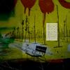
02 reason- I really enjoyed the adaption of the colors and the shorter crop allowing text on top.
2 Love the texture use, the soft coloring and that tiny text above the image :)
#3: text is appropriate..you can't guess the place! hehe however, text is also cute ad the little spot lights
03 - the text use is very nice and the b/w is well done with the lights
03. Interesting cropping, good use of textures and text.
3 - it's a work of art! The lightly coloured brushes were beautifully used on the black & white background, and the text shows also creativity!
Good luck to everyone in next round :) and it will be the final round of challenge #2 :P
Eliminated
with 9 negative votes
_virsaviya_
People's choice:
with 6 votes
eternalphoenix_
Mod's choice
eternalphoenix_
Voting Tally
If your icon number is not listed here, then it means that you have received no votes! Congratulations!
1.+1
2.+1+1-1=+1
3.+1+1+1+1+1+1+1=+6
4.-9
- = lesser quality vote(s)
+ = favorite icon vote(s)
Trivia
- 4/4 participants entered round #13
- 2 reminders
- 10 people voted
- 1 elimination + 1 people's choice + 1 mod's choice
Eliminate:
4. I don't really see that the colour would complement the picture, on the contrary, it makes it less distinguishable (sp?) in all its elements.
02: Not very fortunate cropping, because the top of tower was cut off, not enough space at the top, grainy texture makes icon a bit pixelarated.
04 - the icon is too dark and the blurred effect on the left mismatches
#4: where's the original image? totally disappearing underneath the texture, unfortunately
4 The icon is overtextured - I can hardly see the image, and the dark green/red colors do not match the snow.
04 reason- I don't know what it's supposed to be. The green is fine but the red seems really out of place, and the mask only made it harder to tell. The text box (I think that's what it's supposed to be?) seems really out of place.
04. I literally cannot tell what is going on in the picture. the coloring and the red splotches are very distracting.
4: too much texture usage, overshadows the subject of the icon
o4 -- I can't tell what the image is of and it's too green
#4: The coloring is too murky.
To keep:
#3: The b/w effect is done well and the light texture is lovely.
o1 -- great cropping and use of black and white
3: idk, there's just something about it, it has great composition and its simplicity works.
03. Its awesome how they desaturated the picture to make it seem like its full of void and lifeless. Very nice job icon maker.
02 reason- I really enjoyed the adaption of the colors and the shorter crop allowing text on top.
2 Love the texture use, the soft coloring and that tiny text above the image :)
#3: text is appropriate..you can't guess the place! hehe however, text is also cute ad the little spot lights
03 - the text use is very nice and the b/w is well done with the lights
03. Interesting cropping, good use of textures and text.
3 - it's a work of art! The lightly coloured brushes were beautifully used on the black & white background, and the text shows also creativity!
Good luck to everyone in next round :) and it will be the final round of challenge #2 :P