Challenge #7 - Round #5 - Toledo - results
I'm really sorry, but we have to say good bye to this following participants.
Eliminated:

by elena_vlc_15 with 4 votes
by nutmeg_05 with 4 votes
People's choice:
by purple_wings with 2 votes
Mod's choice:

by angrymobjustice
Voting Tally
If your icon number is not listed here, then it means that you have received no votes! Congratulations!
1.+1
2.-2
3.-1/+2=+1
5.-4
6.-1
7.-4
8.+3
- = lesser quality vote(s)
+ = favorite icon vote(s)
Trivia
- 8/12 participants entered round #5
- 3 reminders
- 7 people voted
- 2 eliminations + 1 people's choice + 1 mod's choice
Eliminate:
#5 - bad crop and coloring
#7 - don't like composition and how paper texture looks, upper image looks very blurry
7: composition could have been better assembled but mainly the city images are a bit blurry and coloring is unattractive
5: it looks just cropped and resized..I guess very little has been done to make the image attractive
3: The font is almost unreadable, the image is blurry and lacks of contrast.
6: The icon is oversaturated, the text is too large and distracting and the light texture is out of place.
#5 - coloring is too dull
#7 - these notebook and light textures don't match this icon
#7 - the picture texture is a bit overwhelming; everything looks jammed into the icon.
#2 - icon looks over-sharpened.
02. the icon is too orange/brown. it's hard to tell what the picture is actually of
05. it's a very strange crop, there is nothing interesting in it and it's dull coloring wise
To keep:
03. i love the rounded corners of the image and the text is nicely done
#1 - love the placement of the text; coloring is very original.
#3 - coloring and textures are awesome
8: Very lovely icon, I like the coloring and the use of textures.
8: the moon texture is lovely and coloring is not bad
#8 - lovely crop, coloring, pretty light texture :)
Good luck to everyone in next round.
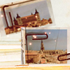
Eliminated:
by elena_vlc_15 with 4 votes
by nutmeg_05 with 4 votes
People's choice:
by purple_wings with 2 votes
Mod's choice:
by angrymobjustice
Voting Tally
If your icon number is not listed here, then it means that you have received no votes! Congratulations!
1.+1
2.-2
3.-1/+2=+1
5.-4
6.-1
7.-4
8.+3
- = lesser quality vote(s)
+ = favorite icon vote(s)
Trivia
- 8/12 participants entered round #5
- 3 reminders
- 7 people voted
- 2 eliminations + 1 people's choice + 1 mod's choice
Eliminate:
#5 - bad crop and coloring
#7 - don't like composition and how paper texture looks, upper image looks very blurry
7: composition could have been better assembled but mainly the city images are a bit blurry and coloring is unattractive
5: it looks just cropped and resized..I guess very little has been done to make the image attractive
3: The font is almost unreadable, the image is blurry and lacks of contrast.
6: The icon is oversaturated, the text is too large and distracting and the light texture is out of place.
#5 - coloring is too dull
#7 - these notebook and light textures don't match this icon
#7 - the picture texture is a bit overwhelming; everything looks jammed into the icon.
#2 - icon looks over-sharpened.
02. the icon is too orange/brown. it's hard to tell what the picture is actually of
05. it's a very strange crop, there is nothing interesting in it and it's dull coloring wise
To keep:
03. i love the rounded corners of the image and the text is nicely done
#1 - love the placement of the text; coloring is very original.
#3 - coloring and textures are awesome
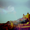
8: Very lovely icon, I like the coloring and the use of textures.
8: the moon texture is lovely and coloring is not bad
#8 - lovely crop, coloring, pretty light texture :)
Good luck to everyone in next round.