Challenge #7 - Round #4 - Dinard - Results
I'm really sorry, but we have to say good bye to this following participants.
Eliminated:

by innocent_lexys with 6 votes

by riekchen with 3 votes

by eternalphoenix_ with 3 votes
People's choice:
by ksi_liv with 2 votes
Mod's choice:

by mariarita with 2 votes
Voting Tally
If your icon number is not listed here, then it means that you have received no votes! Congratulations!
1.-1/+1=0
2.-2
3.-1
4.-6
5.-1/+1=0
6.-4/+1=-3
7.-3
8.-1/+3=+2
9.-1/+1=0
10.-2/+1=-1
11.-1/-1=0
- = lesser quality vote(s)
+ = favorite icon vote(s)
Trivia
- 11/18 participants entered round #4
- 3 reminders
- 8 people voted
- 3 eliminations + 1 people's choice + 1 mod's choice
Eliminate:
#6 - the dark purple on the left hand side is distracting; texture doesn't fit the icon.
#2 - icon looks over-sharpened; text is overpowering.
#4 - the large paper texture is over-powering; the light textures are all concentrated in one place making the icon look uneven.
4: texture and ornamental brush fill icon space without real purpose and draw attention away from the rest
5: coloring is opaque
6: purple texture on the left doesn't mingle with the rest
1 - The colouring is nice, but texture doesn't feet
4 - Too much stuff is going on the icon
7 - Cropping is really weird.. and icon is too green
#6 - oversharped and not the best cropping
#11 - the polaroid textures doesn't match
#4 - the paper texture doesn't match
#o2 - The crop doesn't really suit, it's too close, and also the text is really big and doesn't look good covering the statue.
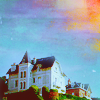
#o7 - Really beautiful sky, but the white blob on the house really distracts.
#11 - Use of light textures doesn't look good here, they look too contrasted and not placed very well.
8: The icon is oversaturated, I like the splash of orange in the corner, but the blue hues are unnaturally bright.
9: The sky texture doesn't match the original image, the light texture that covers the house seems distracting.
10: The light textures are out of place, they don't match the image at all, maybe if they were places above the house it would make some sense.
3 - icon looks too simple and too much green color
4 - too many effects, it's hard to understand what's on icon
6 - icon is too contrasting and look a bit bloory
04 - like the colouring but the textures were an unwise choice, they disrupt the picture.
07 - while I like the crop, the texture obscures the icon, it does not give a misty feel as the text (only noticed at second glance) suggests
10 - the colouring is off, the crop is unimaginative
To keep:
01 - colouring, crop, use of texture - all very well done.
8 - good coloring and cropping. Especially I like sky effects
6: I like the close original cropping, it completely changed the image. The coloring is gorgeous and the use of textures is amazing. Great job!
#o8 - Coloring is so beautiful, and the texture in the sky is placed very subtle and works great.
#9 - very nice coloring
5 - Good clear colors and cropping, good composition.
10: lovely coloring and the light texture on top makes the sky look brighter in that spot: nice effect
#8 - great crop, love the use of textures to enhance the sky
Good luck to everyone in next round.
Eliminated:
by innocent_lexys with 6 votes
by riekchen with 3 votes
by eternalphoenix_ with 3 votes
People's choice:
by ksi_liv with 2 votes
Mod's choice:
by mariarita with 2 votes
Voting Tally
If your icon number is not listed here, then it means that you have received no votes! Congratulations!
1.-1/+1=0
2.-2
3.-1
4.-6
5.-1/+1=0
6.-4/+1=-3
7.-3
8.-1/+3=+2
9.-1/+1=0
10.-2/+1=-1
11.-1/-1=0
- = lesser quality vote(s)
+ = favorite icon vote(s)
Trivia
- 11/18 participants entered round #4
- 3 reminders
- 8 people voted
- 3 eliminations + 1 people's choice + 1 mod's choice
Eliminate:
#6 - the dark purple on the left hand side is distracting; texture doesn't fit the icon.
#2 - icon looks over-sharpened; text is overpowering.
#4 - the large paper texture is over-powering; the light textures are all concentrated in one place making the icon look uneven.
4: texture and ornamental brush fill icon space without real purpose and draw attention away from the rest
5: coloring is opaque
6: purple texture on the left doesn't mingle with the rest
1 - The colouring is nice, but texture doesn't feet
4 - Too much stuff is going on the icon
7 - Cropping is really weird.. and icon is too green
#6 - oversharped and not the best cropping
#11 - the polaroid textures doesn't match
#4 - the paper texture doesn't match
#o2 - The crop doesn't really suit, it's too close, and also the text is really big and doesn't look good covering the statue.
#o7 - Really beautiful sky, but the white blob on the house really distracts.
#11 - Use of light textures doesn't look good here, they look too contrasted and not placed very well.
8: The icon is oversaturated, I like the splash of orange in the corner, but the blue hues are unnaturally bright.
9: The sky texture doesn't match the original image, the light texture that covers the house seems distracting.
10: The light textures are out of place, they don't match the image at all, maybe if they were places above the house it would make some sense.
3 - icon looks too simple and too much green color
4 - too many effects, it's hard to understand what's on icon
6 - icon is too contrasting and look a bit bloory
04 - like the colouring but the textures were an unwise choice, they disrupt the picture.
07 - while I like the crop, the texture obscures the icon, it does not give a misty feel as the text (only noticed at second glance) suggests
10 - the colouring is off, the crop is unimaginative
To keep:
01 - colouring, crop, use of texture - all very well done.
8 - good coloring and cropping. Especially I like sky effects
6: I like the close original cropping, it completely changed the image. The coloring is gorgeous and the use of textures is amazing. Great job!
#o8 - Coloring is so beautiful, and the texture in the sky is placed very subtle and works great.
#9 - very nice coloring
5 - Good clear colors and cropping, good composition.
10: lovely coloring and the light texture on top makes the sky look brighter in that spot: nice effect
#8 - great crop, love the use of textures to enhance the sky
Good luck to everyone in next round.