Challenge #7 - Round #3 - Lucerne - Results
I'm really sorry, but we have to say good bye to this following participants
Eliminated:

by heimedall with 9 votes

by summerxmist with 8 votes
People's choice:

by eternalphoenix_ with 4 votes
Mod's choice:
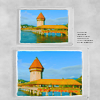
by allllure
Interesting idea with double image, good colouring
Voting Tally
If your icon number is not listed here, then it means that you have received no votes! Congratulations!
2. -1
3. -9
4. -3+2= -1
5. +3
6. -6
7. -4
8. -1+1= 0
9. -1+1= 0
10. -2
11. -8
12. -1+5= +4
- = lesser quality vote(s)
+ = favorite icon vote(s)
Trivia
- 12/26 participants entered round #3
- 3 reminders
- 12 people voted
- 2 elimination + 1 people's choice + 1 mod's choice
Eliminate:
02. the coloring is too orange and brown
3: The icon is blurry and that rectangular on the left seems poorly placed, it distracts attention, but doesn't add anything to the icon.
3- not good coloring
#003 - too dark colors, this green zone looks very strange and crop isn't good
#3 - icon looks over-saturated.
#o3 - The coloring is not so good, also the 'yellow'-stripe doesn't fit.
3: coloring is too red for the most part and that strip that gives a different coloring doesn't really make it better
03. the different color strip is strange and unattractive
003 - bad crop and coloring
3: icon is too fuzzy - the colouring might have worked if the image was sharper, but as it is it looks too overdone
4- i think the darkness around text don't match this icon
4: too dark, probably also because of the texture used
004: the icon looks too dark, the picture inside the circle should have been a little brighter
006: the picture looks too blurry and a little dark
6: The icon is lacking of contrast and it's too light, so the black border seems too heavy and overpowering.
6- don't like the using of paper texture
6: the icon is too dark with too little contrast
006 : washed out, colouring off, texture ... well, it looks like the ugly sister next to 007 (though it's better cropped than 007)
#6: Paperclip is unoriginal and the image is too dark to stand out
#7: paperclip is unoriginal, and the effects don't compliment the image
7: again the icon is a bit dark, and nothing really stands out
#007 - boring colors and use of textures
#o7 - I see a lot of texture-use but further it looks like there's not something special done with the coloring.
008 - looks like nothing was done to the image, it's too plain
9: I like the composition, but the pictures of Lucerne are too bright and oversaturated.
#10 - text is overpowering; icon looks over-sharpened.
010 : oversharpened and too much overlay, text sticks out too much - doesn't fit the icon
#011 - crop and coloring are boring, and this text isn't necessary
11: the writing is too bold and dots don't seem to go with the theme/feel of the icon as well as the rest in the batch
#11 - text is overpowering.
#11 - Beautiful crop and colors, but the text throws it all off, it's wrongly placed/too big.
011 : too sharp, text and texture are uninspired
11: text placement draws attention away from the rest
11. the text is too big and the decoration around it is too bold
011 - the text and dots around it look strange, it would look much better without them
012: the city looks too small and a little blurry, the top half of the icon looks too dark
To keep:
4: Not sure if I like the coloring, but the icon is very creative and the composition is perfect.
#4 because I love the coloring and the texture. It catches the eye and jumped out when I first saw the batch.
5 - love the simple, soft coloring
005 : colouring is good, crop is different from the rest, text is positioned nicely - a well-balanced icon
005 - lovely coloring and texture use
008 - the picture has vivid looking colours and fits well into the icon (not too big and not too small)
9: lovely composition and coloring
12 - good using of textures, love this coloring
#012 - great use of textures, crop
#12 - Great colors and fantastic texture-use.
12. wow. GORGEOUS icon. the coloring, the texture in the bottom right, the sky. it's beautiful.
#12: colouring is unique and playful, as is the cropping. The effects make it a sharper image and provide a lovely contrast. Well done!
Good luck to everyone in next round :)
Eliminated:
by heimedall with 9 votes
by summerxmist with 8 votes
People's choice:
by eternalphoenix_ with 4 votes
Mod's choice:
by allllure
Interesting idea with double image, good colouring
Voting Tally
If your icon number is not listed here, then it means that you have received no votes! Congratulations!
2. -1
3. -9
4. -3+2= -1
5. +3
6. -6
7. -4
8. -1+1= 0
9. -1+1= 0
10. -2
11. -8
12. -1+5= +4
- = lesser quality vote(s)
+ = favorite icon vote(s)
Trivia
- 12/26 participants entered round #3
- 3 reminders
- 12 people voted
- 2 elimination + 1 people's choice + 1 mod's choice
Eliminate:
02. the coloring is too orange and brown
3: The icon is blurry and that rectangular on the left seems poorly placed, it distracts attention, but doesn't add anything to the icon.
3- not good coloring
#003 - too dark colors, this green zone looks very strange and crop isn't good
#3 - icon looks over-saturated.
#o3 - The coloring is not so good, also the 'yellow'-stripe doesn't fit.
3: coloring is too red for the most part and that strip that gives a different coloring doesn't really make it better
03. the different color strip is strange and unattractive
003 - bad crop and coloring
3: icon is too fuzzy - the colouring might have worked if the image was sharper, but as it is it looks too overdone
4- i think the darkness around text don't match this icon
4: too dark, probably also because of the texture used
004: the icon looks too dark, the picture inside the circle should have been a little brighter
006: the picture looks too blurry and a little dark
6: The icon is lacking of contrast and it's too light, so the black border seems too heavy and overpowering.
6- don't like the using of paper texture
6: the icon is too dark with too little contrast
006 : washed out, colouring off, texture ... well, it looks like the ugly sister next to 007 (though it's better cropped than 007)
#6: Paperclip is unoriginal and the image is too dark to stand out
#7: paperclip is unoriginal, and the effects don't compliment the image
7: again the icon is a bit dark, and nothing really stands out
#007 - boring colors and use of textures
#o7 - I see a lot of texture-use but further it looks like there's not something special done with the coloring.
008 - looks like nothing was done to the image, it's too plain
9: I like the composition, but the pictures of Lucerne are too bright and oversaturated.
#10 - text is overpowering; icon looks over-sharpened.
010 : oversharpened and too much overlay, text sticks out too much - doesn't fit the icon
#011 - crop and coloring are boring, and this text isn't necessary
11: the writing is too bold and dots don't seem to go with the theme/feel of the icon as well as the rest in the batch
#11 - text is overpowering.
#11 - Beautiful crop and colors, but the text throws it all off, it's wrongly placed/too big.
011 : too sharp, text and texture are uninspired
11: text placement draws attention away from the rest
11. the text is too big and the decoration around it is too bold
011 - the text and dots around it look strange, it would look much better without them
012: the city looks too small and a little blurry, the top half of the icon looks too dark
To keep:
4: Not sure if I like the coloring, but the icon is very creative and the composition is perfect.
#4 because I love the coloring and the texture. It catches the eye and jumped out when I first saw the batch.
5 - love the simple, soft coloring
005 : colouring is good, crop is different from the rest, text is positioned nicely - a well-balanced icon
005 - lovely coloring and texture use
008 - the picture has vivid looking colours and fits well into the icon (not too big and not too small)
9: lovely composition and coloring
12 - good using of textures, love this coloring
#012 - great use of textures, crop
#12 - Great colors and fantastic texture-use.
12. wow. GORGEOUS icon. the coloring, the texture in the bottom right, the sky. it's beautiful.
#12: colouring is unique and playful, as is the cropping. The effects make it a sharper image and provide a lovely contrast. Well done!
Good luck to everyone in next round :)