Challenge #7 - Round #2 - Austin - Results
I'm really sorry, but we have to say good bye to this following participants.
Eliminated:

by interrogante < with 7 votes
by irati86 with 3 votes
People's choice:
by nutmeg_05 with 1 vote

by innocent_lexys with 1 vote

by marinameira with 1 vote
Mod's choice:

by mariarita
Voting Tally
If your icon number is not listed here, then it means that you have received no votes! Congratulations!
1.-1/+1=0
5.-7
7.-3/+1=-2
8.-1
9.-2
10.-3/+1=-2
11.+1
12.-2
13.-3
15.-1
16.-2/+1=-1
17.-2/+3=+1
18.+1
- = lesser quality vote(s)
+ = favorite icon vote(s)
Trivia
- 19/28 participants entered round #2
- 3 reminders
- 14 people voted
- 2 eliminations + 3 people's choice + 1 mod's choice
Eliminate:
5: coloring is a strange kind of blue
1: the paper texture doesn't fit in
7: coloring is a bit washed out
#09: text doesn't match image, & the effects don't do anything to highlight or beautify it
#13: colouring is off, and the image has been played with too much
#17: colouring is too whimsical for the image, and looks unrealistic against the boring greyscale
15: It's very plain.
19: The coloring could be more creative, as could the cropping.
05: It's a little to bright.The text is too dominating.
#5 - The coloring doesn't compliment the image and it is oversaturated, the text placement, font choice and size are off too.
#10 - On this icon the textures are overused and the colors are oversaturated and the font color is so pale I can only read the text if I concentrate hard.
#12 - The coloring is off, it makes the icon too dark and those light textures are rather distracting as well.
5 - too much blue; the bold text at the bottom makes the icon seem uneven
7 - photo looks washed out
10 - the blue coloring is overwhelming, almost makes the photo look over sharpened
05. the coloring is really strange and not attractive
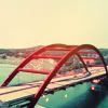
13. the coloring of the bridge is too red and the color of the sky looks unnatural
07. the coloring is a bit too light and the small text doesn't add anything to the icon
5: The icon is oversaturated to death. The colors clash, blue is overpowering and the text seems a bit blurry.
12: The icon is oversaturated and it could use some lightening, the trees and the alley are too dark.
17: The idea was interesting, but the icon is blurry and the blending with the sky wasn't done well. The light texture seems out of place.
#05: the colouring is off and the veil does not give an old photo-feeling but merely diffuses the subject of the pic (if that makes sense)
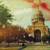
#08: the colouring is way off and the cupola almost disappears into the background.
#16: the colouring (in itself already a tad too much) and the texture contrast too much with the pic and the text. it imbalances the icon.
10: the texture in the bottom edges looks blurry, there's too much empty space and the writing is too small and hardly readable on the background
13: the top half of the icon looks empty
16: the icon looks too dark
To keep:
17 - the building is well placed in the icon and the colourful sky looks really fitting
#07: understated, elegant, subtle colouring, nice placement of text ... old-postcard-style done prettily
16: At first this icon didn't catch my eye, but when I looked closely I realized how beautiful it is. I love the dark green coloring and the texture use. The text fits well too.
17. i really like the coloring of the sky against the black and white
17 - I love how the building, which would usually be the primary focus of the icon, is desaturated, and instead, the sky behind it is alive with color. Very original.
#11 - I love the cropping and the coloring gives a warm mood to the icon, so does the texture. The text placement and font choice are good as well!
01. I love the use of text, and the coloring is beautiful.
#18: icon is clean and simple, with nice lines and compositions. The effects are very well-used
10: coloring and use of texture caught my eye eight away. I also love the simple but cute text
Good luck to everyone in next round.
Eliminated:
by interrogante < with 7 votes
by irati86 with 3 votes
People's choice:
by nutmeg_05 with 1 vote
by innocent_lexys with 1 vote
by marinameira with 1 vote
Mod's choice:
by mariarita
Voting Tally
If your icon number is not listed here, then it means that you have received no votes! Congratulations!
1.-1/+1=0
5.-7
7.-3/+1=-2
8.-1
9.-2
10.-3/+1=-2
11.+1
12.-2
13.-3
15.-1
16.-2/+1=-1
17.-2/+3=+1
18.+1
- = lesser quality vote(s)
+ = favorite icon vote(s)
Trivia
- 19/28 participants entered round #2
- 3 reminders
- 14 people voted
- 2 eliminations + 3 people's choice + 1 mod's choice
Eliminate:
5: coloring is a strange kind of blue
1: the paper texture doesn't fit in
7: coloring is a bit washed out
#09: text doesn't match image, & the effects don't do anything to highlight or beautify it
#13: colouring is off, and the image has been played with too much
#17: colouring is too whimsical for the image, and looks unrealistic against the boring greyscale
15: It's very plain.
19: The coloring could be more creative, as could the cropping.
05: It's a little to bright.The text is too dominating.
#5 - The coloring doesn't compliment the image and it is oversaturated, the text placement, font choice and size are off too.
#10 - On this icon the textures are overused and the colors are oversaturated and the font color is so pale I can only read the text if I concentrate hard.
#12 - The coloring is off, it makes the icon too dark and those light textures are rather distracting as well.
5 - too much blue; the bold text at the bottom makes the icon seem uneven
7 - photo looks washed out
10 - the blue coloring is overwhelming, almost makes the photo look over sharpened
05. the coloring is really strange and not attractive
13. the coloring of the bridge is too red and the color of the sky looks unnatural
07. the coloring is a bit too light and the small text doesn't add anything to the icon
5: The icon is oversaturated to death. The colors clash, blue is overpowering and the text seems a bit blurry.
12: The icon is oversaturated and it could use some lightening, the trees and the alley are too dark.
17: The idea was interesting, but the icon is blurry and the blending with the sky wasn't done well. The light texture seems out of place.
#05: the colouring is off and the veil does not give an old photo-feeling but merely diffuses the subject of the pic (if that makes sense)
#08: the colouring is way off and the cupola almost disappears into the background.
#16: the colouring (in itself already a tad too much) and the texture contrast too much with the pic and the text. it imbalances the icon.
10: the texture in the bottom edges looks blurry, there's too much empty space and the writing is too small and hardly readable on the background
13: the top half of the icon looks empty
16: the icon looks too dark
To keep:
17 - the building is well placed in the icon and the colourful sky looks really fitting
#07: understated, elegant, subtle colouring, nice placement of text ... old-postcard-style done prettily
16: At first this icon didn't catch my eye, but when I looked closely I realized how beautiful it is. I love the dark green coloring and the texture use. The text fits well too.
17. i really like the coloring of the sky against the black and white
17 - I love how the building, which would usually be the primary focus of the icon, is desaturated, and instead, the sky behind it is alive with color. Very original.
#11 - I love the cropping and the coloring gives a warm mood to the icon, so does the texture. The text placement and font choice are good as well!
01. I love the use of text, and the coloring is beautiful.
#18: icon is clean and simple, with nice lines and compositions. The effects are very well-used
10: coloring and use of texture caught my eye eight away. I also love the simple but cute text
Good luck to everyone in next round.