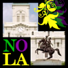
Challenge #7 - Round #1 - New Orleans - Results
I'm really sorry, but we have to say good bye to this following participants.
Eliminated:

by entropy_and_me with 8 votes

by viennarain with 7 votes

by addicted2draco with 5 votes
People's choice:

by mariarita with 2 votes
Mod's choice:

by sweetelfe
nice work with colors and text..
Voting Tally
If your icon number is not listed here, then it means that you have received no votes! Congratulations!
1.-3
2.-2
5.+1
6.+1
7.-1
9.+1
10.+2
11.-9/+1=-8
12.-5
13.-1
14.-2/+1=-1
15.-1/+1=0
17.-1
18.-1/+1=0
19.+1
20.-3/+1=-2
21.+1
22.-7
23.-3/+1=-2
24.-2
26.-1/+1=0
- = lesser quality vote(s)
+ = favorite icon vote(s)
Trivia
- 26/32 participants entered round #1
- 3 reminders
- 14 people voted
- 3 eliminations + 1 people's choice + 1 mod's choice
Eliminate:
#11 ~ The icon is unbalanced and the neon green and yellow does not compliment the icon either.
#20 ~ The textures does not compliment the image, and the coloring is off. I can barely see the boat, and if I recognise it its like its floating in mid-air.
#22 ~ The icon is too dark, the coloring is way off and the grainy texture is overused.
02: This icon seems a little too busy; color & b/w, looks like multiple brushes, and a texture marring the focus of the image.
23: Overall, the icon is just too grey-colored.
24: Too many things going on in this icon with cuts to the picture, patterns, text and brushes.
11. the text and color of it are not fitting to the icon at all
14. the icon is too blue and the text is not attractive when it's vertical like that
12. the separation between black and white is odd and there is too much going on
02-textures are awkwardly placed on the icon
23-too dark
26-too bright and washed-out
24. There's too many random textures that don't make sense with the image
15. Coloring is too pink, and the black brush looks awkward
11. Crop is awkward, and the text & brushes don't fit well with the image
#01 - i don't think the cropping is good, color are too contrasted, that's why the icon seems oversharped and untidy.
#12 - i didn't understand the idea of b/w part, bad croppping, text doesn't match the pic.
#22 - green coloring on this icon looks awful, also that 'noise' doesn't beautify the icon as well.
23- It's very dark.
12- It just looks a little chaotic.
11- Too many colors for my taste.
7: coloring underneath the texture would've been nice but the texture made the icon too dark and grainy
11: unsuccessful composition because colors, text, brush and images placement don't match
22: texture is overpowering
#11: Icon is disjointed and unelegant. The colours and placing of images don't match.
#22: Image is too grainy; it looks like someone's misused or overused a texture, and the result just isn't pleasant to look at.
#20: Object has no background to balance itself against; there's no relevance, nothing to signify the city, and seeing a lone boat is boring.
11: The images are blurry and it seems that nothing was done to them except for cropping. The bright yellow text and the leaves are too overpowering and it was difficult to guess what does "NO LA" mean.
12: The icon is too busy: b/w and colorful parts of the image, various textures and text, the composition is unbalanced. Also, the right part of the icon (especially the lamp post) seems blurry.
18: The icon is way too oversaturated, the castle is a bit blurry and the scratchy texture is out of place.
17 - the icon looks too dark
20 - you can hardly make out what's on this icon, there's too much colour around the boat
22 - the icon looks too gray and too grainy
#01: way oversharpened
#22: it seems like it's way oversharpened.
#13: too pale. which makes the icon seems to be a bit washed out.
#11 - crop seems a bit off; text & brush colors clash with the black
#14 - the blue coloring is overwhelming; it washes out the picture
#1 - dark and over-sharpened
11 - icon is blurry and text doesn't match at all..
12 - icon is blurry, brush work isn't pleasant, text is distracting
22 - icon is oversharped and too noisy cuz of the texture
To keep:
10 - great use of coloring and textures
#23 - the coloring of this icon reminds me of an old photo, like something I'd find while digging through stuff in the attic or something. it's dark enough to look weathered but clear enough to make out what's in it.
#05: the coloring is just beautiful and the text fits very well!
15 - good composition of the sunset behind the castle and the black symbol at the top right
21: The coloring is beautiful! I also like that the icon is so crisp. The light texture is a nice touch. The text use is amazing, it's small, and yet I can read "happily ever"... Great job!
26: Interesting colouring, and seeing the peaceful scene against chaotic is powerful and poignant. Just a nice composition and nice use of lighting.
19: lovely coloring: it's simple but good
20. I love the simplicity and dreamy colors.
#06 - very good job with crop and colors, tiny-text completes great composotion
18. Very pretty coloring, crop, and good texture use
11-good composition and interesting use of text and brushes
09. simple and pretty, the coloring is well done
14: A unique brightening of colors and use of text; very cheerful.
#10 ~ I like its coloring and texture use, its very eye-pleasing. The light texture fits well as well.
Good luck to everyone in next round.
Eliminated:
by entropy_and_me with 8 votes
by viennarain with 7 votes

by addicted2draco with 5 votes
People's choice:

by mariarita with 2 votes
Mod's choice:
by sweetelfe
nice work with colors and text..
Voting Tally
If your icon number is not listed here, then it means that you have received no votes! Congratulations!
1.-3
2.-2
5.+1
6.+1
7.-1
9.+1
10.+2
11.-9/+1=-8
12.-5
13.-1
14.-2/+1=-1
15.-1/+1=0
17.-1
18.-1/+1=0
19.+1
20.-3/+1=-2
21.+1
22.-7
23.-3/+1=-2
24.-2
26.-1/+1=0
- = lesser quality vote(s)
+ = favorite icon vote(s)
Trivia
- 26/32 participants entered round #1
- 3 reminders
- 14 people voted
- 3 eliminations + 1 people's choice + 1 mod's choice
Eliminate:
#11 ~ The icon is unbalanced and the neon green and yellow does not compliment the icon either.
#20 ~ The textures does not compliment the image, and the coloring is off. I can barely see the boat, and if I recognise it its like its floating in mid-air.
#22 ~ The icon is too dark, the coloring is way off and the grainy texture is overused.
02: This icon seems a little too busy; color & b/w, looks like multiple brushes, and a texture marring the focus of the image.
23: Overall, the icon is just too grey-colored.
24: Too many things going on in this icon with cuts to the picture, patterns, text and brushes.
11. the text and color of it are not fitting to the icon at all
14. the icon is too blue and the text is not attractive when it's vertical like that
12. the separation between black and white is odd and there is too much going on
02-textures are awkwardly placed on the icon
23-too dark
26-too bright and washed-out
24. There's too many random textures that don't make sense with the image
15. Coloring is too pink, and the black brush looks awkward
11. Crop is awkward, and the text & brushes don't fit well with the image
#01 - i don't think the cropping is good, color are too contrasted, that's why the icon seems oversharped and untidy.
#12 - i didn't understand the idea of b/w part, bad croppping, text doesn't match the pic.
#22 - green coloring on this icon looks awful, also that 'noise' doesn't beautify the icon as well.
23- It's very dark.
12- It just looks a little chaotic.
11- Too many colors for my taste.
7: coloring underneath the texture would've been nice but the texture made the icon too dark and grainy
11: unsuccessful composition because colors, text, brush and images placement don't match
22: texture is overpowering
#11: Icon is disjointed and unelegant. The colours and placing of images don't match.
#22: Image is too grainy; it looks like someone's misused or overused a texture, and the result just isn't pleasant to look at.
#20: Object has no background to balance itself against; there's no relevance, nothing to signify the city, and seeing a lone boat is boring.
11: The images are blurry and it seems that nothing was done to them except for cropping. The bright yellow text and the leaves are too overpowering and it was difficult to guess what does "NO LA" mean.
12: The icon is too busy: b/w and colorful parts of the image, various textures and text, the composition is unbalanced. Also, the right part of the icon (especially the lamp post) seems blurry.
18: The icon is way too oversaturated, the castle is a bit blurry and the scratchy texture is out of place.
17 - the icon looks too dark
20 - you can hardly make out what's on this icon, there's too much colour around the boat
22 - the icon looks too gray and too grainy
#01: way oversharpened
#22: it seems like it's way oversharpened.
#13: too pale. which makes the icon seems to be a bit washed out.
#11 - crop seems a bit off; text & brush colors clash with the black
#14 - the blue coloring is overwhelming; it washes out the picture
#1 - dark and over-sharpened
11 - icon is blurry and text doesn't match at all..
12 - icon is blurry, brush work isn't pleasant, text is distracting
22 - icon is oversharped and too noisy cuz of the texture
To keep:
10 - great use of coloring and textures
#23 - the coloring of this icon reminds me of an old photo, like something I'd find while digging through stuff in the attic or something. it's dark enough to look weathered but clear enough to make out what's in it.
#05: the coloring is just beautiful and the text fits very well!
15 - good composition of the sunset behind the castle and the black symbol at the top right
21: The coloring is beautiful! I also like that the icon is so crisp. The light texture is a nice touch. The text use is amazing, it's small, and yet I can read "happily ever"... Great job!
26: Interesting colouring, and seeing the peaceful scene against chaotic is powerful and poignant. Just a nice composition and nice use of lighting.
19: lovely coloring: it's simple but good
20. I love the simplicity and dreamy colors.
#06 - very good job with crop and colors, tiny-text completes great composotion
18. Very pretty coloring, crop, and good texture use
11-good composition and interesting use of text and brushes
09. simple and pretty, the coloring is well done
14: A unique brightening of colors and use of text; very cheerful.
#10 ~ I like its coloring and texture use, its very eye-pleasing. The light texture fits well as well.
Good luck to everyone in next round.