Challenge #6 - Round #10 - Turin - Results
I'm really sorry, but we have to say good bye to this following participants.
Eliminated:

by irati86 with 2 votes
People's choice:
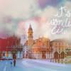
by lihana with 3 votes
Voting Tally
If your icon number is not listed here, then it means that you have received no votes! Congratulations!
1.-1/+1=0
2.-3/+1=-2
3.-2/+1=-1
4.+3
- = lesser quality vote(s)
+ = favorite icon vote(s)
Trivia
- 4/4 participants entered round #10
- 2 reminders
- 6 people voted
- 1 eliminations + 1 people's choice + 0 mod's choice
Eliminate:
1 - because its not very colorful and the text is too big - also the font is not a great choice
2 - the icon is half blue, half red... weird coloring...
#02 - Icon is too plain, coloring doesn't stand out
02 - the coloring is very plain, nothing really stands out.
3. the icon is a little sharp and the text isn't very attractive
03 - nice coloring and crop but it could be better without this text
To keep:
01 - very dark and simple coloring, crop isn't good
2. beautiful coloring. simple, yet pretty!
3 - I really love the coloring!!!
04 - the use of textures and brushes is very nice and the whole icon just looks very pretty.
#04 - Lovely coloring ad use of textures
4 the best because the cropping, along with the textures and coloring used were all gorgeous together, plus the text looks very nice with it.
Good luck to everyone in next round, cuz it's the last one.
Eliminated:
by irati86 with 2 votes
People's choice:
by lihana with 3 votes
Voting Tally
If your icon number is not listed here, then it means that you have received no votes! Congratulations!
1.-1/+1=0
2.-3/+1=-2
3.-2/+1=-1
4.+3
- = lesser quality vote(s)
+ = favorite icon vote(s)
Trivia
- 4/4 participants entered round #10
- 2 reminders
- 6 people voted
- 1 eliminations + 1 people's choice + 0 mod's choice
Eliminate:
1 - because its not very colorful and the text is too big - also the font is not a great choice
2 - the icon is half blue, half red... weird coloring...
#02 - Icon is too plain, coloring doesn't stand out
02 - the coloring is very plain, nothing really stands out.
3. the icon is a little sharp and the text isn't very attractive
03 - nice coloring and crop but it could be better without this text
To keep:
01 - very dark and simple coloring, crop isn't good
2. beautiful coloring. simple, yet pretty!
3 - I really love the coloring!!!
04 - the use of textures and brushes is very nice and the whole icon just looks very pretty.
#04 - Lovely coloring ad use of textures
4 the best because the cropping, along with the textures and coloring used were all gorgeous together, plus the text looks very nice with it.
Good luck to everyone in next round, cuz it's the last one.