Challenge #6 - Round #7 - Palermo - Results
I'm really sorry, but we have to say good bye to this following participants.
Eliminated:
by carmineador with 6 votes
People's choice:
by lihana with 3 votes
Mod's choice:

by rebelstrike21
i really love the colors!
Voting Tally
If your icon number is not listed here, then it means that you have received no votes! Congratulations!
1.-1
2.-2/+1=-1
3.-3
4.+1
5.-6
6.+1
7.-2/+1=-1
8.+3
- = lesser quality vote(s)
+ = favorite icon vote(s)
Trivia
- 8/9 participants entered round #7
- 3 reminders
- 7 people voted
- 1 eliminations + 1 people's choice + 1 mod's choice
Eliminate:
#02 - The icon looks too dark
#o5 - The pink light brush doesn't match the icon
#2 - Too dark coloring and the cropping is weird.
#5 - The red texture and the white over the icon don't fit.
#o3 - Crop doesn't work, it's too close. and text doesn't fit in.
#o5 - Coloring is nice but a little dark which makes the pink dot look too overwhelming.
05 - too pink and with this blur icon looks repellent
07 - too sharp and red
#01 - Coloring looks too green-ish, font choice and text placement aren't the best
#03 - Cropping isn't winning, the text isn't placed well and distracts a little from the actual picture
05. the light texture is too bright and not attractive
03. the coloring is too dark and the text isn't attractive
05 - blob doesn't fit this icon and scratch texture is excess too
07 - icon looks a little bit oversharpened and light balls are excess
To keep:
08 - beautiful colors and lights use
08. the coloring and decoration is really pretty.
#04 - Nice coloring and composition, appropriate use of textures
02 - nice coloring and crop
#o6 - Beautiful coloring, it looks a lot like a painting!
#8 - great compsition, I love textures in this one...
o7 - the coloring is perfect!!!
Good luck to everyone in next round.
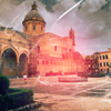
Eliminated:
by carmineador with 6 votes
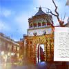
People's choice:
by lihana with 3 votes
Mod's choice:
by rebelstrike21
i really love the colors!
Voting Tally
If your icon number is not listed here, then it means that you have received no votes! Congratulations!
1.-1
2.-2/+1=-1
3.-3
4.+1
5.-6
6.+1
7.-2/+1=-1
8.+3
- = lesser quality vote(s)
+ = favorite icon vote(s)
Trivia
- 8/9 participants entered round #7
- 3 reminders
- 7 people voted
- 1 eliminations + 1 people's choice + 1 mod's choice
Eliminate:
#02 - The icon looks too dark
#o5 - The pink light brush doesn't match the icon
#2 - Too dark coloring and the cropping is weird.
#5 - The red texture and the white over the icon don't fit.
#o3 - Crop doesn't work, it's too close. and text doesn't fit in.
#o5 - Coloring is nice but a little dark which makes the pink dot look too overwhelming.
05 - too pink and with this blur icon looks repellent
07 - too sharp and red
#01 - Coloring looks too green-ish, font choice and text placement aren't the best
#03 - Cropping isn't winning, the text isn't placed well and distracts a little from the actual picture
05. the light texture is too bright and not attractive
03. the coloring is too dark and the text isn't attractive
05 - blob doesn't fit this icon and scratch texture is excess too
07 - icon looks a little bit oversharpened and light balls are excess
To keep:
08 - beautiful colors and lights use
08. the coloring and decoration is really pretty.
#04 - Nice coloring and composition, appropriate use of textures
02 - nice coloring and crop
#o6 - Beautiful coloring, it looks a lot like a painting!
#8 - great compsition, I love textures in this one...
o7 - the coloring is perfect!!!
Good luck to everyone in next round.