Daylight Coloring Tutorial
go from A to B
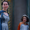
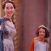
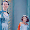
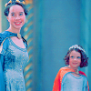
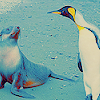
A.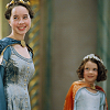
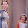
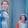
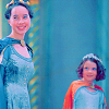
B.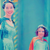
DAYLIGHT TUTORIAL
As with most tuts, you can totally improvise on this coloring. If you see some way to short you path to the end result, or if you'd like to use different colors for the saturation, etc, feel free. Experimentation is fun, whee! Anyhow, here's the image I started with:
Then I added a soft light colorfill layer set to 100% in dark blue: #253570
Repeat the previous step, but with gold: #D7A348
Once more, repeat, but this time with this shade of purple: #B677BC
Last colorfill layer! Same type, new color (light blue): #B9D5DD
Here I added a color balance layer with the following settings at 100%:
SHADOWS: +20, 0, +10
MIDTONES: -20, +15, +20
Here's the first of a few selective coloring layers, this one set at 100%.
REDS: -100, 0, 0, 0
NEUTRALS: +20, -10, 0, 0
Selective coloring #2 - set to 50%...
REDS: -100, 0, +100, 0
NEUTRALS: +75, +20, -30, -30
This layer is Hue/Saturation.
MASTER: 0, +20, 0
Here's the second and last Hue/Saturation layer. (This can be combined with the previous layer to save a step. If you've already done the previous layer, you can edit it to have a higher saturation - probably around 0, +50, 0 or so.)
MASTER: 0, +35, 0
Selective coloring #3 - set to 100%...
REDS: 0, 0, -30, 0
WHITES: 0, 0, -100, 0
NEUTRALS: 0, 0, -5, 0

Selective coloring #4 - set to 100%...
NEUTRALS: +50, -10, 0, 0
Exclusion layer at 50%, with dark blue: #050C2F
I have a lime green texture I use that was set to 30% saturation here. You can get a similar effect using a fill layer on 30% saturation: #93CB44
This step is similar to the last - I use a tan or yellowed paper colored texture set to DARKEN at 70%, but you can get the same effect with the same settings using a fill layer with this color: #C5BF9B
And this is a basic curves layer used to brighten - but you could duplicate the base image and set to screen at whatever degree suits you, probably %20-%50
And you're done! Like I said, you can nix a few of the layers if things are getting to ultraviolet for you - I know the colors are flashy. Feel free to tone down some of the percentages, too.
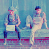
Here are some other icons colored using this technique:

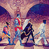

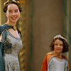
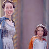
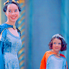
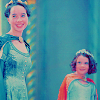
A.
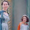
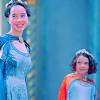
B.
DAYLIGHT TUTORIAL
As with most tuts, you can totally improvise on this coloring. If you see some way to short you path to the end result, or if you'd like to use different colors for the saturation, etc, feel free. Experimentation is fun, whee! Anyhow, here's the image I started with:
Then I added a soft light colorfill layer set to 100% in dark blue: #253570
Repeat the previous step, but with gold: #D7A348
Once more, repeat, but this time with this shade of purple: #B677BC
Last colorfill layer! Same type, new color (light blue): #B9D5DD
Here I added a color balance layer with the following settings at 100%:
SHADOWS: +20, 0, +10
MIDTONES: -20, +15, +20
Here's the first of a few selective coloring layers, this one set at 100%.
REDS: -100, 0, 0, 0
NEUTRALS: +20, -10, 0, 0
Selective coloring #2 - set to 50%...
REDS: -100, 0, +100, 0
NEUTRALS: +75, +20, -30, -30
This layer is Hue/Saturation.
MASTER: 0, +20, 0
Here's the second and last Hue/Saturation layer. (This can be combined with the previous layer to save a step. If you've already done the previous layer, you can edit it to have a higher saturation - probably around 0, +50, 0 or so.)
MASTER: 0, +35, 0
Selective coloring #3 - set to 100%...
REDS: 0, 0, -30, 0
WHITES: 0, 0, -100, 0
NEUTRALS: 0, 0, -5, 0
Selective coloring #4 - set to 100%...
NEUTRALS: +50, -10, 0, 0
Exclusion layer at 50%, with dark blue: #050C2F
I have a lime green texture I use that was set to 30% saturation here. You can get a similar effect using a fill layer on 30% saturation: #93CB44
This step is similar to the last - I use a tan or yellowed paper colored texture set to DARKEN at 70%, but you can get the same effect with the same settings using a fill layer with this color: #C5BF9B
And this is a basic curves layer used to brighten - but you could duplicate the base image and set to screen at whatever degree suits you, probably %20-%50
And you're done! Like I said, you can nix a few of the layers if things are getting to ultraviolet for you - I know the colors are flashy. Feel free to tone down some of the percentages, too.
Here are some other icons colored using this technique: