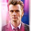
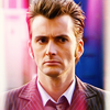
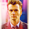
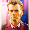
Icon Tutorials ;)
I had a few icon tutorial requests AND I am part of the wonderful landofart
AND one of the current challenges is to create tutorials
.... this is why I am doing tutorials again ^^
okay I am not good at explaining what I do so aks if you have any questions!!!
sgafirenity pointed out that in my last tutorial
I did not use enought pics so I'll try to do it better here ♥
and before I start I really have to clearify! I don't know what I am doing XD
I often just try things out and somehow it looks nice.
that's why I sometimes can't explain a step's purpose ;)
and of course if you use this tutorials you might have to change it a little for different pics !
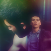
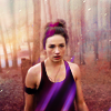
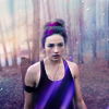
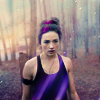
first up:
Okay: I learned in the past few weeks that it's always better to work with a 200x200 base and resize when you're done... I do this now and I did it with this icons but I am recreating this from my psd. so I'm gonna use the 100x100 pics for the tutorial ;)
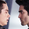
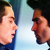
SO of course we start with the base.
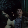
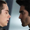
both screencaps from heart fixation
the first one

now I cropped it and resized it to 200x200 pixel.
(again, all the pictures are in 100x100 because I took all of them from the psd. I saved ;)

then I added vibrance: vibrance +5 / saturation +25
I know this step does not change much but it brings out the next one a litte ^^
now (midtone) colour balance CR +17 / MG 0 / YB 0
both of the previous steps just to make Derek look good next to Stiles ^^
and most of all not so blue-ish XD
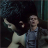
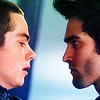
next we add Stiles :D

we only use Stiles of this one and of course we will have to resize it so it fits
I always like to create a group for the pic I am blending in and add a layer mask to the group
(especially if the caps are from different scenes!)
since the base is pretty dark I put the group on "lighten". I like to think it looks better.
I also duplicated the cap and set the second one to screen 20%
and well, now we have Stiles without a body ^^
that's no big deal I just created a layer under the group and painted it black
just under the missing parts of Stiles body ^^
you can always change between hiding and showing the layer so you see the parts that need to be coloured!
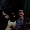
let's say the base is pretty much done
now we add curves to lighten it up a little :)
the cap is really to dark if we want it to have vibrant colouring afterwards
RGB output 54 / input 38
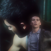
next step: merge all the layers ;)
(I mostly copy all the layers and merge them.
it's easier to recreate or undo a step
duplicate the merged layer, set it to soft light 100% and add an adjustment:
image > adjustments > variations... more red
duplicate the original merged layer set it to screen 100% (depends on how bright your pic is)
use filter > blur > gaussian blur radius 2,0 px
this filter is what makes the pic look so shiny ^^
I like merging a lot so I merged all layers again ^^
time for textures :D I added this texture:
by lessrest
set it to lighten 40%
whoop now it's getting colourful ♥
we add another curve with 2 points
first: output 86 / input 71
second: output 199 / input 182
then another vibrance: vibrance 100 / saturation 0
to bring out the colours a little more :)
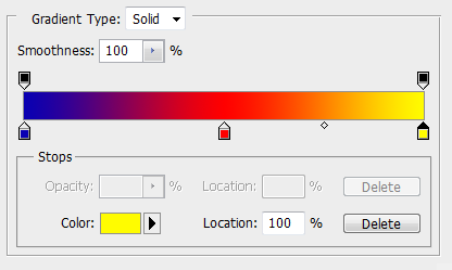
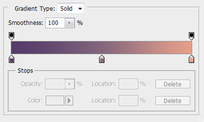
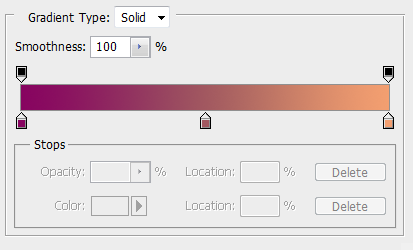
next up: gradient fill set to soft light 100%
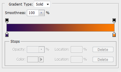
we use a purple coloured gradient fill with 4 stops
(I found this in a tutorial so the credit goes to someone else but I can't find it anymore :(
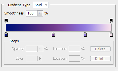
one: #001179 at 0%
two: #6f3b8d at 45%
three: #937cdd at 75%
four: #f7e1ec at 100%
this is when I added a second (midtone) colour balance
CR -15 / MG -10 / YB -40
then I added an selective colour adjustment layer
(just writing down what I've changed ^^)
reds yellow -27
yellows magenta +7 / yellow +47
neutrals yellow +19
next is a colour fill #fdfdd9 set to colour burn 100%
colour burn is always nice to use on vibrant icons :D
another (midtone) colour balance
CR +12 / MG +6 / YB +20

now a pretty intense vibrance: vibrance 100 / saturation 20
and now we have the colours we wanted ♥
this is the point where I merged all the layers again ;)
now this step won't be possible for everyone because I used "topaz labs > topaz clean > crispstyle"
but I guess a filter > sharpen > smart sharpen with an amount around 50 would do aswell
..
so last step before we will add the text... I thought Stiles' face was to dark/redish if you compare it to the rest of the image
so I used a cruve layer: output 38 / input 28
used a layer mask to erease all the parts around his face
RESIZE IT to 100x100 px since we're doing icons here ;)
OKAY last but not least the text ♥
fonts used: Yesterday Again for "deer & love" / Young for the rest
the whole text is in #e1d6da, everything written in Young is in small caps
a little tip here... I always create the text so it fits together and then resize it so it fits the icon
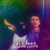
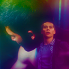
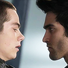
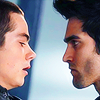
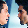
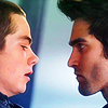
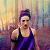
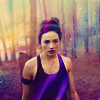
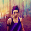
final result:

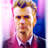
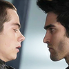
the second tutorial is for this icon:
this second tutorial is easier and faster because we don't have to make 2 pics look good together ^^
also we don't change that much.
the colours stay pretty much the same we just bring them out more :D
we just use one cap I found on fanpop

I did a pretty easy center crop here
but I guess it would look just as good with negative space icons ;)
duplicated the base twice, set the first one to screen 100%
& the second to soft light 50%
after that I just merged all the layers :)
add this texture.
(unfortunately I can't remember who did this one so if you do let me know please ♥)
set it to screen 100%
depending on the image you might have to erase a few parts of the texture.
in this case it just fitted perfectly :)
now all that's left is the colouring.
like I said there is not much to do for us since te texture adds that lovely pink
first I added a colour fill layer #eedb74
i set it to multiply 10%
it just adds a yellow touch to the whites in the icon

oh and we need one merged layer set to soft light 50%
so the doctor looks a little less pale ;)
now we go for a selective colour layer
reds cyan -50 / yellow +30
yellows cyan -72 / magenta -76 / yellow +77 / black +70
neutrals cyan -10 / magenta -10 / yellow +6
blacks cyan -18 / magenta +10 / yellow -23 / black +6
I know it will look pretty yellow after that step but we'll get to it ;)
add a simple black/white gradient fill set to soft light 65%
time for colour balance :)
shadows CR -15 / MG -6 / YB +13
midtones CR +34/ MG +24 / YB +34
now we have a more intense blue in the background
aaand a not so pain in the eye yellow XD
add another selective colour layer
reds yellow -20
yellows cyan -30 / yellow +30
magentasmagenta +4
blacks cyan +30 / magenta -10 / yellow -10
now we use a highlights colour balance :)
shadows CR -20 / MG -20 / YB +20
and see all the yellow is back to normal :)
brighness/contrast is up next contrast +10
and last step a curve layer:
RGB output 112 / input 102
tadaaa :P
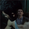
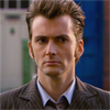
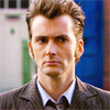
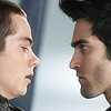
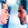
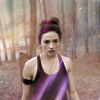
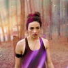
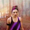
this third tutorial is for this icon
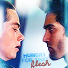
thank you home of the nutty for the lovely cap I am going to use for this icon :D
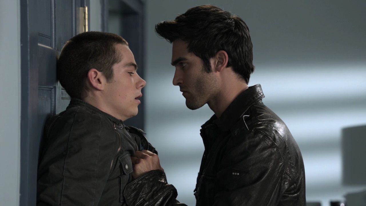
looking at the cap I can't believe I got this icon out of it XD
well first we crop it again.
like you see I cropped it right before the ears of the guys.
like always 200x200.
makes the work easier and the quality better ;)
like you see the base is VERY dark
I don't like dark bases ^^
so we lighten it up a little.
copy the base set it to screen 100%
add a filter > blur > surface blur 2,0
like you see now the guys look pretty pale ^^
that's why I copied the base again and set it to soft light 70%
looks better now doesn't it?
now merge the 3 layers and add a filter.
I used "topaz labs" but if you don't have that just go for
filter > sharpen > smart sharpen

still the base looks a little dark so I copied the merged base
(not the sharpened one, the one before that)
set it to screen 40%
ookay , let's see.
Derek's face is way darker than Stiles' face
so I duplicated the base again and masked away all parts besides Derek's face.
then I added just a little bit more light.
I added a curve layer
RGB output 107 / input 84
but I masked away Stiles' face since his face is already pretty light ;)
next I used a gradient map layer with 2stops.
0% #290a59 & 100% #ee85bc
another curve layer
RGB output 134 / input 111
now we use our first selective colour layer
reds magenta +37 / yellow +100
yellows cyan -100 / yellow +8
next up is a (midtone) colour balance layer
CR 0 / MG 0 / YB +7

the next step is to bring out the beautiful colours we already have in this icon:
add a hue/saturation layer: saturation +37
this step now if mostly for the background :)
add another selective colour layer
cyans cyan +100 / magenta -47 / yellow +100

and now another curve.
this time to make the pink touch go away a little ^^
RED output 87 / input 130
GREEN output 121 / input 128
BLUE output 109 / input 116
one more curve, the last one I promise ♥
RED output 95 / input 113
now I added a gradient fill.
it's one of the basic gradients you have when you install PS
it has 3 steps:
one: #0a00b2 at 0%
two: #ff0000at 50%
three: #fffc00 at 100%
the colour is lovely isn't it ?
the next step was actually my last but it belongs here ^^
last I added a screened texture and it got to light.
so I duplicated the base. put it above all the colouring adjustments
set to soft light 50%
colour balance please. just midtones again
CR -17 / MG 0 / YB +15
time for merging XD
I merged all the layers. copied it and added a "topaz labs" filter
but you go ahead and use smart sharpen just the right amount to bring out the eyes a little
after all the steps we've done Stiles's face is still way brighter.
so copy the merged (new) base and set it so screen 50%
don't forget to mask away Stiles ^^
2 steps left before we add the text.
in this one we add a texture (which, of course, I don't know who made it) :(
set it to screen 100%
add a 2 stop gradient fill layer.
one: #290a59 at 0%
two: #ff7c00 at 100%

so. we. are. done!
oh wait, the text XD
fonts I used: "tahoma" (what you should have on your computer if you use windows) for "hungry for that"
and "the only exception" for "flesh"
I wrote the first 3 words in small caps. and used #0f2e80 as the colour
BUT I did not add a normal text. it looks like that because I set it to soft light
I duplicated "hungry" 3 times so a total of 300% soft light
and "for that" twice but the second with only 70% making a total of 170% soft light
does that make sense?
"flesh" was written in #963737. I set it to 70% opacity and duplicated it ^^
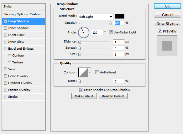
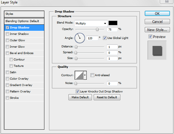
oh and I also added a shadow:
and. DONE. :D
okay another requested tutorial
another site for screencaps XD
I got this next cap at Grande Caps. thanks ♥

like always the first step is the cropping :D
if I don't like the base's colours so much I always add an adjustment
(first of course I duplicated the base)
image > adjustments > variations... more red
I left it normal but I set it to 70% opacity

copy the base again. and once more we add a colour adjustment
image > adjustments > variations... more yellow
I left it normal just like the first one but I set it to 40% opacity
one more base copy
this time set to screen 50%
for this icon we will be using 3 textures.
the first one by burnedbreads
set it to lighten 100%
looks great right? :D
texture number two again by burnedbreads
set it to screen 100%
whoop and the third texture already.
don't know who made it (sorry again) :(
this one is set to lighten 30%
now it looks like this.
first step of the colouring (besides the adjusted bases)
hue/saturation: saturation +42
now we use a gradient fill layer. a basic black/white one
set to soft light 100%
now add a gradient map. set it to soft light 100%
one: #563a6b at 0%
two: #85667c at 50%
three: #e59f8a at 100%
that makes it look like this:
now, colour fill #2da6fb
I set it to 80% soft light
another colour fill.
this time #fbcb37 set to multiply 20% fill
it's selective colour time :)
reds cyan -12 / yellow -11
neutrals magenta +1 / yellow +5

it's selective colour time again XD
reds yellow -19
yellows yellow +100

we have some awesome colour in here already but we're gonna use some vibrant adjustment
vibrance +100
another gradient map was added here
one: #870460 at 0%
two: #a25860 at 50%
three: #f39f70 at 100%

and third selective colour time xD
blacks cyan -2 / magenta +8 / yellow -6 / black -9
aaaaaand the fourth selective colour time XXXXXXDDDD
cyans cyan +74
whites cyan +100
neutrals magenta +10 / black +5
blacks magenta +10
and we're done with the icon.
except the text of course ^^
this time I had trouble to make the text look good (or let's say readable)
so I made a #f0cd74 coloured background for the text.
I used the line tool for this (10px)
"hunted me down" is written in #510793 and the font is called argentina
"you" is written in #f0cd74 and the font before the rain
and for "you" I also added a shadow
and voilá we have our finished icon
AND one of the current challenges is to create tutorials
.... this is why I am doing tutorials again ^^
okay I am not good at explaining what I do so aks if you have any questions!!!
sgafirenity pointed out that in my last tutorial
I did not use enought pics so I'll try to do it better here ♥
and before I start I really have to clearify! I don't know what I am doing XD
I often just try things out and somehow it looks nice.
that's why I sometimes can't explain a step's purpose ;)
and of course if you use this tutorials you might have to change it a little for different pics !
first up:
Okay: I learned in the past few weeks that it's always better to work with a 200x200 base and resize when you're done... I do this now and I did it with this icons but I am recreating this from my psd. so I'm gonna use the 100x100 pics for the tutorial ;)
SO of course we start with the base.
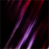
both screencaps from heart fixation
the first one
now I cropped it and resized it to 200x200 pixel.
(again, all the pictures are in 100x100 because I took all of them from the psd. I saved ;)
then I added vibrance: vibrance +5 / saturation +25
I know this step does not change much but it brings out the next one a litte ^^
now (midtone) colour balance CR +17 / MG 0 / YB 0
both of the previous steps just to make Derek look good next to Stiles ^^
and most of all not so blue-ish XD
next we add Stiles :D
we only use Stiles of this one and of course we will have to resize it so it fits
I always like to create a group for the pic I am blending in and add a layer mask to the group
(especially if the caps are from different scenes!)
since the base is pretty dark I put the group on "lighten". I like to think it looks better.
I also duplicated the cap and set the second one to screen 20%
and well, now we have Stiles without a body ^^
that's no big deal I just created a layer under the group and painted it black
just under the missing parts of Stiles body ^^
you can always change between hiding and showing the layer so you see the parts that need to be coloured!
let's say the base is pretty much done
now we add curves to lighten it up a little :)
the cap is really to dark if we want it to have vibrant colouring afterwards
RGB output 54 / input 38
next step: merge all the layers ;)
(I mostly copy all the layers and merge them.
it's easier to recreate or undo a step
duplicate the merged layer, set it to soft light 100% and add an adjustment:
image > adjustments > variations... more red
duplicate the original merged layer set it to screen 100% (depends on how bright your pic is)
use filter > blur > gaussian blur radius 2,0 px
this filter is what makes the pic look so shiny ^^
I like merging a lot so I merged all layers again ^^
time for textures :D I added this texture:
by lessrest
set it to lighten 40%
whoop now it's getting colourful ♥
we add another curve with 2 points
first: output 86 / input 71
second: output 199 / input 182
then another vibrance: vibrance 100 / saturation 0
to bring out the colours a little more :)
next up: gradient fill set to soft light 100%
we use a purple coloured gradient fill with 4 stops
(I found this in a tutorial so the credit goes to someone else but I can't find it anymore :(
one: #001179 at 0%
two: #6f3b8d at 45%
three: #937cdd at 75%
four: #f7e1ec at 100%
this is when I added a second (midtone) colour balance
CR -15 / MG -10 / YB -40
then I added an selective colour adjustment layer
(just writing down what I've changed ^^)
reds yellow -27
yellows magenta +7 / yellow +47
neutrals yellow +19
next is a colour fill #fdfdd9 set to colour burn 100%
colour burn is always nice to use on vibrant icons :D
another (midtone) colour balance
CR +12 / MG +6 / YB +20
now a pretty intense vibrance: vibrance 100 / saturation 20
and now we have the colours we wanted ♥
this is the point where I merged all the layers again ;)
now this step won't be possible for everyone because I used "topaz labs > topaz clean > crispstyle"
but I guess a filter > sharpen > smart sharpen with an amount around 50 would do aswell
..
so last step before we will add the text... I thought Stiles' face was to dark/redish if you compare it to the rest of the image
so I used a cruve layer: output 38 / input 28
used a layer mask to erease all the parts around his face
RESIZE IT to 100x100 px since we're doing icons here ;)
OKAY last but not least the text ♥
fonts used: Yesterday Again for "deer & love" / Young for the rest
the whole text is in #e1d6da, everything written in Young is in small caps
a little tip here... I always create the text so it fits together and then resize it so it fits the icon
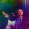
final result:
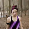
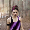
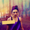
the second tutorial is for this icon:
this second tutorial is easier and faster because we don't have to make 2 pics look good together ^^
also we don't change that much.
the colours stay pretty much the same we just bring them out more :D
we just use one cap I found on fanpop
I did a pretty easy center crop here
but I guess it would look just as good with negative space icons ;)
duplicated the base twice, set the first one to screen 100%
& the second to soft light 50%
after that I just merged all the layers :)
add this texture.
(unfortunately I can't remember who did this one so if you do let me know please ♥)
set it to screen 100%
depending on the image you might have to erase a few parts of the texture.
in this case it just fitted perfectly :)
now all that's left is the colouring.
like I said there is not much to do for us since te texture adds that lovely pink
first I added a colour fill layer #eedb74
i set it to multiply 10%
it just adds a yellow touch to the whites in the icon
oh and we need one merged layer set to soft light 50%
so the doctor looks a little less pale ;)
now we go for a selective colour layer
reds cyan -50 / yellow +30
yellows cyan -72 / magenta -76 / yellow +77 / black +70
neutrals cyan -10 / magenta -10 / yellow +6
blacks cyan -18 / magenta +10 / yellow -23 / black +6
I know it will look pretty yellow after that step but we'll get to it ;)
add a simple black/white gradient fill set to soft light 65%
time for colour balance :)
shadows CR -15 / MG -6 / YB +13
midtones CR +34/ MG +24 / YB +34
now we have a more intense blue in the background
aaand a not so pain in the eye yellow XD
add another selective colour layer
reds yellow -20
yellows cyan -30 / yellow +30
magentasmagenta +4
blacks cyan +30 / magenta -10 / yellow -10
now we use a highlights colour balance :)
shadows CR -20 / MG -20 / YB +20
and see all the yellow is back to normal :)
brighness/contrast is up next contrast +10
and last step a curve layer:
RGB output 112 / input 102
tadaaa :P
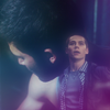
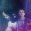
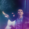
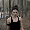
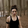
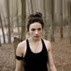
this third tutorial is for this icon
thank you home of the nutty for the lovely cap I am going to use for this icon :D
looking at the cap I can't believe I got this icon out of it XD
well first we crop it again.
like you see I cropped it right before the ears of the guys.
like always 200x200.
makes the work easier and the quality better ;)
like you see the base is VERY dark
I don't like dark bases ^^
so we lighten it up a little.
copy the base set it to screen 100%
add a filter > blur > surface blur 2,0
like you see now the guys look pretty pale ^^
that's why I copied the base again and set it to soft light 70%
looks better now doesn't it?
now merge the 3 layers and add a filter.
I used "topaz labs" but if you don't have that just go for
filter > sharpen > smart sharpen
still the base looks a little dark so I copied the merged base
(not the sharpened one, the one before that)
set it to screen 40%
ookay , let's see.
Derek's face is way darker than Stiles' face
so I duplicated the base again and masked away all parts besides Derek's face.
then I added just a little bit more light.
I added a curve layer
RGB output 107 / input 84
but I masked away Stiles' face since his face is already pretty light ;)
next I used a gradient map layer with 2stops.
0% #290a59 & 100% #ee85bc
another curve layer
RGB output 134 / input 111
now we use our first selective colour layer
reds magenta +37 / yellow +100
yellows cyan -100 / yellow +8
next up is a (midtone) colour balance layer
CR 0 / MG 0 / YB +7
the next step is to bring out the beautiful colours we already have in this icon:
add a hue/saturation layer: saturation +37
this step now if mostly for the background :)
add another selective colour layer
cyans cyan +100 / magenta -47 / yellow +100
and now another curve.
this time to make the pink touch go away a little ^^
RED output 87 / input 130
GREEN output 121 / input 128
BLUE output 109 / input 116
one more curve, the last one I promise ♥
RED output 95 / input 113
now I added a gradient fill.
it's one of the basic gradients you have when you install PS
it has 3 steps:
one: #0a00b2 at 0%
two: #ff0000at 50%
three: #fffc00 at 100%
the colour is lovely isn't it ?
the next step was actually my last but it belongs here ^^
last I added a screened texture and it got to light.
so I duplicated the base. put it above all the colouring adjustments
set to soft light 50%
colour balance please. just midtones again
CR -17 / MG 0 / YB +15
time for merging XD
I merged all the layers. copied it and added a "topaz labs" filter
but you go ahead and use smart sharpen just the right amount to bring out the eyes a little
after all the steps we've done Stiles's face is still way brighter.
so copy the merged (new) base and set it so screen 50%
don't forget to mask away Stiles ^^
2 steps left before we add the text.
in this one we add a texture (which, of course, I don't know who made it) :(
set it to screen 100%
add a 2 stop gradient fill layer.
one: #290a59 at 0%
two: #ff7c00 at 100%
so. we. are. done!
oh wait, the text XD
fonts I used: "tahoma" (what you should have on your computer if you use windows) for "hungry for that"
and "the only exception" for "flesh"
I wrote the first 3 words in small caps. and used #0f2e80 as the colour
BUT I did not add a normal text. it looks like that because I set it to soft light
I duplicated "hungry" 3 times so a total of 300% soft light
and "for that" twice but the second with only 70% making a total of 170% soft light
does that make sense?
"flesh" was written in #963737. I set it to 70% opacity and duplicated it ^^
oh and I also added a shadow:
and. DONE. :D
okay another requested tutorial
another site for screencaps XD
I got this next cap at Grande Caps. thanks ♥
like always the first step is the cropping :D
if I don't like the base's colours so much I always add an adjustment
(first of course I duplicated the base)
image > adjustments > variations... more red
I left it normal but I set it to 70% opacity
copy the base again. and once more we add a colour adjustment
image > adjustments > variations... more yellow
I left it normal just like the first one but I set it to 40% opacity
one more base copy
this time set to screen 50%
for this icon we will be using 3 textures.
the first one by burnedbreads
set it to lighten 100%
looks great right? :D
texture number two again by burnedbreads
set it to screen 100%
whoop and the third texture already.
don't know who made it (sorry again) :(
this one is set to lighten 30%
now it looks like this.
first step of the colouring (besides the adjusted bases)
hue/saturation: saturation +42
now we use a gradient fill layer. a basic black/white one
set to soft light 100%
now add a gradient map. set it to soft light 100%
one: #563a6b at 0%
two: #85667c at 50%
three: #e59f8a at 100%
that makes it look like this:
now, colour fill #2da6fb
I set it to 80% soft light
another colour fill.
this time #fbcb37 set to multiply 20% fill
it's selective colour time :)
reds cyan -12 / yellow -11
neutrals magenta +1 / yellow +5
it's selective colour time again XD
reds yellow -19
yellows yellow +100
we have some awesome colour in here already but we're gonna use some vibrant adjustment
vibrance +100
another gradient map was added here
one: #870460 at 0%
two: #a25860 at 50%
three: #f39f70 at 100%
and third selective colour time xD
blacks cyan -2 / magenta +8 / yellow -6 / black -9
aaaaaand the fourth selective colour time XXXXXXDDDD
cyans cyan +74
whites cyan +100
neutrals magenta +10 / black +5
blacks magenta +10
and we're done with the icon.
except the text of course ^^
this time I had trouble to make the text look good (or let's say readable)
so I made a #f0cd74 coloured background for the text.
I used the line tool for this (10px)
"hunted me down" is written in #510793 and the font is called argentina
"you" is written in #f0cd74 and the font before the rain
and for "you" I also added a shadow
and voilá we have our finished icon