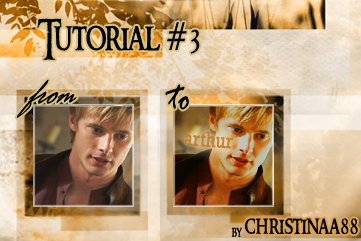
3rd Tutorial
Here we go...long long time ago I made 2 tutorials xD and now I did a 3rd one (:
hope you like it.
if not...I don't care xD well actually I do and actually I hope to get a lot of comments xD
Program Photoshop CS3
Steps: 12
Level: easy
Translateable: yes at least for ps 7.0 it is (:
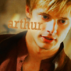
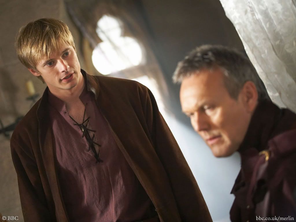
Okay, first just like always find a pic you want to use or just use the picture I used
Open it, crop it 100x100 pixels my base
well done :D..let's continue

step 1
duplicate your layer 3 times, the first set to Screen 70%

step 2
click on the second copy and set it to Soft Light 70%

step 3
and the last time, the last copy.. set it to Pin Light 70%
it does not yet look like anything special xD fine...now we don't need to copy the base anymore ^^

step 4
now we need a custom Curves Layer which makes the pic's colors more beautiful so we click "Layer" > "New Adjustment Layer" > "Curves"
Input: 136
Output: 114
set this to Soft Light 35% Fill

step 5
again we click "Layer" > "New Adjustment Layer" but this time we choose "Brightness & Contrasts"
Contrast: +5
Set this to 25% fill
I guess everyone knows why we use Contrasts xD

step 6
Well, we don't want glowing red colors in our icon so it's going to be a Selective Colors Layer
"Layer" > "New Adjustment Layer" > "Selective Colors"
Reds: +24, 0, 0, 0
Yellows: 0, 0, -15, 0

step 7
okay...petty good so far :D
now we use another custom Curves Layer to lighten the icon up
"Layer" > "New Adjustment Layer" > "Curves"
Input: 126
Output: 114

step 8
Yes it's time for my beloved Gradient Maps :D
We do create a Gradient Map ("Layer" > "New Adjustment Layer" > "Gradient Map"
We create one from #000000 to #FF7C00 or just install this
and now we set this to Luminosity 50% Opacity

step 9
Here I used a Hue/Saturation Layer...
"Layer" > "New Adjustment Layer" > "Hue/Saturation" We just change in the master section:
Hue: -1
Saturation: +5

step 10
no to get a more beautiful color we use the Channel Mixer
"Layer" > "New Adjustment Layer" > "Channel Mixer"
Reds:
Red: 128
Green: -40
Blue:
Red: -55
Green: +60
set this to 70% opacity and actually we are done...we just need the text..thats..
step 11
for this we use the Horizontal Type Tool (T) I used the font Rockwell
for this glowing effect we use "Outer Glow" for that double click on the Type Layer. It will open an extra window "Layer Style" just choose "Outer Glow"
leave everythig to default except Elements
Spread: 4
Size: 16
The color of the text is #C27F37 and the Outer Glow #C2B28E
Oh and I know that everyones always totally eager to have the psd
so I, just like I did in the last 2 Tutorials, uploaded the .psd
hope you like it.
if not...I don't care xD well actually I do and actually I hope to get a lot of comments xD
Program Photoshop CS3
Steps: 12
Level: easy
Translateable: yes at least for ps 7.0 it is (:
Okay, first just like always find a pic you want to use or just use the picture I used
Open it, crop it 100x100 pixels my base
well done :D..let's continue
step 1
duplicate your layer 3 times, the first set to Screen 70%
step 2
click on the second copy and set it to Soft Light 70%
step 3
and the last time, the last copy.. set it to Pin Light 70%
it does not yet look like anything special xD fine...now we don't need to copy the base anymore ^^
step 4
now we need a custom Curves Layer which makes the pic's colors more beautiful so we click "Layer" > "New Adjustment Layer" > "Curves"
Input: 136
Output: 114
set this to Soft Light 35% Fill
step 5
again we click "Layer" > "New Adjustment Layer" but this time we choose "Brightness & Contrasts"
Contrast: +5
Set this to 25% fill
I guess everyone knows why we use Contrasts xD
step 6
Well, we don't want glowing red colors in our icon so it's going to be a Selective Colors Layer
"Layer" > "New Adjustment Layer" > "Selective Colors"
Reds: +24, 0, 0, 0
Yellows: 0, 0, -15, 0
step 7
okay...petty good so far :D
now we use another custom Curves Layer to lighten the icon up
"Layer" > "New Adjustment Layer" > "Curves"
Input: 126
Output: 114
step 8
Yes it's time for my beloved Gradient Maps :D
We do create a Gradient Map ("Layer" > "New Adjustment Layer" > "Gradient Map"
We create one from #000000 to #FF7C00 or just install this
and now we set this to Luminosity 50% Opacity
step 9
Here I used a Hue/Saturation Layer...
"Layer" > "New Adjustment Layer" > "Hue/Saturation" We just change in the master section:
Hue: -1
Saturation: +5
step 10
no to get a more beautiful color we use the Channel Mixer
"Layer" > "New Adjustment Layer" > "Channel Mixer"
Reds:
Red: 128
Green: -40
Blue:
Red: -55
Green: +60
set this to 70% opacity and actually we are done...we just need the text..thats..
step 11
for this we use the Horizontal Type Tool (T) I used the font Rockwell
for this glowing effect we use "Outer Glow" for that double click on the Type Layer. It will open an extra window "Layer Style" just choose "Outer Glow"
leave everythig to default except Elements
Spread: 4
Size: 16
The color of the text is #C27F37 and the Outer Glow #C2B28E
Oh and I know that everyones always totally eager to have the psd
so I, just like I did in the last 2 Tutorials, uploaded the .psd