animanga_lims Commentary
Round 02 for animanga_lims is finally over. I wanted to be cool like kanrinin, whiteplums, nyaabo, and twisted_fruitie, so here is a brief commentary on my extremely neutral journey throughout the competition.
Original idea by whiteplums @ fruitycoma
Template stolen by kanrinin
Icons Submitted
1
2
3
4
5


6
7
8
9
10



11
12
13

Variations
1
2
3
4
5

6
7
8
9


Credit goes to 77words for her icon table generator.
Round 01: Bleach (manga)
Image used

01 Faves
00 Vote-offs
I was pretty happy when I saw that Bleach was used for the first challenge. In round 01 for animanga_lims, the challenges were almost all shoujo, so it was a pleasant surprise to see a shounen series used.
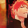
The image was pretty easy to work with, in my opinion. It was high quality, and there were quite a few cropping options available. I decided to icon Ichigo because, well, he looked the coolest. With this round I tried to make my icon nice, but not too flashy. I enhanced the colors a little bit and added some textures to the side to make the icon seem a little less empty. I'm horrible at trying to think of captions, so gogo tiny text! :3
Favorite icon for this round:
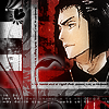
by ?
The design of the icon is really neat. I really like the mix of monochrome + red, such an awesome combination. XD
Round 02: Angelic Layer (anime)
Image used

02 Faves
00 Vote-offs
When I first saw the image I was all, 'Oh carp...' because of the large amounts of text and the so-so quality. I remember having quite a bit of trouble with the coloring of this icon. I wanted to make it seem contrasted, but not so much to the point where the guy/girl's (I dunno what it is) face looked like a sharpened mess. I kept abusing the gradient map option to get the muted effect. The icon seemed a little empty, so I added some patterns to the left side. The patterns don't seem to fit that well, but at the time I thought they did. Added some uninspired text, and voila. My round 02: icon is finished.
Favorite icon for this round:

by raku_rai
I really like how clean this icon is. It had an interesting crop, nice typography, and great coloring in my opinion. Most of the icons in this round who iconed that person had a reddish color scheme, and this one stood out because it was blue.
Round 03: Peace Maker Kurogane (manga)
Image used

02 Faves
00 Vote-offs
nyaabo's moderator's choice
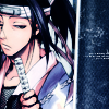
This week was awesome. The images were very HQ, and I got moderator's choice for the first time at animanga_lims..! For the icon, I thought I wouldn't have to do much, since the picture was great. I wanted to keep the blueish feel, because they colors of the image was already pretty and shiny. I tried to make my icon stand out a little more by flipping the image. Apparently it worked, since my crits said that they liked the cropping. XD With some slight image editing, tiny text, and a very nice texture by gender, I had my icon. I was very pleased on how it turned out. :3
Favorite icon for this round:
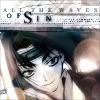
by silverqe
Oh wow, this icon is awesome. The monochrome effect with some splashes of color is what caught my attention. The pattern on the top suited the image well, and the typography is well done.
Round 04: Wolf's Rain (anime)
Image used

01 Faves
01 Vote-offs
During this time, I was panicking because I had 4 exams that I hardly studied for. It didn't help that the images weren't really appealing. I just wanted to get my icon done and over with.
I knew I would use the first or third image, because the second one seemed extremely hard to work with. After trying to work with the first image, I realized that the icon looked very dull. I dunno why, maybe it was because of the close crop or the color of the background. So here I was with the third image, not knowing what to do. It took me about 15 minutes to find out how to crop the girl. I didn't know whether to crop her close up, or have her whole body in the icon. I decided to use the latter idea, because it would give me more space to work with. The coloring was pretty easy, I just needed to tone down the green. To fill up the empty space, I again, used a texture by gender, edited the colors, and pasted it on.
My crit had something to do with how plain the icon is, which I agree on. This entry was really, well, blah. Curse you exams..!
Favorite icons for this round:
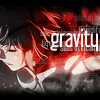
by kanrinin
The monochrome effect with the hint of red stood out amongst the majority of green icons. I really like the typography, with the semi transparent text underneath the main caption.
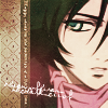
by blueberry_ocean
This icon is very pretty. I like how blueberry_ocean colored the eye of the person. The pattern is a nice addition, and I even like the scribbled cursive text (which I really don't care for) used as decoration.
Round 05: DOGS (manga)
Image used

02 Faves
01 Vote-offs
I had 3 exams this week, so I was kind of pressed for time. I didn't want to use my skip, because it was DOGS. For any of you who haven't read this series yet, I strongly suggest that you do so.
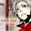
I'm not strong at manga coloring, but I tried my best at it. I wanted to color Badou, but I ended up using Heine because... well honestly I don't know why. The good thing is that I survived. Blargh, exams. Blargh, manga coloring.
Favorite icons for this round:

by sinspire
The coloring on this icon is just simply amazing. It also stood out since hardly anyone included that person in their icons. I wonder how people can color manga so well? XD

by aerostati
This icon is just full of awesome. The coloring, the background, the gayness, are all very well done. XD
Round 06: Howl's Moving Castle (anime)
Image used

01 Faves
00 Vote-offs

->
Whoo, Howl's Moving Castle! \o/ I was really happy with the images nyaabo and adaneko chose. They were really clear and clean, so I was excited to make my icon for this week.
For the first version, I knew I was going to icon the image with Howl and Sophie. I knew that not much had to be done with the icon, because the image was really high quality. Looking through my textures folder, I found one by inxsomniax which would suit the icon well. I was happy until I got to the coloring. I don't think I'm a fan of green icons. The icon also didn't seem to stand out. Luckily, I saved my .psd (which I almost never do), and started over again.
When I started again, I rotated the crop slightly, to focus on Howl and Sophie more. I really like the color blue so I again abused the gradient map tool, as well as the light blue color burn layer. I thought that the blue on Sophie's clothes mixed well with Howl's pink cape thingy. I added a very subtle light texture, and slapped on some text. Century Gothic, you are indeed an awesome font.
I thought my icon turned out pretty well for this week, and was glad that it didn't get any vote-offs. :D
Favorite icon for this round:
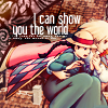
by kaneha
The coloring on this entry is gorgeous, and so original compared to the other icons. I really loved how kaneha added more dimension to Howl and Sophie's clothing, so they could stand out more. An awesome icon indeed.
Round 07: Katekyo Hitman Reborn! (manga)
Image used

04 Faves
00 Vote-offs
This week was definitely a struggle. Although the image was pretty nice, I had no clue what I was going to do with the mass amounts of text.
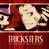
I thought everyone was going to icon Gokudera (the person with the grey/silver hair), or Tsuna (the loser person with the light brown hair), so I decided to make an entry of Yamamoto (guy on bottom left). It turns out I was wrong. The coloring wasn't very difficult, but trying to find a way to mask the text was the hard part. It probably took me a good half an hour to decide what to do. I tried the black gradient fade thing, duplicated images, and even attempted to make the icon non 100x100. I finally settled on using a texture to hide the empty space. It suited the icon well, so I put down a caption (which I figured out that it had no relevance to the icon after reading KHR!) and some tiny text. I also added in Reborn since he is cute and he filled some empty space in the left part of the icon.
Favorite icon for this round:

by _wizu
I really adore everything about this icon. The coloring, the text, the crop. Everything is extremely well done. Plus _wizu iconed Hibari, who is quite 1337.
Round 08: Samurai Champloo (anime)
Image used
Used Skip
I tried making an icon. I failed. I skipped. I then ate ice cream afterwards. :O
Favorite icons for this round:
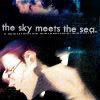
by sinspire
This icon is really nice. The mix of purples and blues really caught my attention.
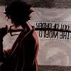
by saluchna
Ooh, the typography. Such an original way of presenting the text.
Round 09: D.Gray-man (manga)
Image used

15 Faves
01 Vote-offs
People's Choice

->
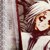
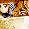
I again had some trouble with this entry because of the hush requirement. Due to the icon being hush, I tried to focus on the cropping and composition because sometimes textless icons can look a little empty. I used Allen since he was the highest quality out of all the people in the image. Luckily I found a texture by gender, which seemed to match the color scheme of Allen extremely well. The texture was also a little grungy, which suited the serious feeling of the icon. It took me a rather long time to add some decoration to the entry. I first thought blood splatters or a scribbly brush, but I decided to use semi transparent rectangles and some more cut out textures. After that I thought my icon was finished, until I randomly decided to rotate the crop. It seemed to look alot better than it was previously.
I was pleasantly surprised that my icon got people's choice. The people who voted liked the cropping and coloring, which I was going for! Bwahahaha.
Favorite icon for this round:
by twisted_fruitie
The design of this icon is great. Like I said before, usually a hush icon can look empty, but this entry is definitely not. Great use of textures, as well as brushes to make an awesome textless icon. :O
Round 10: Darker than Black (anime)
Image used

10 Faves
00 Vote-offs
People's Choice

->
->
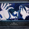
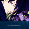
Ooh, this week was not fun. I thought it would be, because the image looked all nice and HQ, until I found out that it was so hard to crop. ;-; After spending around 20 minutes deciding how to crop the thing, I didn't know what I was going to do after. I was just going to try and color and nicely and add a pattern to the bottom... which I did.
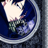
I thought the first version icon was okay, but I didn't think that it would survive amongst the rest. It just so happens that I was looking at some icons by eternalphoenix_, and I thought that this icon was really neat. I was also browsing through the round 09 icons for manga_battle and saw this icon by kanrinin. Both icons had really nice designs and incorporated the camera lens effect really well, so I thought that I could do something similar to that. I browsed through stockxchange, and found some nice photos of camera lenses to use. I stuck Hei inside one, and I almost had my icon!
The semi transparent circle surrounding Hei bothered me, so I erased that. I added in some text, and had to use some serious drop shadowing so people could read it. Finally, I was finished with this icon. It took me at least an hour and a half to make, I was glad that people liked it.
Favorite icon for this round:
by sinspire
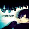
This icon is probably my favorite throughout the whole competition. The way that sinspire designed this icon is really neat. The buildings at the top, the shadow effects, and the vibrant coloring is just amazing. She also extracted the background and redrew the hand and some of the hair of Hei in a way that is completely natural.
Round 11: Eyeshield 21 (manga)
Image used

7 Faves
7 Vote-offs
People's Choice
->
->
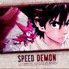
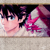
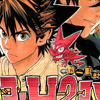
... This challenge killed me a little. Despite it being ES21 which is full of awesome awesome win win awesome win awesome, I had so much trouble with the image. Like, pull hair out of skull trouble. The crop had me frustrated, because everything seemed to look awkward when I tried to resize the image. I wanted to icon Sena though, since he is great.
What I had the most trouble with, was probably the extraction. Luckily Sena and the Devil Bat had that white outline around them, so it was easier to cut out the background.
I also had to redraw some of the text on Sena's neck and shirt.
I found some nice textures by inxsomniax to use for the background as well as a way to cover up the Eyeshield 21 text. To make Sena less orange, I abused the soft light + desaturation process. All I needed was to add text, and I was done.
After coming back to the computer after playing Phoenix Wright, something didn't look right with my icon. It looked pretty boring, so I had to change something. I decided to rotate the textures that were used as empty space slightly, as well as the text and tiny text. I made the 'demon' text red, because demons are red?
This icon on my laptop looks somewhat blue, but apparently that isn't the case. Everyone said that my icon looked red/brown/purple, so I guess my monitor sucks. ;-;
Favorite icon for this round:
by _wizu
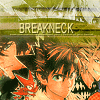
I thought that this icon had an really interesting composition. Although I thought the coloring was a little off, the composition was still well done.
Final Round: Triple Triad (anime and manga)
Image used for theme 1 (Black Lagoon hush), image used for theme 2 (Gintama lyrical), image used for theme 3 (free choice).


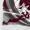
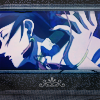
->
->
Note to self, never play Phoenix Wright when you are pressed for time and need to make three icons.
Anyway, you know how I said that the Eyeshield 21 theme killed me a little? This theme killed me alot. Both images had some bad qualities about them. This image was very hard to crop, and was somewhat poor quality wise. This image was extremely sharpened in places, but was easier to crop than the first image.
I decided to use the first image, because it seemed easier to crop. Even though the quality wasn't as good as the second image, I thought I could hide it by desaturating the picture, blurring it a little, and texture abusing. The icon turned out decent, but it was hard to see the focus of it. So, I scrapped the idea.
Argh, huge hand lady. There cropping, and finding a way to make the icon look interesting troubled me a lot. I tried cropping close up, didn't work. I then tried rotating the image, didn't work. So I had to settle with cropping the full image of the huge hand lady. It turns out she has a huge nose as well. After cropping, I rummaged through my texture folder to find a pattern/texture that would fit well with the icon. I couldn't find any, but luckily I found a nice mask brush by 77words, which suited the icon perfectly. I manipulated the colors and brightness of it a little, and there was my texture. Finding the right decoration was a challenge as well. I was contemplating whether to use blood splatters, scribble brushes, flowers, or a fancy design to place in that empty space below the person. After much experimenting, I used the fancy design because it looked the cleanest on the icon.
The coloring wasn't as bad as I thought. The blur tool, curves, exclusion layers, and some light textures were all I needed to abuse. The first icon seemed too saturated, so I desaturated it a little bit and had my finished product.
People seemed to like the design of the icon, which I'm very glad about.
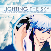
->
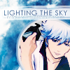
I was quite pleased with the outcome of this icon. It took me a while to choose an image, but I ended up using an anime picture. I wanted to icon Gintoki, because he is very cool.
Coloring the image was quite easy, but the hard part was trying to hide all the people surrounding Gintoki. I decided to use a sky texture to mask the people. The lyrics provided had the word sky in it, so I thought the text would fit well with the icon. After looking at the icon again, some people may not have liked the white clouds on the left. So I found another sky texture, enhanced the colors slightly, and my icon was done!
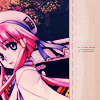
->
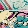
By this time, I wanted to get my icon over and done with. I chose to use an Aria image, because the art is extremely pretty. The whole icon was pretty easy to make, especially the coloring. I slapped on a texture and some tiny text, and called it a day.
I thought I finished my icon until I looked at it again. It seemed to lack something. I chose a rose texture by gender, curved it slightly, and plastered it onto my icon. The text was pretty difficult, since there was no free space. I had to use the gaussian blur + rectangle technique to create some empty space for the typography. But alas, my icon was done. Free at last~
Things I Learned
- Clean icons seem to do well in LIMS
- I make very neutral icons
- I abuse tiny text like a madman
- I use textures to fill up empty space way too much
- Blue = red/brown sometimes
- Having an interesting crop can really make your icon stand out (in a good way)
- Never play Phoenix Wright when you have a deadline
Final Thoughts
Well, animanga_lims round 02 is finally over. I think during that time I've managed to create a style that people can identify me by. I've also become more picky when making my icons, editing really small details that probably no one can see (except for myself).
A huge thank you goes to nyaabo and adaneko, the great round 02 mods for animanga_lims. Thanks for killing me alot inside providing the tough images which made me be extra creative/meticulous when making my icons. I'm tired of writing now, so I think I'll stop. Thanks for reading, if you're crazy enough to look through the entire thing. XD
If you want to sign up for animanga_lims round 03, comment here. Also, if you want to sign up for manga_battle round 02, please read this entry!
Original idea by whiteplums @ fruitycoma
Template stolen by kanrinin
Icons Submitted
1
2
3
4
5
6
7
8
9
10
11
12
13
Variations
1
2
3
4
5
6
7
8
9
Credit goes to 77words for her icon table generator.
Round 01: Bleach (manga)
Image used
01 Faves
00 Vote-offs
I was pretty happy when I saw that Bleach was used for the first challenge. In round 01 for animanga_lims, the challenges were almost all shoujo, so it was a pleasant surprise to see a shounen series used.
The image was pretty easy to work with, in my opinion. It was high quality, and there were quite a few cropping options available. I decided to icon Ichigo because, well, he looked the coolest. With this round I tried to make my icon nice, but not too flashy. I enhanced the colors a little bit and added some textures to the side to make the icon seem a little less empty. I'm horrible at trying to think of captions, so gogo tiny text! :3
Favorite icon for this round:
by ?
The design of the icon is really neat. I really like the mix of monochrome + red, such an awesome combination. XD
Round 02: Angelic Layer (anime)
Image used
02 Faves
00 Vote-offs
When I first saw the image I was all, 'Oh carp...' because of the large amounts of text and the so-so quality. I remember having quite a bit of trouble with the coloring of this icon. I wanted to make it seem contrasted, but not so much to the point where the guy/girl's (I dunno what it is) face looked like a sharpened mess. I kept abusing the gradient map option to get the muted effect. The icon seemed a little empty, so I added some patterns to the left side. The patterns don't seem to fit that well, but at the time I thought they did. Added some uninspired text, and voila. My round 02: icon is finished.
Favorite icon for this round:
by raku_rai
I really like how clean this icon is. It had an interesting crop, nice typography, and great coloring in my opinion. Most of the icons in this round who iconed that person had a reddish color scheme, and this one stood out because it was blue.
Round 03: Peace Maker Kurogane (manga)
Image used
02 Faves
00 Vote-offs
nyaabo's moderator's choice
This week was awesome. The images were very HQ, and I got moderator's choice for the first time at animanga_lims..! For the icon, I thought I wouldn't have to do much, since the picture was great. I wanted to keep the blueish feel, because they colors of the image was already pretty and shiny. I tried to make my icon stand out a little more by flipping the image. Apparently it worked, since my crits said that they liked the cropping. XD With some slight image editing, tiny text, and a very nice texture by gender, I had my icon. I was very pleased on how it turned out. :3
Favorite icon for this round:
by silverqe
Oh wow, this icon is awesome. The monochrome effect with some splashes of color is what caught my attention. The pattern on the top suited the image well, and the typography is well done.
Round 04: Wolf's Rain (anime)
Image used
01 Faves
01 Vote-offs
During this time, I was panicking because I had 4 exams that I hardly studied for. It didn't help that the images weren't really appealing. I just wanted to get my icon done and over with.
I knew I would use the first or third image, because the second one seemed extremely hard to work with. After trying to work with the first image, I realized that the icon looked very dull. I dunno why, maybe it was because of the close crop or the color of the background. So here I was with the third image, not knowing what to do. It took me about 15 minutes to find out how to crop the girl. I didn't know whether to crop her close up, or have her whole body in the icon. I decided to use the latter idea, because it would give me more space to work with. The coloring was pretty easy, I just needed to tone down the green. To fill up the empty space, I again, used a texture by gender, edited the colors, and pasted it on.
My crit had something to do with how plain the icon is, which I agree on. This entry was really, well, blah. Curse you exams..!
Favorite icons for this round:
by kanrinin
The monochrome effect with the hint of red stood out amongst the majority of green icons. I really like the typography, with the semi transparent text underneath the main caption.
by blueberry_ocean
This icon is very pretty. I like how blueberry_ocean colored the eye of the person. The pattern is a nice addition, and I even like the scribbled cursive text (which I really don't care for) used as decoration.
Round 05: DOGS (manga)
Image used
02 Faves
01 Vote-offs
I had 3 exams this week, so I was kind of pressed for time. I didn't want to use my skip, because it was DOGS. For any of you who haven't read this series yet, I strongly suggest that you do so.
I'm not strong at manga coloring, but I tried my best at it. I wanted to color Badou, but I ended up using Heine because... well honestly I don't know why. The good thing is that I survived. Blargh, exams. Blargh, manga coloring.
Favorite icons for this round:
by sinspire
The coloring on this icon is just simply amazing. It also stood out since hardly anyone included that person in their icons. I wonder how people can color manga so well? XD
by aerostati
This icon is just full of awesome. The coloring, the background, the gayness, are all very well done. XD
Round 06: Howl's Moving Castle (anime)
Image used
01 Faves
00 Vote-offs
->
Whoo, Howl's Moving Castle! \o/ I was really happy with the images nyaabo and adaneko chose. They were really clear and clean, so I was excited to make my icon for this week.
For the first version, I knew I was going to icon the image with Howl and Sophie. I knew that not much had to be done with the icon, because the image was really high quality. Looking through my textures folder, I found one by inxsomniax which would suit the icon well. I was happy until I got to the coloring. I don't think I'm a fan of green icons. The icon also didn't seem to stand out. Luckily, I saved my .psd (which I almost never do), and started over again.
When I started again, I rotated the crop slightly, to focus on Howl and Sophie more. I really like the color blue so I again abused the gradient map tool, as well as the light blue color burn layer. I thought that the blue on Sophie's clothes mixed well with Howl's pink cape thingy. I added a very subtle light texture, and slapped on some text. Century Gothic, you are indeed an awesome font.
I thought my icon turned out pretty well for this week, and was glad that it didn't get any vote-offs. :D
Favorite icon for this round:
by kaneha
The coloring on this entry is gorgeous, and so original compared to the other icons. I really loved how kaneha added more dimension to Howl and Sophie's clothing, so they could stand out more. An awesome icon indeed.
Round 07: Katekyo Hitman Reborn! (manga)
Image used
04 Faves
00 Vote-offs
This week was definitely a struggle. Although the image was pretty nice, I had no clue what I was going to do with the mass amounts of text.
I thought everyone was going to icon Gokudera (the person with the grey/silver hair), or Tsuna (the loser person with the light brown hair), so I decided to make an entry of Yamamoto (guy on bottom left). It turns out I was wrong. The coloring wasn't very difficult, but trying to find a way to mask the text was the hard part. It probably took me a good half an hour to decide what to do. I tried the black gradient fade thing, duplicated images, and even attempted to make the icon non 100x100. I finally settled on using a texture to hide the empty space. It suited the icon well, so I put down a caption (which I figured out that it had no relevance to the icon after reading KHR!) and some tiny text. I also added in Reborn since he is cute and he filled some empty space in the left part of the icon.
Favorite icon for this round:
by _wizu
I really adore everything about this icon. The coloring, the text, the crop. Everything is extremely well done. Plus _wizu iconed Hibari, who is quite 1337.
Round 08: Samurai Champloo (anime)
Image used
Used Skip
I tried making an icon. I failed. I skipped. I then ate ice cream afterwards. :O
Favorite icons for this round:
by sinspire
This icon is really nice. The mix of purples and blues really caught my attention.
by saluchna
Ooh, the typography. Such an original way of presenting the text.
Round 09: D.Gray-man (manga)
Image used
15 Faves
01 Vote-offs
People's Choice
->
I again had some trouble with this entry because of the hush requirement. Due to the icon being hush, I tried to focus on the cropping and composition because sometimes textless icons can look a little empty. I used Allen since he was the highest quality out of all the people in the image. Luckily I found a texture by gender, which seemed to match the color scheme of Allen extremely well. The texture was also a little grungy, which suited the serious feeling of the icon. It took me a rather long time to add some decoration to the entry. I first thought blood splatters or a scribbly brush, but I decided to use semi transparent rectangles and some more cut out textures. After that I thought my icon was finished, until I randomly decided to rotate the crop. It seemed to look alot better than it was previously.
I was pleasantly surprised that my icon got people's choice. The people who voted liked the cropping and coloring, which I was going for! Bwahahaha.
Favorite icon for this round:
by twisted_fruitie
The design of this icon is great. Like I said before, usually a hush icon can look empty, but this entry is definitely not. Great use of textures, as well as brushes to make an awesome textless icon. :O
Round 10: Darker than Black (anime)
Image used
10 Faves
00 Vote-offs
People's Choice
->
->
Ooh, this week was not fun. I thought it would be, because the image looked all nice and HQ, until I found out that it was so hard to crop. ;-; After spending around 20 minutes deciding how to crop the thing, I didn't know what I was going to do after. I was just going to try and color and nicely and add a pattern to the bottom... which I did.
I thought the first version icon was okay, but I didn't think that it would survive amongst the rest. It just so happens that I was looking at some icons by eternalphoenix_, and I thought that this icon was really neat. I was also browsing through the round 09 icons for manga_battle and saw this icon by kanrinin. Both icons had really nice designs and incorporated the camera lens effect really well, so I thought that I could do something similar to that. I browsed through stockxchange, and found some nice photos of camera lenses to use. I stuck Hei inside one, and I almost had my icon!
The semi transparent circle surrounding Hei bothered me, so I erased that. I added in some text, and had to use some serious drop shadowing so people could read it. Finally, I was finished with this icon. It took me at least an hour and a half to make, I was glad that people liked it.
Favorite icon for this round:
by sinspire
This icon is probably my favorite throughout the whole competition. The way that sinspire designed this icon is really neat. The buildings at the top, the shadow effects, and the vibrant coloring is just amazing. She also extracted the background and redrew the hand and some of the hair of Hei in a way that is completely natural.
Round 11: Eyeshield 21 (manga)
Image used
7 Faves
7 Vote-offs
People's Choice
->
->
... This challenge killed me a little. Despite it being ES21 which is full of awesome awesome win win awesome win awesome, I had so much trouble with the image. Like, pull hair out of skull trouble. The crop had me frustrated, because everything seemed to look awkward when I tried to resize the image. I wanted to icon Sena though, since he is great.
What I had the most trouble with, was probably the extraction. Luckily Sena and the Devil Bat had that white outline around them, so it was easier to cut out the background.
I also had to redraw some of the text on Sena's neck and shirt.
I found some nice textures by inxsomniax to use for the background as well as a way to cover up the Eyeshield 21 text. To make Sena less orange, I abused the soft light + desaturation process. All I needed was to add text, and I was done.
After coming back to the computer after playing Phoenix Wright, something didn't look right with my icon. It looked pretty boring, so I had to change something. I decided to rotate the textures that were used as empty space slightly, as well as the text and tiny text. I made the 'demon' text red, because demons are red?
This icon on my laptop looks somewhat blue, but apparently that isn't the case. Everyone said that my icon looked red/brown/purple, so I guess my monitor sucks. ;-;
Favorite icon for this round:
by _wizu
I thought that this icon had an really interesting composition. Although I thought the coloring was a little off, the composition was still well done.
Final Round: Triple Triad (anime and manga)
Image used for theme 1 (Black Lagoon hush), image used for theme 2 (Gintama lyrical), image used for theme 3 (free choice).
->
->
Note to self, never play Phoenix Wright when you are pressed for time and need to make three icons.
Anyway, you know how I said that the Eyeshield 21 theme killed me a little? This theme killed me alot. Both images had some bad qualities about them. This image was very hard to crop, and was somewhat poor quality wise. This image was extremely sharpened in places, but was easier to crop than the first image.
I decided to use the first image, because it seemed easier to crop. Even though the quality wasn't as good as the second image, I thought I could hide it by desaturating the picture, blurring it a little, and texture abusing. The icon turned out decent, but it was hard to see the focus of it. So, I scrapped the idea.
Argh, huge hand lady. There cropping, and finding a way to make the icon look interesting troubled me a lot. I tried cropping close up, didn't work. I then tried rotating the image, didn't work. So I had to settle with cropping the full image of the huge hand lady. It turns out she has a huge nose as well. After cropping, I rummaged through my texture folder to find a pattern/texture that would fit well with the icon. I couldn't find any, but luckily I found a nice mask brush by 77words, which suited the icon perfectly. I manipulated the colors and brightness of it a little, and there was my texture. Finding the right decoration was a challenge as well. I was contemplating whether to use blood splatters, scribble brushes, flowers, or a fancy design to place in that empty space below the person. After much experimenting, I used the fancy design because it looked the cleanest on the icon.
The coloring wasn't as bad as I thought. The blur tool, curves, exclusion layers, and some light textures were all I needed to abuse. The first icon seemed too saturated, so I desaturated it a little bit and had my finished product.
People seemed to like the design of the icon, which I'm very glad about.
->
I was quite pleased with the outcome of this icon. It took me a while to choose an image, but I ended up using an anime picture. I wanted to icon Gintoki, because he is very cool.
Coloring the image was quite easy, but the hard part was trying to hide all the people surrounding Gintoki. I decided to use a sky texture to mask the people. The lyrics provided had the word sky in it, so I thought the text would fit well with the icon. After looking at the icon again, some people may not have liked the white clouds on the left. So I found another sky texture, enhanced the colors slightly, and my icon was done!
->
By this time, I wanted to get my icon over and done with. I chose to use an Aria image, because the art is extremely pretty. The whole icon was pretty easy to make, especially the coloring. I slapped on a texture and some tiny text, and called it a day.
I thought I finished my icon until I looked at it again. It seemed to lack something. I chose a rose texture by gender, curved it slightly, and plastered it onto my icon. The text was pretty difficult, since there was no free space. I had to use the gaussian blur + rectangle technique to create some empty space for the typography. But alas, my icon was done. Free at last~
Things I Learned
- Clean icons seem to do well in LIMS
- I make very neutral icons
- I abuse tiny text like a madman
- I use textures to fill up empty space way too much
- Blue = red/brown sometimes
- Having an interesting crop can really make your icon stand out (in a good way)
- Never play Phoenix Wright when you have a deadline
Final Thoughts
Well, animanga_lims round 02 is finally over. I think during that time I've managed to create a style that people can identify me by. I've also become more picky when making my icons, editing really small details that probably no one can see (except for myself).
A huge thank you goes to nyaabo and adaneko, the great round 02 mods for animanga_lims. Thanks for killing me alot inside providing the tough images which made me be extra creative/meticulous when making my icons. I'm tired of writing now, so I think I'll stop. Thanks for reading, if you're crazy enough to look through the entire thing. XD
If you want to sign up for animanga_lims round 03, comment here. Also, if you want to sign up for manga_battle round 02, please read this entry!