photoshop / water critique?
I'm in a Photoshop class again, with a midterm project to re-create an advertisement.
I picked this image, and found photos from Thinkstock (AI has an account, so we can use them for projects) to composite my own version.

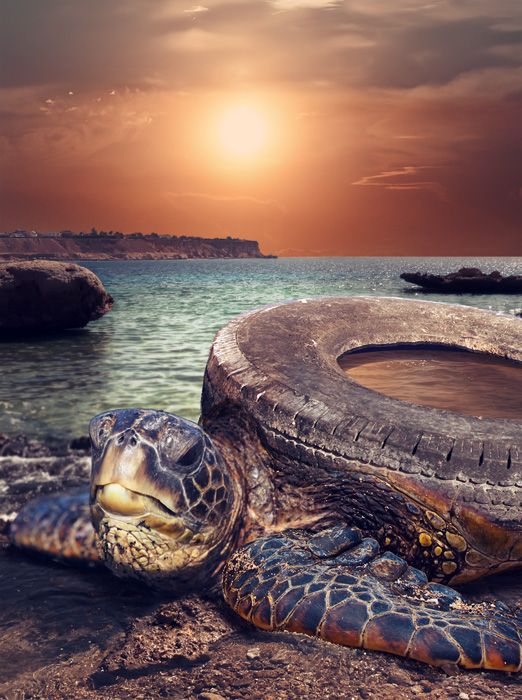
It's made up of four images- two for the turtle, the tire, and the background. I feel like everything is fairly well integrated except the water inside the tire, which is the only thing I've built from scratch.
So I'm wondering if anyone could give me suggestions for the water inside the tire? It looks a ton better than earlier versions, but it still definitely lacks the sense of realism I'm aiming for.
Any other critique would also be appreciated, of course! Thank you!
(I'll be adding in the text and border, but I want to get this part looking right first.)
This entry was originally posted at http://replacementparts.dreamwidth.org/56386.html. Please comment there using OpenID.
I picked this image, and found photos from Thinkstock (AI has an account, so we can use them for projects) to composite my own version.

It's made up of four images- two for the turtle, the tire, and the background. I feel like everything is fairly well integrated except the water inside the tire, which is the only thing I've built from scratch.
So I'm wondering if anyone could give me suggestions for the water inside the tire? It looks a ton better than earlier versions, but it still definitely lacks the sense of realism I'm aiming for.
Any other critique would also be appreciated, of course! Thank you!
(I'll be adding in the text and border, but I want to get this part looking right first.)
This entry was originally posted at http://replacementparts.dreamwidth.org/56386.html. Please comment there using OpenID.