Icon Tutorial #9
Wow. I haven't written a tutorial since the summer of 2006! Yikes! This tutorial is based off of this set of icons and was requested by elerrina_amanya. Part 1 explains the steps I take on almost every icon I've created for at least the past year, if not longer. I thought it deserved to be seperated from the rest of the tutorial.
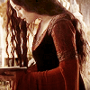
Image program: Made in PSP9 (Probably would work on lower versions.) Probably is translateable to PS.
Level: moderate beginner to intermediate (Because of the adjustment layers.)
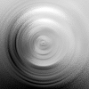
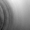
Additional Tools: These textures from graphic_sl - Circle Texture, Curved Texture
Notes: Please do not duplicate my icons, or the icons in this tutorial. See tutorial for additional notes.
Part 1:
1.) Resize, sharpen, and crop your image. Duplicate your image layer twice. Set the middle layer to screen and the top layer to soft light. (I like to use the Layer Link Toggle buttons at the right of my layers pallete to link these three layers together to make it easier to change the cropping later if I decide it would look better a different way.)
2.) Go to Layers>New Adjustment Layer>Curves and click once on the dotted diagonal line. Set the Channel to RGB. Set the Input to 89 and the Output to 117. This lightens the image without fading it.
3.) Adjust the opacity of the screen and/or soft light layer as needed, depending on if you want the icon to be lighter or darker.
Notes: A.) Sometimes the icon may look better with the soft light layer set to overlay or hard light.
B.) Sometimes I will set the soft light layer to a lower opacity and use either Adjust>Blur>Gaussian Blur with the Radius set to 8.00 (usually, sometimes I'll set it to 2.00 or 4.00 if 8.00 seems to be too much.) or Adjust>Blur>Motion Blur with the Angle set to 315.00 and Strength set to 100%. Whichever effect looks better. This will give the icon a soft glow. It seems to work best with the soft light layer, and occasionally the screen layer, but never both at the same time, and it doesn't work so well when the soft light layer is set to hard light or overlay.
C.) Sometimes I find that I need a duplicate of the screen layer to brighten a really dark icon. The opacity usually has to be reduced to around 35-50%. Other times I may duplicate the soft light layer if I have a really light icon. Again, the opacity probably will need to be reduced - usually from somewhere between 12-28%.
D.) Usually I'll play around with additional Curves, and/or Color Balance Layers, and textures.
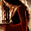
Tutorial 9:
1.) Follow steps 1-3 above. Since my cropping of this particular screencap is pretty dark I duplicated the screen layer and reduced the opacity to 40%.
2.) Go to Layers>New Adjustment Layers>Color Balance. Under Tone Balance, select Midtones and check the Preserve Luminance box. Leave Shadows and Highlights alone. Under Color Balance set the Color Levels to 70, 0, and -70. Click OK. Set the blend to Lighten and the opacity to 46%.
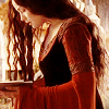
3.) Create a new layer and flood fill with a Foreground-background gradient made from #F7EFE7 and #E7DBCE. (Mine is set to Linear Style wiith an Angle of 103 and no repeats.) You may save this to copy and paste onto your icon if you can't create the same gradient.) Set the blend mode to Color (Legacy) and reduce the opacity of the layer to 32%. Soft Light or Burn also work well. (In my set, I used Soft Light on most of the Pride and Prejudice icons, Color (Legacy) on the LOTR icons, and Burn on the Twilight icons.)
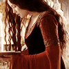
4.) Copy/Paste this texture as a new layer on to your icon, set the blend mode to Soft Light and reduce the opacity to 34%. Mirror, Flip, and/or Rotate the layer as needed until the icon has darker shadows where you think it looks best. (For this icon, I just mirrored it.) Next, Copy/Paste this texture as a new layer on to your icon, set the blend mode to Soft Light and reduce the opacity to 56%. Mirror, Flip, and/or Rotate the layer as needed until the icon has darker shadows where you think it looks best. (I left it as it is for this icon.) For some icons you may need both, other icons you may need just the circle or just the curved texture. I just hide/unhide the other layer using the Visibility Toggle until I decide what way it looks best. The aim is to add a little depth to the icon, while keeping the opacity reduced enough that you aren't seeing any of the curved lines on the icon subject's face.
5.) Not all icons need this, but to add a little extra depth to this icon, I duplicated the linked soft light layer of my screencap, dragged it to the top and reduced the opacity to 12%.
I realize now this wasn't the best screencap to choose - it doesn't show the step-by-step changes as well as another might have, but oh well. I like the way the finished icon turned out. And now I know why it's been almost two years since I wrote a tutorial... it took me about five hours to write this.
If anything is confusing, don't hesitate to leave a comment. :)
Other icons made the same way:

Image program: Made in PSP9 (Probably would work on lower versions.) Probably is translateable to PS.
Level: moderate beginner to intermediate (Because of the adjustment layers.)
Additional Tools: These textures from graphic_sl - Circle Texture, Curved Texture
Notes: Please do not duplicate my icons, or the icons in this tutorial. See tutorial for additional notes.
Part 1:
1.) Resize, sharpen, and crop your image. Duplicate your image layer twice. Set the middle layer to screen and the top layer to soft light. (I like to use the Layer Link Toggle buttons at the right of my layers pallete to link these three layers together to make it easier to change the cropping later if I decide it would look better a different way.)
2.) Go to Layers>New Adjustment Layer>Curves and click once on the dotted diagonal line. Set the Channel to RGB. Set the Input to 89 and the Output to 117. This lightens the image without fading it.
3.) Adjust the opacity of the screen and/or soft light layer as needed, depending on if you want the icon to be lighter or darker.
Notes: A.) Sometimes the icon may look better with the soft light layer set to overlay or hard light.
B.) Sometimes I will set the soft light layer to a lower opacity and use either Adjust>Blur>Gaussian Blur with the Radius set to 8.00 (usually, sometimes I'll set it to 2.00 or 4.00 if 8.00 seems to be too much.) or Adjust>Blur>Motion Blur with the Angle set to 315.00 and Strength set to 100%. Whichever effect looks better. This will give the icon a soft glow. It seems to work best with the soft light layer, and occasionally the screen layer, but never both at the same time, and it doesn't work so well when the soft light layer is set to hard light or overlay.
C.) Sometimes I find that I need a duplicate of the screen layer to brighten a really dark icon. The opacity usually has to be reduced to around 35-50%. Other times I may duplicate the soft light layer if I have a really light icon. Again, the opacity probably will need to be reduced - usually from somewhere between 12-28%.
D.) Usually I'll play around with additional Curves, and/or Color Balance Layers, and textures.
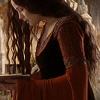
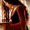
Tutorial 9:
1.) Follow steps 1-3 above. Since my cropping of this particular screencap is pretty dark I duplicated the screen layer and reduced the opacity to 40%.
2.) Go to Layers>New Adjustment Layers>Color Balance. Under Tone Balance, select Midtones and check the Preserve Luminance box. Leave Shadows and Highlights alone. Under Color Balance set the Color Levels to 70, 0, and -70. Click OK. Set the blend to Lighten and the opacity to 46%.
3.) Create a new layer and flood fill with a Foreground-background gradient made from #F7EFE7 and #E7DBCE. (Mine is set to Linear Style wiith an Angle of 103 and no repeats.) You may save this to copy and paste onto your icon if you can't create the same gradient.) Set the blend mode to Color (Legacy) and reduce the opacity of the layer to 32%. Soft Light or Burn also work well. (In my set, I used Soft Light on most of the Pride and Prejudice icons, Color (Legacy) on the LOTR icons, and Burn on the Twilight icons.)
4.) Copy/Paste this texture as a new layer on to your icon, set the blend mode to Soft Light and reduce the opacity to 34%. Mirror, Flip, and/or Rotate the layer as needed until the icon has darker shadows where you think it looks best. (For this icon, I just mirrored it.) Next, Copy/Paste this texture as a new layer on to your icon, set the blend mode to Soft Light and reduce the opacity to 56%. Mirror, Flip, and/or Rotate the layer as needed until the icon has darker shadows where you think it looks best. (I left it as it is for this icon.) For some icons you may need both, other icons you may need just the circle or just the curved texture. I just hide/unhide the other layer using the Visibility Toggle until I decide what way it looks best. The aim is to add a little depth to the icon, while keeping the opacity reduced enough that you aren't seeing any of the curved lines on the icon subject's face.
5.) Not all icons need this, but to add a little extra depth to this icon, I duplicated the linked soft light layer of my screencap, dragged it to the top and reduced the opacity to 12%.
I realize now this wasn't the best screencap to choose - it doesn't show the step-by-step changes as well as another might have, but oh well. I like the way the finished icon turned out. And now I know why it's been almost two years since I wrote a tutorial... it took me about five hours to write this.
If anything is confusing, don't hesitate to leave a comment. :)
Other icons made the same way: