Icon Tutorial 07: Frosted Arwen Icon
This tutorial was requested by _hushed_art for the icons made in this post. It will create icons in the following style. Note: Step 12 has been edited to tell you what the layer was supposed to be set to.
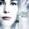
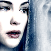
Image program: PSP9 (Probably would work on PSP8, but I don't know if it would work below that.)
Level: Intermediate to Advanced
Additional Tools: The Lady of Shalott brush from the Waterhouse Ladies set at Devonshire Design.
Notes: This is an icon that will not be easy for a beginner. Not only does it use adjustment layers, but the frosted layer will be difficult. This tutorial is created from an icon that followed most of the steps in this tutorial by tinuviel428 so it will be very similiar except for a few steps.
01: Create your base.
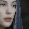
02: Duplicate the base layer, sharpen it (Adjust>Sharpness>Sharpen) and set the duplicate layer's opacity to 58%.
03:We will begin working with the adjustment layers now.
A.) Go to Layers>New Adjustment Layer>Curves and click once on the dotted diagonal line. Set the Channel to RGB. Set the Input to 175 and the Output to 239.
B.) Remaining in the RGB channel, click on the dotted line again and set the Input to 174 and the Output to 210.
C.) Change the Channel to Green. Click on the dotted line again and set the Input to 216 and the Output to 206.
D.) Change the Channel to Blue. Click on the dotted line one last time and set the Input to 235 and the Output the 200.
Click ok. :)
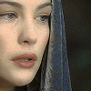
04: Got to Layers>New Adjustment Layer>Brightness/Contrast and set the settings to the following - Brightness=20, Contrast=18.

05: Go to Edit>Copy Merged (Ctrl+Shift+C = keyboard shortcut) and then go to Edit>Paste>Paste As New Layer. (Ctrl+L = Keyboard shortcut.) Now, go to Adjust>Hue and Saturation>Hue/Saturation/Lightness (Shift+H = Keyboard Shortcut) and set the Hue, Saturation, and Lightness all to 0 to desaturate the layer.
06a: Sharpen they eyebrows and the the eyes with the sharpen brush (settings: size=3, hardness=50, step=25, density=100, thinkness=100, rotation=0, opacity=100)
06b: Soften the skin on the face and neck with the soften brush (settings: size=3, hardness=50, step=25, density=100, thinkness=100, rotation=0, opacity=100) avoiding things like the eyebrows, eyes, lips, nostrils and ears. Also, for this icon be careful to avoid the creases of the skin just above the eyes. The purpose of this is to help create the slightly oversharpened look that helps enhance the frosty look.
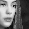
07: Set the greyed and sharpened layer to hardlight, leaving the opacity at 100%.
08: Duplicate the hard light layer and set it to soft light, opacity at 22%.

09: Another Curves Layer.
A.) Go to Layers>New Adjustment Layer>Curves again and click once on the dotted diagonal line. Set the Channel to RGB. Set the Input to 229 and the Output to 250.
B.) Change the Channel to Red. Click on the dotted line again and set the Input to 210 and the Output the 189.
C.) Change the Channel to Green. Click on the dotted line one last time and set the Input to 208 and the Output to 195.
Click ok. :)
10: Go to Layers>New Adjustment Layer>Brightness/Contrast and set the settings to the following - Brightness=0, Contrast=9.
11: Create a new layer and fill it with white (#FFFFFF). Set the layer to Saturation (Legacy) and the opacity to 22. Sometimes this makes a nice icon, but if you want the frosted look do the next few steps.
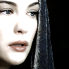
12: Create a new layer, set it to burn and fill it with a medium dark color. For this icon we will use #95ADCF. #ECD6B2 would make a nice golden hue, and I'm sure other colors would work if you experimented with it a little bit.

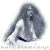
13: Create a new layer between the layers for steps 11 and 12. Use the brush shown below (From Devonshire Design) at full size (Size=255, Step=25, Density=100, Rotation=0, Opacity=100) in white (#FFFFFF). Place the brush in various places on the icon about 2 or 3 times, until it gives a nice frosted look to the icon - you'll have to keep playing with it until you get them placed just right - it varies with every icon. (I probably could have used one more brushing on these examples but I'm not going to bother changing it now.)
to create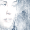
14: On the same layer, use the eraser brush (Settings: Shape=round, Size=37, Hardness=18, Step=10, Density=100, Thickness=100, Rotation=0, Opacity=5) to erase the white layer from the face, as well as hair and clothing if you desire it and find that it looks better. Just be careful not to erase all the frosting away. :)
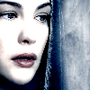
15: Add text and decorative brushes as desired.
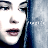
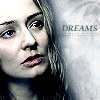
If you want to post something you've made following this tutorial, I'd be happy to see it, but no pressure. :)
Image program: PSP9 (Probably would work on PSP8, but I don't know if it would work below that.)
Level: Intermediate to Advanced
Additional Tools: The Lady of Shalott brush from the Waterhouse Ladies set at Devonshire Design.
Notes: This is an icon that will not be easy for a beginner. Not only does it use adjustment layers, but the frosted layer will be difficult. This tutorial is created from an icon that followed most of the steps in this tutorial by tinuviel428 so it will be very similiar except for a few steps.
01: Create your base.
02: Duplicate the base layer, sharpen it (Adjust>Sharpness>Sharpen) and set the duplicate layer's opacity to 58%.
03:We will begin working with the adjustment layers now.
A.) Go to Layers>New Adjustment Layer>Curves and click once on the dotted diagonal line. Set the Channel to RGB. Set the Input to 175 and the Output to 239.
B.) Remaining in the RGB channel, click on the dotted line again and set the Input to 174 and the Output to 210.
C.) Change the Channel to Green. Click on the dotted line again and set the Input to 216 and the Output to 206.
D.) Change the Channel to Blue. Click on the dotted line one last time and set the Input to 235 and the Output the 200.
Click ok. :)
04: Got to Layers>New Adjustment Layer>Brightness/Contrast and set the settings to the following - Brightness=20, Contrast=18.
05: Go to Edit>Copy Merged (Ctrl+Shift+C = keyboard shortcut) and then go to Edit>Paste>Paste As New Layer. (Ctrl+L = Keyboard shortcut.) Now, go to Adjust>Hue and Saturation>Hue/Saturation/Lightness (Shift+H = Keyboard Shortcut) and set the Hue, Saturation, and Lightness all to 0 to desaturate the layer.
06a: Sharpen they eyebrows and the the eyes with the sharpen brush (settings: size=3, hardness=50, step=25, density=100, thinkness=100, rotation=0, opacity=100)
06b: Soften the skin on the face and neck with the soften brush (settings: size=3, hardness=50, step=25, density=100, thinkness=100, rotation=0, opacity=100) avoiding things like the eyebrows, eyes, lips, nostrils and ears. Also, for this icon be careful to avoid the creases of the skin just above the eyes. The purpose of this is to help create the slightly oversharpened look that helps enhance the frosty look.
07: Set the greyed and sharpened layer to hardlight, leaving the opacity at 100%.
08: Duplicate the hard light layer and set it to soft light, opacity at 22%.
09: Another Curves Layer.
A.) Go to Layers>New Adjustment Layer>Curves again and click once on the dotted diagonal line. Set the Channel to RGB. Set the Input to 229 and the Output to 250.
B.) Change the Channel to Red. Click on the dotted line again and set the Input to 210 and the Output the 189.
C.) Change the Channel to Green. Click on the dotted line one last time and set the Input to 208 and the Output to 195.
Click ok. :)
10: Go to Layers>New Adjustment Layer>Brightness/Contrast and set the settings to the following - Brightness=0, Contrast=9.
11: Create a new layer and fill it with white (#FFFFFF). Set the layer to Saturation (Legacy) and the opacity to 22. Sometimes this makes a nice icon, but if you want the frosted look do the next few steps.
12: Create a new layer, set it to burn and fill it with a medium dark color. For this icon we will use #95ADCF. #ECD6B2 would make a nice golden hue, and I'm sure other colors would work if you experimented with it a little bit.
13: Create a new layer between the layers for steps 11 and 12. Use the brush shown below (From Devonshire Design) at full size (Size=255, Step=25, Density=100, Rotation=0, Opacity=100) in white (#FFFFFF). Place the brush in various places on the icon about 2 or 3 times, until it gives a nice frosted look to the icon - you'll have to keep playing with it until you get them placed just right - it varies with every icon. (I probably could have used one more brushing on these examples but I'm not going to bother changing it now.)
to create
14: On the same layer, use the eraser brush (Settings: Shape=round, Size=37, Hardness=18, Step=10, Density=100, Thickness=100, Rotation=0, Opacity=5) to erase the white layer from the face, as well as hair and clothing if you desire it and find that it looks better. Just be careful not to erase all the frosting away. :)
15: Add text and decorative brushes as desired.
If you want to post something you've made following this tutorial, I'd be happy to see it, but no pressure. :)