????
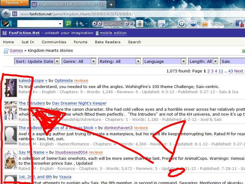
What the actual hell is going on with ff.net's layout???

That is the fugliest thing I ever saw. Layout-wise. Loki is looking damn fine as always. Just the other day I saw a tumblr-post that was a shoutout to ffnet for having the same layout since the beginning of time. It was fine the way it was! Especially now that they added that hideous thing. Imagine finding a fic with an angsty summary, and you're trying to mentally prepare yourself for some angst, but the picture right next to it is so ridiculous that you have to laugh - or maybe the picture is just off-putting. So much more can go wrong now in the entice-your-potential-readers-to-read-your-fic-department!

That is the fugliest thing I ever saw. Layout-wise. Loki is looking damn fine as always. Just the other day I saw a tumblr-post that was a shoutout to ffnet for having the same layout since the beginning of time. It was fine the way it was! Especially now that they added that hideous thing. Imagine finding a fic with an angsty summary, and you're trying to mentally prepare yourself for some angst, but the picture right next to it is so ridiculous that you have to laugh - or maybe the picture is just off-putting. So much more can go wrong now in the entice-your-potential-readers-to-read-your-fic-department!