Icon Tutorial 4
propernice asked for a tutorial, so I complied. Hopefully this is the one you wanted, bb.
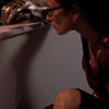
How to go from

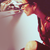
to
(or pretty damn close...)
Made in PS7. Involves curves and selective coloring.
Step 1: Grab your base and prepare it to your liking. Blur the skin if you wish. Sharpen if need be. Crop.
Step 2: Curves layer set at Normal 100%
RGB - I: 97//O:162
Red - I: 108//O:128
Blue - I:126//O:106
Step 3: Selective coloring set at Normal 100%.
Red: -58/0/+34/+18
Yellow: -32/-14/+33/-39
Neutrals: -26/-11/+15/-13
Step 4: Duplicate the base, drag to the top, and set to Screen 100%. The icon should be bright and yellow at this point. We need to fix that.
Step 5: New layer: A light blue (c4d0fe) set to Linear Burn 100%.
Step 6: Curves layer set at Normal 100%
RGB - I: 100//O:118 & I:158//O:181
Red - I: 108//O:128
Blue - I:126//O:106
Step 7: Color balance set at Normal 100%.
Midtones: -2/-5/-19
Shadows: 0/0/0
Highlights: -28/0/0
Step 8: Duplicate the base again, drag to the top, and set to Screen 100%.
Step 9: Hue/Saturation set at Normal 100%.
Master - Saturation: +10
Step 10: Selective coloring set at Normal 100%.
Yellow: +45/+9/+24/0
Neutrals: +21/0/-8/0
Step 11: New layer: Take the soft round brush set to size 45-65 and dot a bright orange (fd971f) where there needs to be light. Set to Screen 50%. (For the purposes of this base, the dot is applied in the wall, underneath the glove.)
Step 12: Duplicate the base again, drag to the top, and set to Screen 100%.
Step 13: New layer: A dark reddish brown (2e0006) set to Exclusion 100%. (No, I’m still not over adding this layer.)
Step 14: Duplicate the base again, drag to the top, and set to Soft Light 25% to recover some of the lost depth of the icon.
Step 15: Take this texture
by satin999 and set to Screen 20%.
Step 16: New layer: Take the soft round brush set to size 100-200 and dot a light gray (dfdfdf) where there needs to be some shadowing.
And you’re done! This should get you pretty close to the icon here. As always, you should play with layer opacities and settings because they will vary from base to base. This tutorial will not work on all icons.
I’d love to see what you guys get. (And on a side note, this icon won Mod’s Choice for the first round at tw_hush.)
How to go from
to
(or pretty damn close...)
Made in PS7. Involves curves and selective coloring.
Step 1: Grab your base and prepare it to your liking. Blur the skin if you wish. Sharpen if need be. Crop.
Step 2: Curves layer set at Normal 100%
RGB - I: 97//O:162
Red - I: 108//O:128
Blue - I:126//O:106
Step 3: Selective coloring set at Normal 100%.
Red: -58/0/+34/+18
Yellow: -32/-14/+33/-39
Neutrals: -26/-11/+15/-13
Step 4: Duplicate the base, drag to the top, and set to Screen 100%. The icon should be bright and yellow at this point. We need to fix that.
Step 5: New layer: A light blue (c4d0fe) set to Linear Burn 100%.
Step 6: Curves layer set at Normal 100%
RGB - I: 100//O:118 & I:158//O:181
Red - I: 108//O:128
Blue - I:126//O:106
Step 7: Color balance set at Normal 100%.
Midtones: -2/-5/-19
Shadows: 0/0/0
Highlights: -28/0/0
Step 8: Duplicate the base again, drag to the top, and set to Screen 100%.
Step 9: Hue/Saturation set at Normal 100%.
Master - Saturation: +10
Step 10: Selective coloring set at Normal 100%.
Yellow: +45/+9/+24/0
Neutrals: +21/0/-8/0
Step 11: New layer: Take the soft round brush set to size 45-65 and dot a bright orange (fd971f) where there needs to be light. Set to Screen 50%. (For the purposes of this base, the dot is applied in the wall, underneath the glove.)
Step 12: Duplicate the base again, drag to the top, and set to Screen 100%.
Step 13: New layer: A dark reddish brown (2e0006) set to Exclusion 100%. (No, I’m still not over adding this layer.)
Step 14: Duplicate the base again, drag to the top, and set to Soft Light 25% to recover some of the lost depth of the icon.
Step 15: Take this texture
by satin999 and set to Screen 20%.
Step 16: New layer: Take the soft round brush set to size 100-200 and dot a light gray (dfdfdf) where there needs to be some shadowing.
And you’re done! This should get you pretty close to the icon here. As always, you should play with layer opacities and settings because they will vary from base to base. This tutorial will not work on all icons.
I’d love to see what you guys get. (And on a side note, this icon won Mod’s Choice for the first round at tw_hush.)