atm | tutorial #3
So john_scorpy asked for a tutorial of this icon, and here I am trying to explain myself the better I can. Hope it's actually useful and not just a lot of babbling. :DDD
>
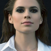
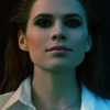
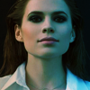
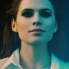
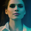
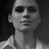
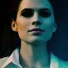
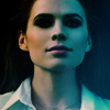
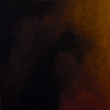
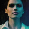
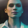
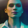
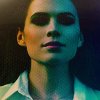
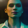
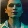
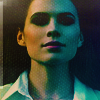
So we are going from this to this. So as you can see there's gonna be a lot of focus on colour and shadows, because that's where I was going~~ (yes, my dear obvious self).
section 01. base colouring.
So, I made this icon for au_rooms mythology challenge, so I really really wanted all the icons to have well... symbolism and a lot of crap nobody would notice but made me happy. So I knew from the start the icon would have two sides, and decided to work from there.
So first thing I did was to draw the colours I wanted over each side, in separate layers. and blur them. So, basically I created two gradients, set the first to multiply and the second to overlay:
+
* +
* >
*black background non-existance in actual layers.
I then added a vibrance layer (75) because I wanted to start poping those colours. But as I wanted to have also more shadows I added a gradient map (#077cb9 to #4f3723)
+
>
vibrance layer + gradient map on soft light.
So now it was a bit too dark, so I added a curves layer (up in the middle, down in the middle of the lowest part lol), selective colouring on yellows (up yellows, down cyans) and cyans (up cyans, down yellows and magentas) to pop those, and another curves layer (same as before but less strong), so it goes like this:
>
>
curves > selective colouring > curves
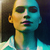
So now it seems like I'm going somewhere, colours are more defined, shadows are stronger, so... I decide to cover it up. Sorta. This time I go the easy way and use two gradients.

* >
* >
*black background non-existance in actual layers.
I set the first to exclusion 50%, and the second one to soft light 100%. But since I liked those shadows I copied it all, pasted it on top, desaturated and put it on soft light.
>
section 02. texture overload.
So now I had shadows plus colours, what I was looking for, but those black were too profund, so it was time to get out the big guns.
So, I took this texture by longerthanwedo, moved it around until the cyans were covering the half of the icon as I was doing, an set it on soft light (17%)
>
The next three textures are all by mm3butterfly @ encorevous. I set this first one on %45 soft light, hoping that it'd light it up a lil bit but the texture wouldn't be too overpowering.
>
For some reason, I like to keep going back on what I'm doing, and I really do love those shadows, so I setted this one on difference (23%)
>
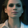
But as I keep contradicting myself, I went and grabed one of my favourites textures and set it on Screen. I like my shadows, but I don't want them to feel empty. And I knew I would push them up later on again. So now we have this:
>
section 03. colouring and (minimal) texturing
So now I'm sorta back into a new base, to call it something. So, I get back to colouring and adding the little touches that will actually turn this into an icon.
So, first, I want to focus on those colours again, which are now a little washed up. So, I add a vibrance layer (100) and a curves one (a very very very soft one to up the contrast a bit)
>
vibrance > curves
And since apparentely, eveything was starting to be too magenta, I added a gradient map (from #656238 to #1a2a29).
+
>
Nexts steps were:
- Adding another texture because in my going back and forth I had lost some of that feeling.
+
>
texture by mm3butterfly once again. set on screen %38
- Using high pass (around ~1) on a merged layer, and adding a random (no, srsly, random... the actual image has a earth globe. IDK), anyway, as I was saying, a random white stripe.
>
highpass ~1 (softlight 25%) + white strip, softlight %100
So back into light and shadows and a bit of colouring, i procedeed to add a b&w gradient map, another vibrance layer to pop the colours once again, and a curves layer.
So we have:

>
>
gradient map on softlight (21%), vibrance 41, curves (up in the middle, still up but not so much on the low part)
So we are almost there. By now I felt I had lost ALL feeling of texture, so I took this one that I had already used, put it on a bigger size (I might have sharpened it then, not 100% sure tho) and moved it around.

>
I put it on screen, @ %25, and then masked away the part on the right size of her face. The nexts two steps is actually a selective colour layer that I duplicated. I focused once again on yellows and cyans. (Cyans: +61 -47 -61 0; Yellows: -59, -14, +79, 0).
>
selective colouring, 36%, on normal > selective colouring, 36%, on luminosity.
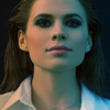
So finally, I copied merged, desaturated, blurred and set on softlight (%58), and added a another curves layer (up in the middle) just to make everything more shiny.
>
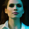
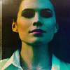
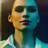
And that's it, that's the final icon :D
TL,DR I basically used graidents&gradients maps and selective colouring for the colouring process, a few textures all together (most by mm3butterfly), and curves to light everything up.
If you want any more details, like the exact curves, tel me and I'll upload them, I just didn't want to take forever on this, and in most of them I just lightned up the mid tones, and maybe darkened the darkest ones for contrast.
If you have any questions anyway, feel free to ask. !
Ask the maker thread
request post
PS: Guys, I'm having a very busy week, so tutorials and request will take more than expected, but I wil do them :D Also, I'm very sorry, I forgot lj puts comments with links as spams. If you'd rather leave me fandoms (if I know them in this case) instead of actual pictures it's alright. Also, I DO see the comments and will unspam them as soon as I can when I do. So don't worry about resending them.
>
So we are going from this to this. So as you can see there's gonna be a lot of focus on colour and shadows, because that's where I was going~~ (yes, my dear obvious self).
section 01. base colouring.
So, I made this icon for au_rooms mythology challenge, so I really really wanted all the icons to have well... symbolism and a lot of crap nobody would notice but made me happy. So I knew from the start the icon would have two sides, and decided to work from there.
So first thing I did was to draw the colours I wanted over each side, in separate layers. and blur them. So, basically I created two gradients, set the first to multiply and the second to overlay:
+
* +
* >
*black background non-existance in actual layers.
I then added a vibrance layer (75) because I wanted to start poping those colours. But as I wanted to have also more shadows I added a gradient map (#077cb9 to #4f3723)
+
>
vibrance layer + gradient map on soft light.
So now it was a bit too dark, so I added a curves layer (up in the middle, down in the middle of the lowest part lol), selective colouring on yellows (up yellows, down cyans) and cyans (up cyans, down yellows and magentas) to pop those, and another curves layer (same as before but less strong), so it goes like this:
>
>
curves > selective colouring > curves
So now it seems like I'm going somewhere, colours are more defined, shadows are stronger, so... I decide to cover it up. Sorta. This time I go the easy way and use two gradients.
* >
* >
*black background non-existance in actual layers.
I set the first to exclusion 50%, and the second one to soft light 100%. But since I liked those shadows I copied it all, pasted it on top, desaturated and put it on soft light.
>
section 02. texture overload.
So now I had shadows plus colours, what I was looking for, but those black were too profund, so it was time to get out the big guns.
So, I took this texture by longerthanwedo, moved it around until the cyans were covering the half of the icon as I was doing, an set it on soft light (17%)
>
The next three textures are all by mm3butterfly @ encorevous. I set this first one on %45 soft light, hoping that it'd light it up a lil bit but the texture wouldn't be too overpowering.
>
For some reason, I like to keep going back on what I'm doing, and I really do love those shadows, so I setted this one on difference (23%)
>
But as I keep contradicting myself, I went and grabed one of my favourites textures and set it on Screen. I like my shadows, but I don't want them to feel empty. And I knew I would push them up later on again. So now we have this:
>
section 03. colouring and (minimal) texturing
So now I'm sorta back into a new base, to call it something. So, I get back to colouring and adding the little touches that will actually turn this into an icon.
So, first, I want to focus on those colours again, which are now a little washed up. So, I add a vibrance layer (100) and a curves one (a very very very soft one to up the contrast a bit)
>
vibrance > curves
And since apparentely, eveything was starting to be too magenta, I added a gradient map (from #656238 to #1a2a29).
+
>
Nexts steps were:
- Adding another texture because in my going back and forth I had lost some of that feeling.
+
>
texture by mm3butterfly once again. set on screen %38
- Using high pass (around ~1) on a merged layer, and adding a random (no, srsly, random... the actual image has a earth globe. IDK), anyway, as I was saying, a random white stripe.
>
highpass ~1 (softlight 25%) + white strip, softlight %100
So back into light and shadows and a bit of colouring, i procedeed to add a b&w gradient map, another vibrance layer to pop the colours once again, and a curves layer.
So we have:
>
>
gradient map on softlight (21%), vibrance 41, curves (up in the middle, still up but not so much on the low part)
So we are almost there. By now I felt I had lost ALL feeling of texture, so I took this one that I had already used, put it on a bigger size (I might have sharpened it then, not 100% sure tho) and moved it around.
>
I put it on screen, @ %25, and then masked away the part on the right size of her face. The nexts two steps is actually a selective colour layer that I duplicated. I focused once again on yellows and cyans. (Cyans: +61 -47 -61 0; Yellows: -59, -14, +79, 0).
>
selective colouring, 36%, on normal > selective colouring, 36%, on luminosity.
So finally, I copied merged, desaturated, blurred and set on softlight (%58), and added a another curves layer (up in the middle) just to make everything more shiny.
>
And that's it, that's the final icon :D
TL,DR I basically used graidents&gradients maps and selective colouring for the colouring process, a few textures all together (most by mm3butterfly), and curves to light everything up.
If you want any more details, like the exact curves, tel me and I'll upload them, I just didn't want to take forever on this, and in most of them I just lightned up the mid tones, and maybe darkened the darkest ones for contrast.
If you have any questions anyway, feel free to ask. !
Ask the maker thread
request post
PS: Guys, I'm having a very busy week, so tutorials and request will take more than expected, but I wil do them :D Also, I'm very sorry, I forgot lj puts comments with links as spams. If you'd rather leave me fandoms (if I know them in this case) instead of actual pictures it's alright. Also, I DO see the comments and will unspam them as soon as I can when I do. So don't worry about resending them.