[tutorial] First attempt
post title translated into: OMG, she made a tutorial, run away... u_u
I keep spamming you today <3! But benelie asked for a tutorial for this icon… and… somehow I got myself to do it. So… I hope I just don’t… fail big… u_u
Anyway, first tutorial in English I make (second one in general!) First I need to thank make_me_irish and morningglory___ for helping me translating all my commands, cause, you know, my photoshop is in Spanish. So, I think this is pretty messed up, but I hope you can understand it, and that I didn’t make any really huge mistakes! If you have a question, ask <3!
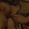
First thing, I got the image… that would be this from homeofthenutty. I personally never crop/cut them, I open a white 100x100 archive and paste the big image there, so then, I change the size of the original image and move it around to find the best cropping.
Once you have that, you’ll have something like this:
First thing, duplicate the base image twice. You’ll have now 3 layers. The first (the original one) will always remain the same, is the background one.
Now, go to the second one and go to… Filters/Blur/Gausian blur.
Enter between ONE or TWO of blurring, press ok, and then set the layer to screen.
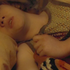
Mine looks like this:

You may need to change the opacity of the layer if the image is too white. But it probably will work ok with 100%.
Now, on the other Layer you copied, set it to Linear Light. So that borders and stuff are clear and not blurred. Like this:
Next step is saturation. Go to Image / Adjustments / Hue/Saturation
Now, I used the followings:
All:
Saturation: +59
Reds:
Saturation: -10
Yellows:
Saturation: -95
Anyway, image is still too dark, well, mine is, so… next step is Image / Adjustments / Curves
Bleh, pretty sure you know how this works, but, bleh, just discovered sth myself while doing the tutorial, so… I’ll explain it as if you never on your life used this u.u
Make click on the line, and the boxes for Input and output will appear. For this I used:
Input: 93
Output: 116
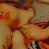
My icon now looks like this now:
So, up to the next step: Colour balance (that’d be Image / Adjustments / Colour balance)
Shadows:
-8, -5, +7
Midtones:
-12, +1, +6
Highlights:
+1, 0, -14
Now I’ve got this:

For my taste, the icon was still too orange/red. So, I applied Hue/Saturation again.
All:
Saturation: +21
Reds:
Saturation: -22
Yellows:
Saturation: -48
And to highlight it even more, went and used Curves again too.
This time:
Input: 90
Output: 131
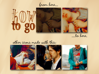
And now, the end! Icon looks like this:
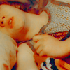
I hope it was clear and you found it useful! Remember to ask if there’s sth you don’t understand, and sorry if it was lame!! Please comment and tell me watch you thought, so that I know if I totally should never do one of this again LOL
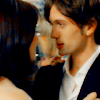
Btw, I specially made those other icons cause I hadn’t applied the colouring to anything else… so, I leave them here if you wanna use them:
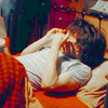
||
||
Remember, comments&credit are always love <3!
I keep spamming you today <3! But benelie asked for a tutorial for this icon… and… somehow I got myself to do it. So… I hope I just don’t… fail big… u_u
Anyway, first tutorial in English I make (second one in general!) First I need to thank make_me_irish and morningglory___ for helping me translating all my commands, cause, you know, my photoshop is in Spanish. So, I think this is pretty messed up, but I hope you can understand it, and that I didn’t make any really huge mistakes! If you have a question, ask <3!

First thing, I got the image… that would be this from homeofthenutty. I personally never crop/cut them, I open a white 100x100 archive and paste the big image there, so then, I change the size of the original image and move it around to find the best cropping.
Once you have that, you’ll have something like this:

First thing, duplicate the base image twice. You’ll have now 3 layers. The first (the original one) will always remain the same, is the background one.
Now, go to the second one and go to… Filters/Blur/Gausian blur.
Enter between ONE or TWO of blurring, press ok, and then set the layer to screen.
Mine looks like this:

You may need to change the opacity of the layer if the image is too white. But it probably will work ok with 100%.
Now, on the other Layer you copied, set it to Linear Light. So that borders and stuff are clear and not blurred. Like this:

Next step is saturation. Go to Image / Adjustments / Hue/Saturation
Now, I used the followings:
All:
Saturation: +59
Reds:
Saturation: -10
Yellows:
Saturation: -95
Anyway, image is still too dark, well, mine is, so… next step is Image / Adjustments / Curves
Bleh, pretty sure you know how this works, but, bleh, just discovered sth myself while doing the tutorial, so… I’ll explain it as if you never on your life used this u.u
Make click on the line, and the boxes for Input and output will appear. For this I used:
Input: 93
Output: 116
My icon now looks like this now:

So, up to the next step: Colour balance (that’d be Image / Adjustments / Colour balance)
Shadows:
-8, -5, +7
Midtones:
-12, +1, +6
Highlights:
+1, 0, -14
Now I’ve got this:

For my taste, the icon was still too orange/red. So, I applied Hue/Saturation again.
All:
Saturation: +21
Reds:
Saturation: -22
Yellows:
Saturation: -48
And to highlight it even more, went and used Curves again too.
This time:
Input: 90
Output: 131
And now, the end! Icon looks like this:

I hope it was clear and you found it useful! Remember to ask if there’s sth you don’t understand, and sorry if it was lame!! Please comment and tell me watch you thought, so that I know if I totally should never do one of this again LOL
Btw, I specially made those other icons cause I hadn’t applied the colouring to anything else… so, I leave them here if you wanna use them:

||

||

Remember, comments&credit are always love <3!