elise's first ever icon tutorial!
Hello all! I was home from school today to catch up on my sleep (or attempt to, at least), and now that I'm awake I figured I'd get my butt in gear and write up the tutorial I promised! Well, I didn't promise it so much as say, "Hmm, maybe I'll make a tutorial for this," but that's beside the point.
Unfortunately this tutorial isn't translatable because it involves selective coloring. If you really want me to, I could screw around with the channel mixer and try to recreate the selective color using that. I don't know if I'll be able to, but I could try. Let me know, I'd be happy to do it.
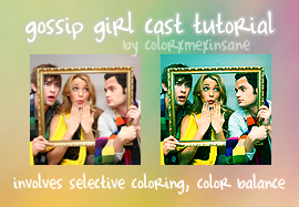
(See the post this icon is from here.)
001. Crop your base to 100 by 100. I'm using a base from this photo from YouKnowYouLoveMe.Org. If your base is dark, you may need to duplicate it and set the layer to screen.

002. My base was kind of blurry, so I sharpened it once. You may not need to sharpen at all, or you may need to sharpen more than once. It all depends on your image.

>
003. Create a new hue/saturation layer (Layer > New Adjustment Layer > Hue/Saturation). Increase the master saturation to +25.

>
004. Create a new color balance layer (Layer > New Adjustment Layer > Color Balance). Enter the following settings:
Midtones: -22, 29, 46
Shadows: -48, 33, 21
Leave highlights alone.

>
005. Now it's time for the selective color layer! (Layer > New Adjustment Layer > Selective Color) Enter the following settings:
Reds: 100, 0, 100, 0
Yellows: 100, 53, 18, 0
Greens: 100, 0, 0, 0
Cyans: 100, 23, 0, 7
Blues: 100, 0, 0, 0
Neutrals: 51, 1, 12, 0

>
006. Almost done! Duplicate your base and drag it to the top. Change the blend mode to soft light and change the opacity to 40%.

>
And that's it! Remember that you don't have to follow this tutorial exactly; feel free to play around with the settings until you find something you like. I'd love to see results if you try this out. -winkwink-
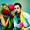
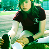
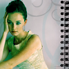
Other icons made using this tutorial:


Unfortunately this tutorial isn't translatable because it involves selective coloring. If you really want me to, I could screw around with the channel mixer and try to recreate the selective color using that. I don't know if I'll be able to, but I could try. Let me know, I'd be happy to do it.

(See the post this icon is from here.)
001. Crop your base to 100 by 100. I'm using a base from this photo from YouKnowYouLoveMe.Org. If your base is dark, you may need to duplicate it and set the layer to screen.

002. My base was kind of blurry, so I sharpened it once. You may not need to sharpen at all, or you may need to sharpen more than once. It all depends on your image.

>

003. Create a new hue/saturation layer (Layer > New Adjustment Layer > Hue/Saturation). Increase the master saturation to +25.

>

004. Create a new color balance layer (Layer > New Adjustment Layer > Color Balance). Enter the following settings:
Midtones: -22, 29, 46
Shadows: -48, 33, 21
Leave highlights alone.

>

005. Now it's time for the selective color layer! (Layer > New Adjustment Layer > Selective Color) Enter the following settings:
Reds: 100, 0, 100, 0
Yellows: 100, 53, 18, 0
Greens: 100, 0, 0, 0
Cyans: 100, 23, 0, 7
Blues: 100, 0, 0, 0
Neutrals: 51, 1, 12, 0

>

006. Almost done! Duplicate your base and drag it to the top. Change the blend mode to soft light and change the opacity to 40%.

>

And that's it! Remember that you don't have to follow this tutorial exactly; feel free to play around with the settings until you find something you like. I'd love to see results if you try this out. -winkwink-
Other icons made using this tutorial:
