Icon Tut #3
Oookay, since I have no life, I decided to do yet another icon tutorial. It's been a while since I did my last one, and a friend asked me to do one for this particular icon anyways. ^^
Go from this:
to this: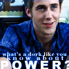
Programs used: PS7
So, we have the base:
, which I got from a bunch of caps I took of Ryan Gosling from the movie, Murder By Numbers. Crop the original image (100x100) and Auto Contrast (Image > Adjustments > Auto Contrast).
Duplicate the base layer, desaturate (Image > Adjustments > Desaturate), and lower the opacity to 30%.
It should look like this:
Duplicate the base layer again, and set it on top of the desaturated layer, and change the blend mode to Soft Light, 100% opacity.
So far:
The icon looks more defined without having to sharpen it, and it seems like it has more depth. But I wanted to make the colors brighter and more contrasted -
With the lasso tool (example), select Ryan's shirt like so:
I also selected his eyes too. Create a new layer and flood fill the selection with #5F8CE3. Blend mode Color, 100%.
This is the result:
Under the Colored layer, apply the text. The reason for the text being under the color layer is because it gives sort of a glow around the text. I chose a quote from the movie - "What's a dork like you know about power?"
First text layer, font is Georgia, bold, size 7pt, anti-alias smooth, color #FFFFFF, and text is "what's a dork like you".
Second text layer, font is also Georgia, bold, size 9pt, AV width spacing 350 (example), anti-alias smooth, color #FFFFFF, text is "know about".
Third text layer, font is Arial Black, size 18pt, AV width spacing 225, anti-alias smooth, color #FFFFFF, text is "power?" in caps.
This is what all the text looks like: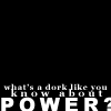
and this is what the text on the icon looks like: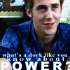
And here we select a brush by _joni: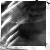
. On a new layer above the Color layer, apply the brush in #5F8CE3.
Et voilà:
If any of this was confusing or unclear, please let me know and I'll try to explain myself better. Comments are appreciated. XD
Go from this:

to this:

Programs used: PS7
So, we have the base:

, which I got from a bunch of caps I took of Ryan Gosling from the movie, Murder By Numbers. Crop the original image (100x100) and Auto Contrast (Image > Adjustments > Auto Contrast).
Duplicate the base layer, desaturate (Image > Adjustments > Desaturate), and lower the opacity to 30%.
It should look like this:

Duplicate the base layer again, and set it on top of the desaturated layer, and change the blend mode to Soft Light, 100% opacity.
So far:

The icon looks more defined without having to sharpen it, and it seems like it has more depth. But I wanted to make the colors brighter and more contrasted -
With the lasso tool (example), select Ryan's shirt like so:

I also selected his eyes too. Create a new layer and flood fill the selection with #5F8CE3. Blend mode Color, 100%.
This is the result:

Under the Colored layer, apply the text. The reason for the text being under the color layer is because it gives sort of a glow around the text. I chose a quote from the movie - "What's a dork like you know about power?"
First text layer, font is Georgia, bold, size 7pt, anti-alias smooth, color #FFFFFF, and text is "what's a dork like you".
Second text layer, font is also Georgia, bold, size 9pt, AV width spacing 350 (example), anti-alias smooth, color #FFFFFF, text is "know about".
Third text layer, font is Arial Black, size 18pt, AV width spacing 225, anti-alias smooth, color #FFFFFF, text is "power?" in caps.
This is what all the text looks like:

and this is what the text on the icon looks like:

And here we select a brush by _joni:

. On a new layer above the Color layer, apply the brush in #5F8CE3.
Et voilà:

If any of this was confusing or unclear, please let me know and I'll try to explain myself better. Comments are appreciated. XD