My Icon History
It's almost the new year, a time for thought and reflection so I decided go over all my old icons and see how much I've improved. Then I thought why not post my icon history so you guys can get a kick out of it like I did? I also hope that this offers some hope to those of you who think they'll never get better. Look how much I've improved in just nine months, you can do it too! So kick back, relax, and prepare to laugh at my stinky icons.
-------------------------------------------------------------------------
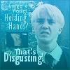
I couldn't find and frankly I don't remember the first icon I ever made but this Draco one is one of the first that I ever posted (04/04/05). Very simple as you can see.

I used a lot of gradients in my first few icons. Mostly set on "screen" which tended to wash everything out. Not a good idea! Creative cropping was virtually non-existent and my text was simple and kind of pixelated. And not to mention the true sign of a newbie, I used borders, very ugly borders. Some icons makers know how to use borders very creatively. I did not. I still do not, which is why I avoid them at all costs.
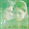

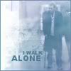
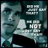
Okay I moved on from the washed out icons to a phase I like to call "Text of House". Which is exactly what it sounds like, lots and lots of text quotes from the tv show "House M.D." This was my first tv fandom so nearly all my earlier icons are based around it. I stopped using gradients (thank god) and just slapped funny quotes and lines from the show onto simple caps. And by golly, people loved them! Of course I'm sure this was due far more to the genius of the show's writers than any skill I had at that point.
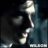
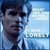
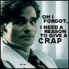
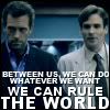
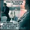
More "Text of House" icons with a few Harry Potter thrown in. Except now I started working on the clarity of the actual picture as well. A bit more clear and crisp but not a vast improvement. And I went from a 1 pixel border to a 2 pixel border! *groans* But look the first sign of good cropping Yay! *claps*
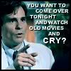

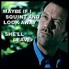


And then I started making up my own lines instead of just using direct quotes. The icon quality isn't that great but some of these icons still make me crack up.

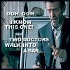
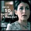
I had a bit of a relapse and went back to the "washed out" stage. *covers eyes* It's too painful to watch! But, yay, I finally started to use brushes!
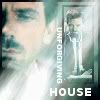
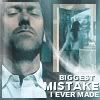
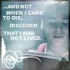
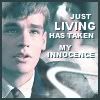
Then came my "confused" stage in which I went back and forth between washed out icons, badly used gradients and simple text (all in one post too). Yeah, I guess I'll just say I was "experimenting".
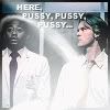
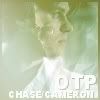
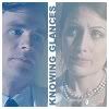
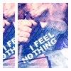

And then came the light texture phase. In my defense I'd just like to say, "Everyone else was doing it!" Yeah I know, if everyone else started using ugly dots on their icons would I do it too? Yes, I mean no, uh. Onto the icons! So besides the light textures I also started doing a bit of blending and using boxes for the first time.

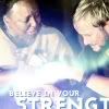
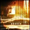
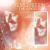

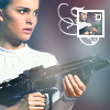
Star Wars! Yes, I moved on from House to the epic geek fandom that is Star Wars. In terms of style I used lots of light textures and gradients (although not set on screen anymore - well, at least not all the time). I also improved the clarity of the pics and the cropping.
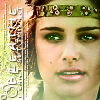

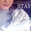
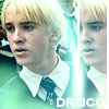

I made lots and lots of icons of House and Star Wars using light textures but I made one batch of LOTR icons that I am very proud of. Yes I used gradients here too but I put so much time and effort into each icon that I just had to stop and admire them. So pretty....
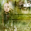
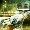
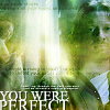
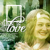


Okay onto the self-bashing self-evaluation. I started experimenting with cropping and brushes but still used gradients (badly). And it was around this time (and a bit earlier, in fact) that I started using text brushes. I hadn't found a way to improve my own text skills so I borowed the talent of others (with credit of course). Thank you to all the wonderful people that make text brushes for the text-ly-challenged people like me. As I said before, I also started cropping more and made lots of "boxy" icons.
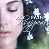
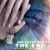

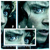
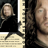
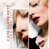
And then I finally started to ween myself off the gradients and light textures. It's about time! This was getting to be more painful than I thought it would be. The clarity of my icons got better and I started working on my own text again.
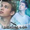
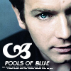
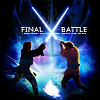
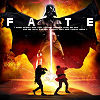
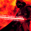
Then I fell into the next phase that hit the iconing community, "black & white icons with a splash of color" or in my case, color icons with a splash of black & white. This was a good trend. Unlike the light textures, anyone could achieve this effect without a lot of talent or skill. Very lucky for me, indeed! And I also started putting a brush of color behind my text to make it stick out. And...look my first animation! Awwww.
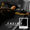
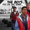
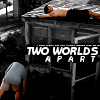
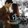
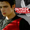
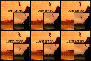
And then came the craze of icons100 where you had to make 100 icons of your favorite movie or character. And the fangirls went crazy... The first one I did was for the movie Equilibrium and the best thing to come out of that was these cool animations. Yes, 100 icons, and I only have these icons to show for it. *face palms* Even then, the idea for the animations was stolen from I mean inspired by kiwi28's amazing lotr animations (who I gave credit to at the bottom of my icon post). If there's one thing that I am most proud of, it is that I gave credit for everything that I used and everyone that inspired me ever since I started iconning. Remember that! Credit is essential.

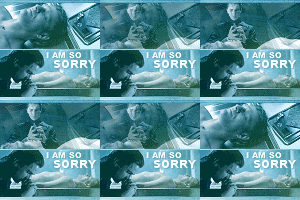
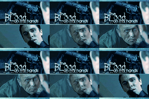
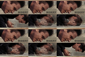
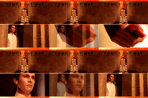
And being the crazy fangirl that I am, I signed up for two challenges at once, Equilibrium and Bruce Wayne from Batman Begins. But I got to stare at my favorite actor, Christian Bale so it was all good (expect for all the drool that clogged up my keyboard during this time). Darn that man and his yummy biceps! Anyways, I kind of went back and forth between using text brushes and my own text (with the brush of black behind it) during this time.
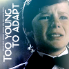



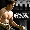
I went through all the icons I made for these two challenges and the best ones were the ones in which I used no gradients or brushes at all. See, sometimes simplicity is the best technique of all!
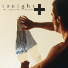
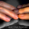

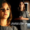
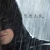
Then came a short-lived phase of using small text, just big enough to read and the color blue set on "exclusion". Pretty but hard on the eyes!
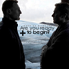


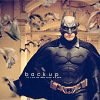

And along came the next trend of the iconning community, Boxes! I loved these little boxes to pieces; it added a whole new dimension to the icons. But alas, I still used gradients set on "screen". *shakes head at stupidity* I also dove head first into the "black & white with a splash of color" trend and used it everywhere. Really I do mean, everywhere!!
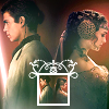

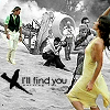

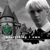
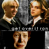
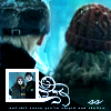
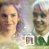
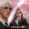
Then when I started my set of 50 Draco/Hermione icons for ships100, I used a mixture of all styles I had used before. Everything from gradients and light textures *cringe* to boxes and text brushes. This was kind of a culmination of everything that had come before. I had been blending and making manips long before I got into iconning so this gave me an opportunity to get back to my roots.
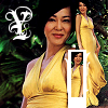
And finally I entered a new phase of icons when I made these A*Teens and Aishwarya Rai ones. I started to concentrate more on the clarity and cropping of the images and I used light textures more effectively. *breaths a sigh of relief*
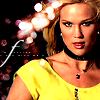
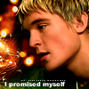
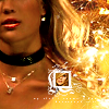
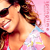
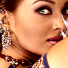
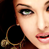
After this I kind of drew back from gradients and brushes all together and made very simple icons.
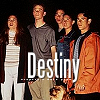

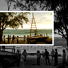
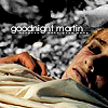
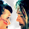
Then came time for a new style, the "scrapbook look". It doesn't look like much but it took me ages to finish each icon! Besides, this style really helped me improve my cropping skills and I learned to format the "overall look" of an icon. You know, getting the colors and text and pictures to all work together/compliment each other. I learned to make my icons complete! Although the effects of that learning did not really begin to show until the end of this stage.

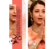
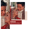
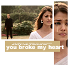

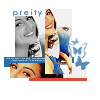
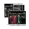
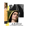
Using what I had learned, I evolved the "scrapbook look" by using textures for the first time. But my text still needs a lot of work. Which is why I chose to either leave my icons textless or use the small font I had been using earlier. Poor badly texted icons...
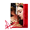
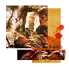
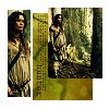
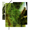
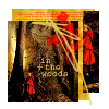
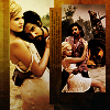
I had a bit of a relapse of using gradients again (Ahh! Will they never leave?!) and I continued to use textures (and small text) in my icons
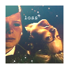
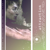

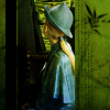
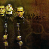
Then I finally started experimenting with different fonts and font sizes (yay!) and I got better at using gradients (kind of).

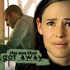
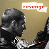
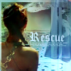
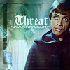
I went back to my first fandom, House M.D., with the techniques I had learned and as you can see, I used better cropping and the colors of my icons are more crisp and sharp. I also started to use larger and more varied fonts.
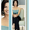
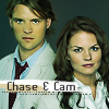

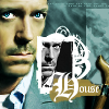
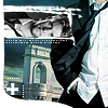

And then came Supernatural! It was at this point that I started to fully experiment with lots of different fonts (although I wasn't always successful in these attempts). And I continued to improve the coloring of my icons by enhancing the colors on my own rather than using gradients. There's a tip for all you icon makers!
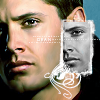
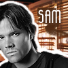
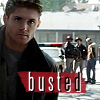

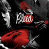

Since this was my first step into a new fandom, I used all the techniques I had learned earlier, boxes, brushes of black or color behind text, black and white with a splash of color and even a variation of the "scrapbook" look. It's a big ol' bundle of mixed-up mess!
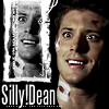
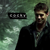


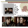

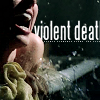
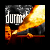
And then I discovered two new things, the font "Steelfish" and the technique of erasing parts of a word so the word seems to disappear behind a person or object, creating a 3-D look. Snazy isn't it? Okay, not quite yet, but I got better at it later.
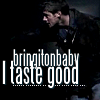
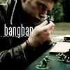
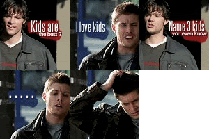
I also started making the well loved, Dean/Sam conversation icons. This was kind of a nod back to the funny House icons I use to make back when I first started. My biggest problem with these icons was that the image quality was so poor. I used (and still use) Animation Shop to make them so I always have to reduce the quality to make sure the icon is under 40K. (I'm in the process of getting Image Ready, suggested by the wonderful fearkills, so hopefully this will be remedied in future animated icons)
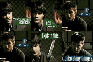


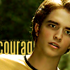
I continued to use the font "Steelfish" on my icons but I also ventured into the "Alias" font and a couple of other fonts as well. And look the first emergence of the "dotted line" brush. (You saw it coming, didn't you!) It was at this time that I started using the "smooth" & "sharpen" brushes to improve the quality of my icons....and began to fall into the pit of "shiny eyes and porcelain skin". Yikes! Another word of advice, sometimes too much perfection is just that, too much!
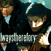
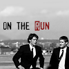
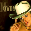
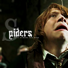


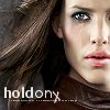
And here I am at the bottom of that pit, with yukky gradients and all. *peeks between the hands covering her face* What was I thinking?
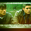
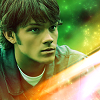
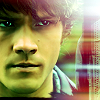
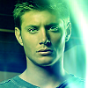
Thankfully I emerged from the pit with a bit of advice from pixiewildfire. Then I took a completely different turn with my icons by using various textures and new fonts but no "smoothening". I also took a bit of a step back to the "scrapbook" style from before. Icon makers always return to what they know best!
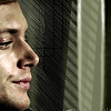
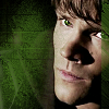
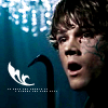
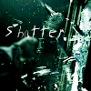
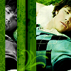
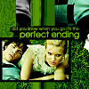
Eventually, I slowly started using "smooth" tool again although way more sparingly than before! I also began using the "burn" option to apply color to my icons which was inspired by the creative tinamishi. In terms of text, I tended to stay away from it all together and used it only when I could think of a creative way to make it fit with the icon. Smart move! I am finally learning, aren't I?
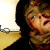
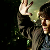
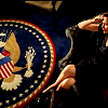
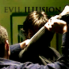
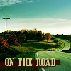

And with these "Dark Angel" icons came the peak use of the "burn" technique and my plunge into the world of "dotted lines". Oh how addictive those silly little lines can be. Admit it! You've all used them or at least thought about using them! Fess up.
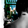
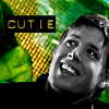
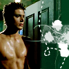
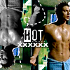
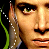
I moved back to Supernatural and used lots of new fonts and that technique I had used earlier, the color blue set on "exclusion". See? Once again going back to what I know best...

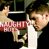
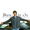
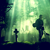
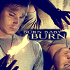
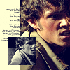
Then came two new techniques, "The Return to Boxes" and "Brushes Galore" The first technique was a return to the boxes I had used earlier but now in a much simpler way and sometimes with no border at all.
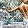
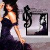
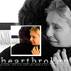
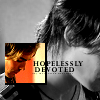
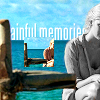
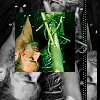
The second technique, "Brushes Galore" involved the use of lots and lots of brushes. Flowers, decorations, symbols, dotted lines, just about everything really. And especially the use of tiny text! I've been using tiny text for as long as I can remember but I used it like crazy in these icons.
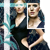
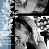
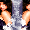
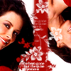
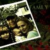
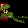
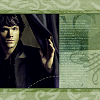
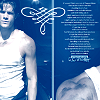
The End. (Okay, not really, because I've made lots of icons since then but they're so recent that I don't have much to say about them. Plus, it makes a lot more sense to look back at them a year from now and see how much I've improved by then.)
-------------------------------------------------------------------------------------
I hope you've enjoyed the ride, had a few laughs along the way and gained some confidence because no matter how bad you think your icons are now, you can improve by leaps and bounds if you practice. That applies to everything in life so never give up! And Happy New Year (in case I don't post before then)!
This was inspired by the icon histories done by the members of the month at icon_crack.
-------------------------------------------------------------------------
I couldn't find and frankly I don't remember the first icon I ever made but this Draco one is one of the first that I ever posted (04/04/05). Very simple as you can see.
I used a lot of gradients in my first few icons. Mostly set on "screen" which tended to wash everything out. Not a good idea! Creative cropping was virtually non-existent and my text was simple and kind of pixelated. And not to mention the true sign of a newbie, I used borders, very ugly borders. Some icons makers know how to use borders very creatively. I did not. I still do not, which is why I avoid them at all costs.
Okay I moved on from the washed out icons to a phase I like to call "Text of House". Which is exactly what it sounds like, lots and lots of text quotes from the tv show "House M.D." This was my first tv fandom so nearly all my earlier icons are based around it. I stopped using gradients (thank god) and just slapped funny quotes and lines from the show onto simple caps. And by golly, people loved them! Of course I'm sure this was due far more to the genius of the show's writers than any skill I had at that point.
More "Text of House" icons with a few Harry Potter thrown in. Except now I started working on the clarity of the actual picture as well. A bit more clear and crisp but not a vast improvement. And I went from a 1 pixel border to a 2 pixel border! *groans* But look the first sign of good cropping Yay! *claps*
And then I started making up my own lines instead of just using direct quotes. The icon quality isn't that great but some of these icons still make me crack up.
I had a bit of a relapse and went back to the "washed out" stage. *covers eyes* It's too painful to watch! But, yay, I finally started to use brushes!
Then came my "confused" stage in which I went back and forth between washed out icons, badly used gradients and simple text (all in one post too). Yeah, I guess I'll just say I was "experimenting".
And then came the light texture phase. In my defense I'd just like to say, "Everyone else was doing it!" Yeah I know, if everyone else started using ugly dots on their icons would I do it too? Yes, I mean no, uh. Onto the icons! So besides the light textures I also started doing a bit of blending and using boxes for the first time.
Star Wars! Yes, I moved on from House to the epic geek fandom that is Star Wars. In terms of style I used lots of light textures and gradients (although not set on screen anymore - well, at least not all the time). I also improved the clarity of the pics and the cropping.
I made lots and lots of icons of House and Star Wars using light textures but I made one batch of LOTR icons that I am very proud of. Yes I used gradients here too but I put so much time and effort into each icon that I just had to stop and admire them. So pretty....
Okay onto the self-bashing self-evaluation. I started experimenting with cropping and brushes but still used gradients (badly). And it was around this time (and a bit earlier, in fact) that I started using text brushes. I hadn't found a way to improve my own text skills so I borowed the talent of others (with credit of course). Thank you to all the wonderful people that make text brushes for the text-ly-challenged people like me. As I said before, I also started cropping more and made lots of "boxy" icons.
And then I finally started to ween myself off the gradients and light textures. It's about time! This was getting to be more painful than I thought it would be. The clarity of my icons got better and I started working on my own text again.
Then I fell into the next phase that hit the iconing community, "black & white icons with a splash of color" or in my case, color icons with a splash of black & white. This was a good trend. Unlike the light textures, anyone could achieve this effect without a lot of talent or skill. Very lucky for me, indeed! And I also started putting a brush of color behind my text to make it stick out. And...look my first animation! Awwww.
And then came the craze of icons100 where you had to make 100 icons of your favorite movie or character. And the fangirls went crazy... The first one I did was for the movie Equilibrium and the best thing to come out of that was these cool animations. Yes, 100 icons, and I only have these icons to show for it. *face palms* Even then, the idea for the animations was stolen from I mean inspired by kiwi28's amazing lotr animations (who I gave credit to at the bottom of my icon post). If there's one thing that I am most proud of, it is that I gave credit for everything that I used and everyone that inspired me ever since I started iconning. Remember that! Credit is essential.
And being the crazy fangirl that I am, I signed up for two challenges at once, Equilibrium and Bruce Wayne from Batman Begins. But I got to stare at my favorite actor, Christian Bale so it was all good (expect for all the drool that clogged up my keyboard during this time). Darn that man and his yummy biceps! Anyways, I kind of went back and forth between using text brushes and my own text (with the brush of black behind it) during this time.
I went through all the icons I made for these two challenges and the best ones were the ones in which I used no gradients or brushes at all. See, sometimes simplicity is the best technique of all!
Then came a short-lived phase of using small text, just big enough to read and the color blue set on "exclusion". Pretty but hard on the eyes!
And along came the next trend of the iconning community, Boxes! I loved these little boxes to pieces; it added a whole new dimension to the icons. But alas, I still used gradients set on "screen". *shakes head at stupidity* I also dove head first into the "black & white with a splash of color" trend and used it everywhere. Really I do mean, everywhere!!
Then when I started my set of 50 Draco/Hermione icons for ships100, I used a mixture of all styles I had used before. Everything from gradients and light textures *cringe* to boxes and text brushes. This was kind of a culmination of everything that had come before. I had been blending and making manips long before I got into iconning so this gave me an opportunity to get back to my roots.
And finally I entered a new phase of icons when I made these A*Teens and Aishwarya Rai ones. I started to concentrate more on the clarity and cropping of the images and I used light textures more effectively. *breaths a sigh of relief*
After this I kind of drew back from gradients and brushes all together and made very simple icons.
Then came time for a new style, the "scrapbook look". It doesn't look like much but it took me ages to finish each icon! Besides, this style really helped me improve my cropping skills and I learned to format the "overall look" of an icon. You know, getting the colors and text and pictures to all work together/compliment each other. I learned to make my icons complete! Although the effects of that learning did not really begin to show until the end of this stage.
Using what I had learned, I evolved the "scrapbook look" by using textures for the first time. But my text still needs a lot of work. Which is why I chose to either leave my icons textless or use the small font I had been using earlier. Poor badly texted icons...
I had a bit of a relapse of using gradients again (Ahh! Will they never leave?!) and I continued to use textures (and small text) in my icons
Then I finally started experimenting with different fonts and font sizes (yay!) and I got better at using gradients (kind of).
I went back to my first fandom, House M.D., with the techniques I had learned and as you can see, I used better cropping and the colors of my icons are more crisp and sharp. I also started to use larger and more varied fonts.
And then came Supernatural! It was at this point that I started to fully experiment with lots of different fonts (although I wasn't always successful in these attempts). And I continued to improve the coloring of my icons by enhancing the colors on my own rather than using gradients. There's a tip for all you icon makers!
Since this was my first step into a new fandom, I used all the techniques I had learned earlier, boxes, brushes of black or color behind text, black and white with a splash of color and even a variation of the "scrapbook" look. It's a big ol' bundle of mixed-up mess!
And then I discovered two new things, the font "Steelfish" and the technique of erasing parts of a word so the word seems to disappear behind a person or object, creating a 3-D look. Snazy isn't it? Okay, not quite yet, but I got better at it later.
I also started making the well loved, Dean/Sam conversation icons. This was kind of a nod back to the funny House icons I use to make back when I first started. My biggest problem with these icons was that the image quality was so poor. I used (and still use) Animation Shop to make them so I always have to reduce the quality to make sure the icon is under 40K. (I'm in the process of getting Image Ready, suggested by the wonderful fearkills, so hopefully this will be remedied in future animated icons)
I continued to use the font "Steelfish" on my icons but I also ventured into the "Alias" font and a couple of other fonts as well. And look the first emergence of the "dotted line" brush. (You saw it coming, didn't you!) It was at this time that I started using the "smooth" & "sharpen" brushes to improve the quality of my icons....and began to fall into the pit of "shiny eyes and porcelain skin". Yikes! Another word of advice, sometimes too much perfection is just that, too much!
And here I am at the bottom of that pit, with yukky gradients and all. *peeks between the hands covering her face* What was I thinking?
Thankfully I emerged from the pit with a bit of advice from pixiewildfire. Then I took a completely different turn with my icons by using various textures and new fonts but no "smoothening". I also took a bit of a step back to the "scrapbook" style from before. Icon makers always return to what they know best!
Eventually, I slowly started using "smooth" tool again although way more sparingly than before! I also began using the "burn" option to apply color to my icons which was inspired by the creative tinamishi. In terms of text, I tended to stay away from it all together and used it only when I could think of a creative way to make it fit with the icon. Smart move! I am finally learning, aren't I?
And with these "Dark Angel" icons came the peak use of the "burn" technique and my plunge into the world of "dotted lines". Oh how addictive those silly little lines can be. Admit it! You've all used them or at least thought about using them! Fess up.
I moved back to Supernatural and used lots of new fonts and that technique I had used earlier, the color blue set on "exclusion". See? Once again going back to what I know best...
Then came two new techniques, "The Return to Boxes" and "Brushes Galore" The first technique was a return to the boxes I had used earlier but now in a much simpler way and sometimes with no border at all.
The second technique, "Brushes Galore" involved the use of lots and lots of brushes. Flowers, decorations, symbols, dotted lines, just about everything really. And especially the use of tiny text! I've been using tiny text for as long as I can remember but I used it like crazy in these icons.
The End. (Okay, not really, because I've made lots of icons since then but they're so recent that I don't have much to say about them. Plus, it makes a lot more sense to look back at them a year from now and see how much I've improved by then.)
-------------------------------------------------------------------------------------
I hope you've enjoyed the ride, had a few laughs along the way and gained some confidence because no matter how bad you think your icons are now, you can improve by leaps and bounds if you practice. That applies to everything in life so never give up! And Happy New Year (in case I don't post before then)!
This was inspired by the icon histories done by the members of the month at icon_crack.