MME layouts
Some midweek eye candy for you....
I did 6 layouts over the months of August and September for MWL to showcase their MME papers. I know I'm a bit tardy -- I'm only just getting around to posting up their pictures now...
Layout 1
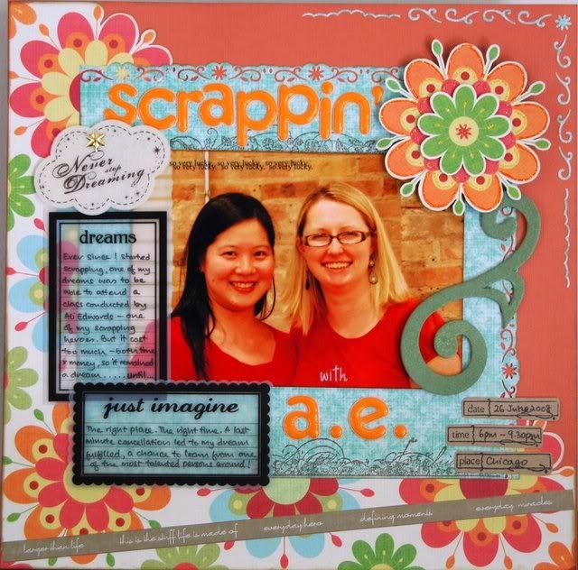
This was the 1st LO I did after coming back from my summer in the USA. It was a fitting LO, I thought, seeing that AE is one of my icons of scrapbooking... I played with the Fiskars border punch here and reused the punched out bits as part of the design along the edge of the cardstock. Finicky stuff, it was!
Layout 2
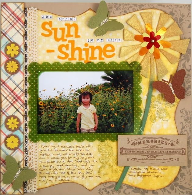
This was the 2nd LO I did. Here, I played with glimmer mist and Heidi Swapp masks. I also did quite a bit of stamping with all my various stamps. Did the paper shapes intentionally to mimic the look of the front cover of the Making Memories Noteworthy album, not that anyone noticed, I think. Heh. I also played with my new Cuttlebug, cutting and embossing the butterflies...
Layout 3
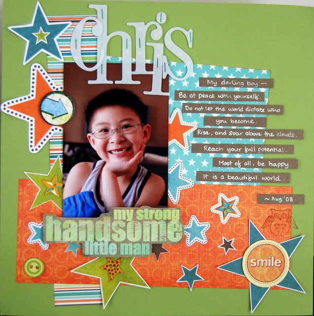
This LO of Chris evolved quite naturally from the papers. I liked the cheeriness of it, and the bright happy colours suited him perfectly. The journalling is an excerpt from Desiderata, one of my favourite poems of all time....
Layout 4
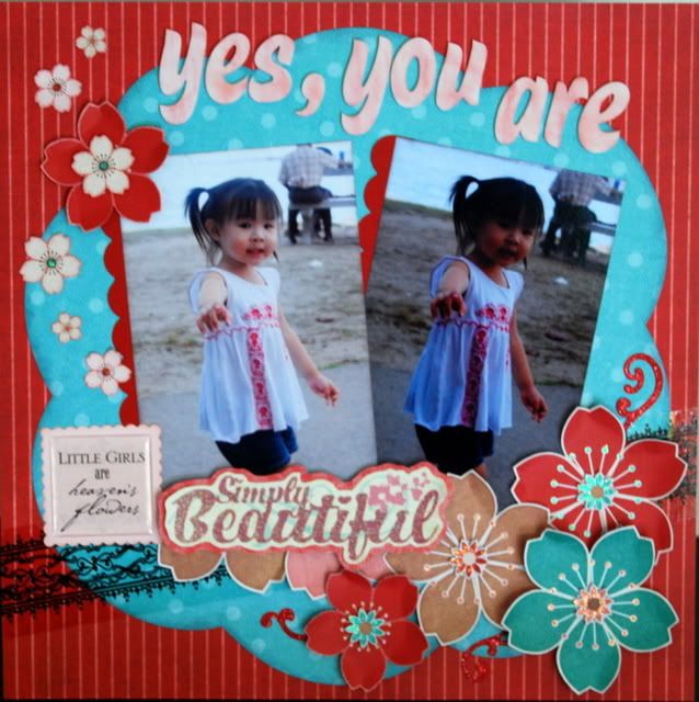
I actually like this LO the least of all. I thought it was a little bit too simple. But then again, there's beauty in simplicity. But I was getting a bit tired by then....
Layout 5
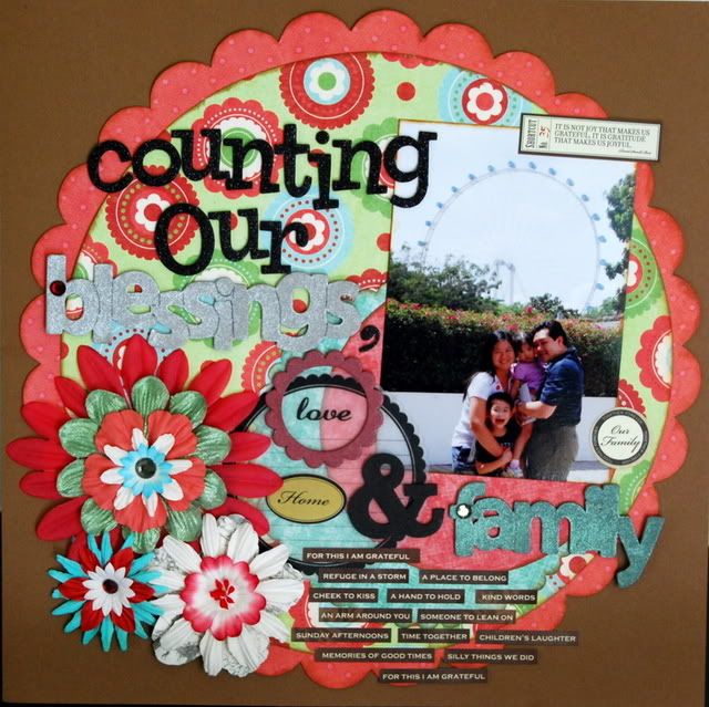
This was done in the last week, after I discovered that MWL would be releasing MME the following Thursday. The heat was on.... This LO was a departure from my usual style, but I liked how it turned out in the end. Initially, the plan was to use the repeating motif of scalloped circles to pick up the shape of the Singapore Flyer in the background, but guess that got lost in the complexity of all the other elements. I used the 7Gypsies journalling stickers -- that's one embellishment that I love using for its simplicity and ease of use...
Layout 6
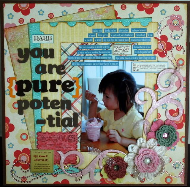
The final lap. I liked how this LO turned out... but realized that my designs tend to take up pretty much the entire 12x12" space of the page, unlike some other scrappers, who are able to just cluster their photos and embellishments in one area and leave lots of negative space... Personal style, I guess. I played a lot with different paper shapes here, and also with elements of the shabby chic style, which I think is kinda the style I scrap most comfortably in....
TFL!!!
Stay tuned for LOs made with 7Gypsies Nottinghill collection, coming up next, when I finish them.... :)
I did 6 layouts over the months of August and September for MWL to showcase their MME papers. I know I'm a bit tardy -- I'm only just getting around to posting up their pictures now...
Layout 1

This was the 1st LO I did after coming back from my summer in the USA. It was a fitting LO, I thought, seeing that AE is one of my icons of scrapbooking... I played with the Fiskars border punch here and reused the punched out bits as part of the design along the edge of the cardstock. Finicky stuff, it was!
Layout 2

This was the 2nd LO I did. Here, I played with glimmer mist and Heidi Swapp masks. I also did quite a bit of stamping with all my various stamps. Did the paper shapes intentionally to mimic the look of the front cover of the Making Memories Noteworthy album, not that anyone noticed, I think. Heh. I also played with my new Cuttlebug, cutting and embossing the butterflies...
Layout 3

This LO of Chris evolved quite naturally from the papers. I liked the cheeriness of it, and the bright happy colours suited him perfectly. The journalling is an excerpt from Desiderata, one of my favourite poems of all time....
Layout 4

I actually like this LO the least of all. I thought it was a little bit too simple. But then again, there's beauty in simplicity. But I was getting a bit tired by then....
Layout 5

This was done in the last week, after I discovered that MWL would be releasing MME the following Thursday. The heat was on.... This LO was a departure from my usual style, but I liked how it turned out in the end. Initially, the plan was to use the repeating motif of scalloped circles to pick up the shape of the Singapore Flyer in the background, but guess that got lost in the complexity of all the other elements. I used the 7Gypsies journalling stickers -- that's one embellishment that I love using for its simplicity and ease of use...
Layout 6

The final lap. I liked how this LO turned out... but realized that my designs tend to take up pretty much the entire 12x12" space of the page, unlike some other scrappers, who are able to just cluster their photos and embellishments in one area and leave lots of negative space... Personal style, I guess. I played a lot with different paper shapes here, and also with elements of the shabby chic style, which I think is kinda the style I scrap most comfortably in....
TFL!!!
Stay tuned for LOs made with 7Gypsies Nottinghill collection, coming up next, when I finish them.... :)