tutorial: gradient tool
By request here is a tutorial for how to make those radial gradients and then just a whole lot of info on gradients. Okay, so everything about gradients all is all in here, or so I hope. I probs left out a few things.
Feel free to ask any questions at all, no questions are ever stupid.. well thats a lie, but whatever.
And comments are love!
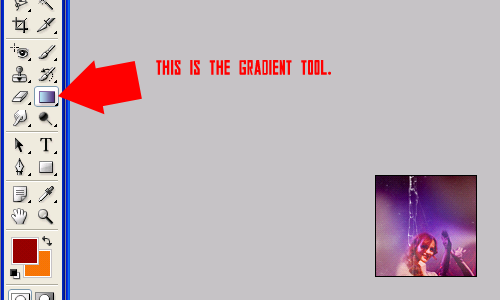
THE GRADIENT TOOL: One of the best and most helpful tools ever, that no one knows how to use.
When you click on it, it immeditately should show you your own linear custom gradient, up in the little box in the corner (gradient menu).
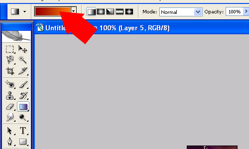
The two colors being combined into a gradient are your foreground and background colors chosen on your tool bar.
And next to the menu of gradients are 5 little box with different styles of gradients; linear, radial, angle, reflected, and diamond.
Linear: Usually looks best and works well with graphics.

Radial: Also looks nice with graphics!

Angle:

Reflected:

Diamond:

HOW TO USE IT:
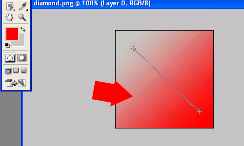
To use the gradient tool, you simple drag the cursor over your canvas how ever you want.
Try experimenting in different directions and lengths.
OTHER WAYS:
You can select one of your layers (or create a new one), fill it and right click, and go to blending options. Once there, you can select gradient overlay.
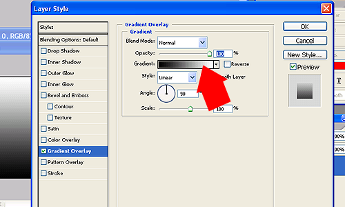
And you'll find yourself with your gradient menu again. Here you can change what style and what colors you want your gradient to be or you can select a gradient preset (the ones photoshop provides you with).
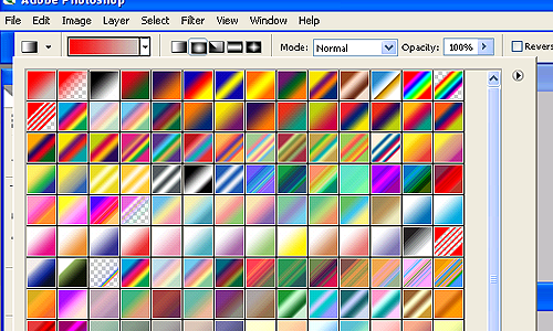
I have Photoshop CS2, so I don't know if other versions have the same gradients, but you should be able to load them all the same.
HOW TO LOAD GRADIENTS:
Click the arrow button on the side of the gradient menu, and find load gradients. You can also see preset manager, which you can also load gradients, brushes, patterns, etc through.
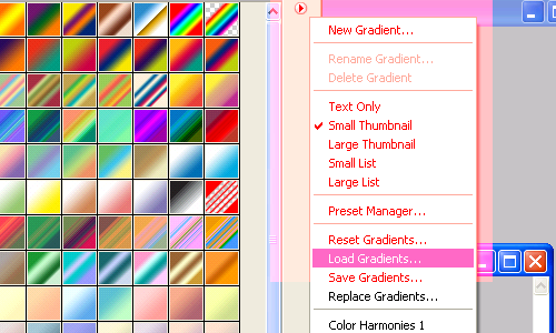
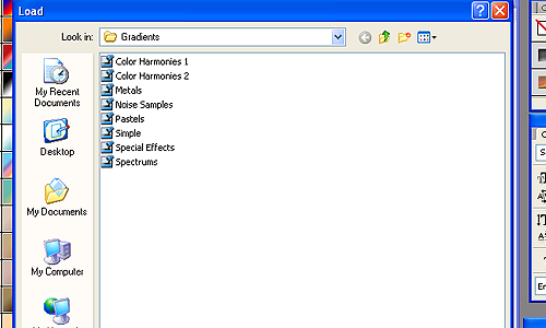
These are the 8 photoshop preset gradients. You just click one, press load and fin- its loaded.
HOW TO MAKE THIS RADIAL GRADIENT:
1. Open a 100 by 100 pixel canvas.
Layer > New Layer. Fill layer with paint bucket black. Right click > Blending options > Gradient overlay.

Select the first gradient named 'Foreground to Background', and then go style > radial.
When choosing colors for the gradients, it works best if you chose a light color (white, light blue/gray) for your foreground and then a darker color for your background.
USING GRADIENTS:
Gradients can be used in many ways, and seriously- try them all, but in my opinion they look best on mulitply, screen, lighten, or soft light. There's no wrong way to use them. Most of the time they're used to add lighting or coloring to an icon, or for us insane icon makers who need to have like 9,038, 497 billion layers to color an icon- gradients can really make a nice effect without all the extra selective color and curves layers.
+

(on lighten) + Some experimenting =

Other examples of icons with gradients:
As you can see, some are more noticeable- then others like icon 3- the gradient just changed the lighting and coloring of icon. But like I said before, there's no wrong way to use them. =)
I hope you guys all found this useful! =) Meme + link awayyyyyy.