tutorial #03 - are you trying to save my soul?

library_of_sex asked me if I could make this tutorial, so here we go.
[x] Comments are ♥!
[x] If you use it, I'd love to see your results.
[x] Made in PS 7
[x] Uses: Selective coloring, color balance, vector masks and curves.
[x] Difficulty Level: Medium
[x] PSD: No.
[x] Keep in mind that every picture requires different settings!
1st Step:
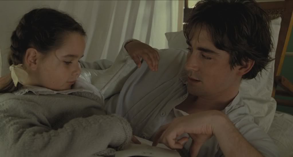
Open your picture. This is mine (from the beautiful movie "the Fall"), credit goes to dgtall. Crop it (or paste it onto a 100x100px canvas), keep in mind that parts of the picture will be covered.
So, mine looks like this now:

2nd Step:
To lighten your icon duplicate your base layer twice and set both to Screen, opacity 100%. The number of screen-layers and opacity-settings depend on your picture though.

3rd Step:
To enhance the blue create a Color Balance layer. These are my settings:
Midtones: 0 +1 +2
Shadows: +2 +3 -6
Highlights: 0 -3 +13
Duplicate this layer (both set to Normal, opacity 100%).

4th Step:
Create a new layer and fill it with a brownish red (#540000), set it to Exclusion, opacity 21%. This will make the white in your image blue. To get the yellowish coloring we need the blue as contrast.

-->

5th Step:
Now we really want to get to the yellowish coloring, which you can achieve by creating another Color Balance layer (Normal, 100% opacity) and enhance the yellows. My settings are the following:
Midtones: -8 -18 -25
Shadows: -8 -25 -59
Highlights: -14 -5 -10

Now it's washed out and dull, so we have to work on that.
6th Step:
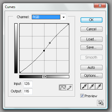
We need more contrast, so create a Curves layer (Normal, 100% opacity). Depending on your picture a simply enhancing the contrast with a brightness/contrast layer will do, but mine got to reddish so I used the Curves layer instead because you can regulate the colors there.
These are my settings (I know that Curves layers can be confusing from time to time so there I made screencaps to help you - but please play around with these settings!)
RGB
Input: 126
Output: 116
Screencap
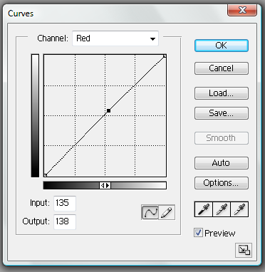
Red
Input: 135
Output: 138
Screencap
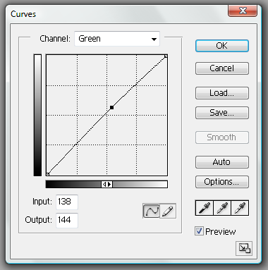
Green
Input: 138
Output: 144
Screencap
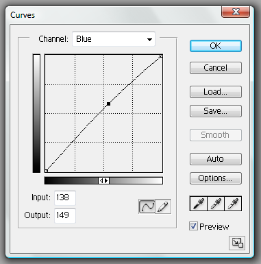
Blue
Input: 138
Output: 149
Screencap

7th Step:
Now create a Selective Color Layer (Normal, opacity 100%) to brighten the colors up a tad. I used these settings:
Reds: 0 +5 0 +8
Yellows: -17 -11 -9 0
Neutrals: +5 +9 +10 -11

8th Step:
Create a Hue/Saturation layer(Normal, opacity 100%) to brighten the yellows.
Master
Saturation: +5
Yellow
Saturation: +5

9th Step:
Add a black/white Gradient Map, set it to Soft Light and lower the opacity to 10%.
The last steps are barely visible, but I think it still makes a difference (or these are remains from layers and colorings that I changed during the coloring process).
We're done with the coloring! This is what I have now:

! If you're not satisfied with your result play around with the settings of each layer, since you can see the final result when you already have all layers. Sometimes you have to erase some again, make a new one, etc. This is the time to go crazy and play. !
10th Step:
Create a new layer and fill it with whatever color fits your icon. I usually use the Color Picker Tool to find a good color that is already in the icon. My color is a yellowish gray (#CACABA). You can also use a texture for this.
Erase the parts that you don't like.
Mine looks like this now:

11th Step:
I wanted the side to be free to make it a bit more interesting, but like this it didn't work. I merged the layers leaving the last one out (the one with the color/texture). Then I took the Smudge Tool and carefully smudged down Roy's arm, so that there is no empty space on the side. Now the color is pretty similar to the gray I used, but I think although subtle it works. xD

-->

12th Step:
Apply a Layer Mask to the layer with your color/texture. Layer masks are my best friend when it comes to PS, because when you use a black brush/text with the layer mask you erase, but unlike using the eraser you can make it visible again by simply using white.

Set the Foreground Color to black and use the Horizontal Type Mask Tool (click on your type tool until the menu unfolds - there it is). Make sure you have the layer mask chosen and then write your text.

Et voilá. We're done.
Of course you can still apply texture brushes or whatever you like.

I hope this was helpful. Let me know what you think and I'd love to see your results. If you have any questions, don't hestitate to ask!
Original icon post.