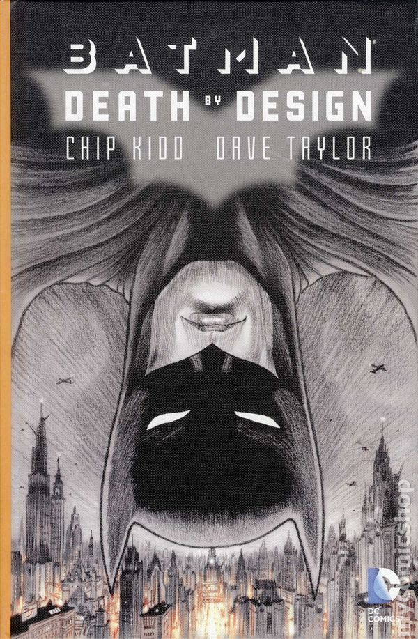
Kidd, Chip: Batman: Death by Design

Batman: Death by Design (2012)
Written by: Chip Kidd
Illustrated by: Dave Taylor
Genre: Graphic Novel
Pages: 112 pages
Why I Read It: I noticed this graphic novel on Tor.com and due to the name of "Chip Kidd," who I know is famous in graphic designer circles, I forwarded said link to my husband, who is a graphic designer. He picked it up at the comic shop, and then when he read it, he asked if I wanted to. I asked, "Is it good?" He said, "Yes, but I don't know if you'll like it." I told him to put it in my comic TBR pile and I'd get around to it. Thanks to the Olympic coverage and all the crazy amount of reading I've been doing lately, I finally did, and I'm glad I did.
The premise: ganked form BN.com: In this new original graphic novel from superstar writer/designer Chip Kidd and artist Dave Taylor, Gotham City is undergoing one of the most expansive construction booms in its history. The most prestigious architects from across the globe have buildings in various phases of completion all over town. As chairman of the Gotham Landmarks Commission, Bruce Wayne has been a key part of this boom, which signals a golden age of architectural ingenuity for the city. And then, the explosions begin. All manner of design-related malfunctions-faulty crane calculations, sturdy materials suddenly collapsing, software glitches, walkways giving way and much more-cause casualties across the city. This bizarre string of seemingly random, unconnected catastrophes threaten to bring the whole construction industry down. Fingers are pointed as Batman must somehow solve the problem and find whoever is behind it all.
Spoilers, yay or nay?: Nay. The story is a simple one, and while I'll talk about the bones of the story, I won't spoil any reviews. If you're in a hurry, feel free to skip to "My Rating," but otherwise, feel free to keep reading.
The Story: The reason my hubby feared I wouldn't care for this was because it's kind of a throw-back Batman story. Gone is the modern grittiness I've come to associate with Batman's world; instead, it's more of a noir feel, almost coming close to steampunk (an aside: steampunk Gotham and steampunk Batman would be TOTALLY COOL). I was so drawn (har har) into the story, the look and feel for Gotham and the world, that when a familiar villain pops up, it almost jolted me out of the story. I'd say I was disappointed, that but that would be overstating it. It was just jarring, that's all, and there's a few scenes with that villain where I'm still not wholly sure what was happening. I'll roll with it, though.
The story itself centers on the upcoming demolition of Wayne Central Station. Bruce has signed the order, having his own reasons for destroying the very thing his father built, but there are many who are opposed. It's an interesting story in that it centers, mostly, on architecture, and the drive of the story has to do with buildings, the integrity of structures, and what happens when a corrupt system is in charge of making sure these buildings go up. You'd think that'd be boring, but the story itself is quite fascinating. Perhaps it's my own interest in design and architecture, but I was glued to the pages, fascinated by the way the story unfolded and learning who was doing what and why. The end's quite good too, and I was quite charmed by time I closed the book.
The Art: The art was one of the main reasons I was glued to the pages. Everything is penciled originally in blue and inked over in graphite, according to the artist notes in the back. No erasures made, and the coloring was added digitally. It makes for quite the gorgeous set of pages, and while I normally plow through a comic glancing at the art long enough to glean the story, here I was really paying attention to the detail. It's fully engaging, and I loved how the coloring, when it was present, would highlight certain elements of the panels. This is some of the best art I've seen, certainly the most unique.
My Rating: Good Read
I ended up really, really enjoying this piece. The only thing keeping it from an "Excellent" rating is that there were a few moments in the plot that I kind of had to shrug and move on from, simply because I understood just enough to get what was happening, but the how's behind it were a mystery to me. That being said, I loved the old, noir, pulpish look, and the art was just simply fabulous. So glad I forwarded the review of this book to my hubby, and I'm so glad he picked it up. I'm not sure every Batman will fall head-over-heels with this like I did, but I think if you go into knowing it's not the gritty-realism of Nolan's Batman, if you know it's kind of a throwback in terms of style, you'll be just fine. And let's face it: a Batman story about architecture is just plain cool.
Cover Commentary: It's a cool cover. It's also fascinating to look at upside-down, as Chris Lough comments on Tor.com that "flipping the cover of the book suddenly turns Batman hovering over skyscrapers into Batman amongst the people of Gotham," which I can stare at for hours and not see except for half a second before I lose it again. At any rate. It would definitely catch my eye, and that's the important thing.
Next Up: Bellwether by Connie Willis