icon tutorial
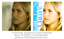
Learn how to get the coloring as well as the texture and text.
- Made in Paint Shop Pro X, other PSP versions will work as well.
- Includes Color Balance, Curves & Channel Mixer.
- Moderate difficulty, it just depends on your basic level of understanding with PSP.
- Translatable(at least coloring wise) to other programs.
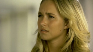
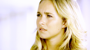
Okay we're using this base. What I normally do with screencaps is open it up(duh) and resize(Image > Resize) it to a height of 175.
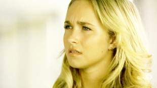
Duplicate your base 3 times.
Set the first two(from bottom to top) to Screen, Ocpacity 100%. Then set the top one to Soft Light, Opacity 30%.
You should have your base layer, then two screened layers, then on top the soft light layer.
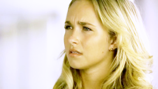
Now make a new Color Balance layer. Layer > New Adjustment Layer > Color Balance. Make sure Preserve Luminance is selected.
I used the following settings:
Midtones: 0,0,21
Highlights: 0,0,36
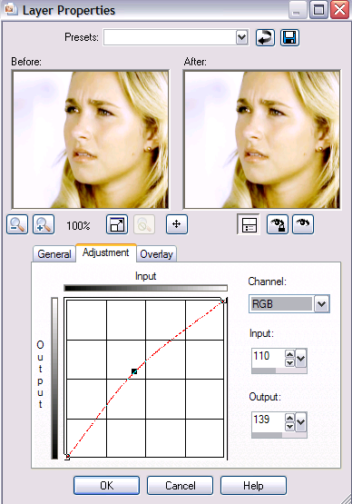
Now make a new Curves layer. Layer > New Adjustment Layer > Curves.
I used the following settings:
RBG > Input: 110 Output: 139
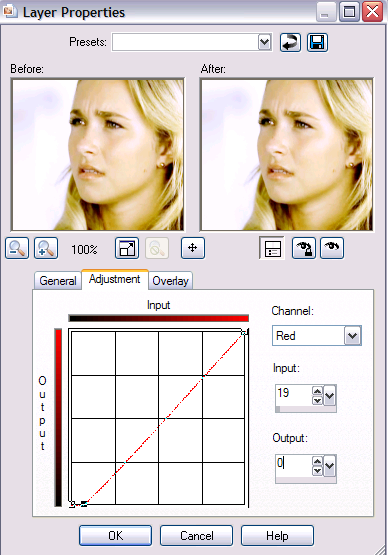
Red > Input: 19 Output: 0
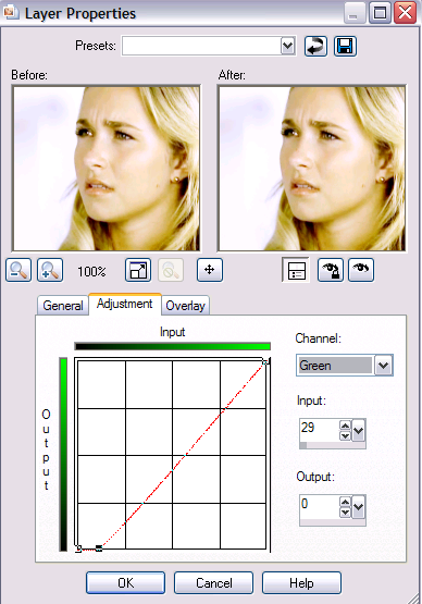
Green > Input: 29 Output: 0
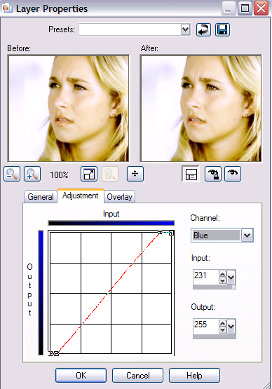
Blue > Point One > Input: 231 Output: 255
Blue > Point Two > Input: 19 Output: 0
Now make a new Channel Mixer layer. Layer > New Adjustment Layer > Channel Mixer. Make sure Monochrome is unselected.
I used the following settings:
Red: 144, -42, 0
Green: 11, 87, 1
Blue: -100, 100, 110

Now add a new Brightness/Contrast layer. Layer > New Adjustment Layer > Brightness/Contrast.
Brightness: 2
Contrast: 6

Alright, so that's it for the coloring part!
Go ahead and merge your layers. Layer > Merge > Marge All(Flatten.)
Resize your image. I resized mine to a height of 101.
Now just copy and paste it to a new 100x100 base.
Duplicate the layer. Now Sharpen the top layer. Adjust > Sharpness > Sharpen. Now set the Opacity to 17%.
Now take this "texture" (really it's just part of another Heroes screencap I've already colored) and copy and paste it on there.
Move the texture to where you want it. With this one I just moved the texture over to the right edge. Set it to Blend Mode to Darken. Now you just use your eraser tool to remove any texture that overlaps your picture. Which for this one really isn't much.
Now for the text:
With text what I do(I do it kind of weird) is open a new base, size 500x200 or so. It gives me a big space to work with. Flood Fill it with a grayish color like #c0c0c0.
Now go back to your icon. Select the Pen Tool. I selected a bright yellow color to draw my line in so I can see it clearly. Draw a small straight line going from bottom to top(otherwise the text will go a different way.)
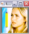
Now cut it and paste it onto your 500x200 base.
Now go to your Dropper Tool and get one of the pretty blues from your texture for your text. I used #35cffa.

Now go over to you 500x200 image, select the Text Tool. Make sure Create As on the text tool bar is set to Floating, otherwise this won't work. I also have the Kerning set to 25. I have Bold selected. I'm using a text called Sexsmith but you can use whatever one you want. I also have the Size set at 72 and the Units set at Points.
Hover the cursor over the line. The cursor should change when hovered over the line, the A should now have a little curved line under it.
Type in your text and the text should be going from top to bottom/bottom to top. Like this. You should have those little "ants" blinking around it the text.
Now you're going to de-select the text. Selections > Select None.
Now copy your text and paste it as new image.
Going back to your 500x200 image. Just delete the text you created. Now using the same settings create the same text only this time make it white in color. Then de-select the text and paste the text as another new image. You can go ahead and close the 500x200 image now if you want.
Now resize your texts to a height of 80 on both.
Now copy and paste both onto your icon. Move both texts to the position you want them, I moved them over to the right over the texture. Make sure that wherever they end up that the are overlapping. Put to white text above the blue text.
Now erase the parts of the white text that go over the white part of the texture. That way you have the pretty blue text over the white of the texture and the white text over the blue of the texture.
Now merge the two text layers. Make sure the top one is selected. Layer > Merge > Merge Down.
Now we're gonna put a Shadow behind the text. Effects > 3D Effects > Drop Shadow.
I used the following settings:
Vertical: 1
Horizontal: 1
Opacity: 100
Blur: 1
Color: a light gray(#c0c0c0)
And that is it! I hope I explained things well enough. If you have any questions feel free to ask.