Round One: Challenge Four: Results
Eliminated: jessieflower, kala_way
People's Choice: sidhex3
Mod's Choice: girl_interrupt
Eliminated:


kala_way
w/ -10 votes
jessieflower
w/ -3 votes
People's Choice:
Mod's Choice:


sidhex3
w/ +3 votes
girl_interrupt
If anyone would like a banner, please let me know.
ICON COMMENTS (Icon # here)
#1: (-4) + (+3) = -1
- the font type doesn't fit, the crop is a bit too undramatic
- i really like the crop but the text looks a bit pixelated
- Everything about this icon is excellent but the text lets it down. Would have been better without it or with it a different font and smaller.
- the font doesn't fit the image
+ I think the contrast is really nice and the text placement is absolutely superb.
+ Very cute
+ nice concept and execution, only one of the group I'd probably use
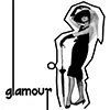
#2: (-10) = -10
- seems unfinished (too much unused white space), the stroke around her is too bold and too close to her
- While I think there is good contrast within the icon something seems a little off. I think the outline of the woman is the problem it seems too sharpened and left without that outline I think it would have been better.
- It's too "far" cropped, the lines are so overpowering that those take away from the actual main point. A closer crop and thinner lines would fit the topic better
- luv what you did with the text, but the lines around the image don't work well. maybe if the lines were antiliased or made softer they'd work better and in shades of grey.
- outline around the woman is highly distracting...would be much better without it.
- Great idea, but I think they went a little overboard with the pencil tool. It would have been perfect without the outline.
- icon appeared a bit blurry in some places and the amount of white space makes the icon seem lacking
- The black lines around the lady and the text is too overpowering and takes the whole attention in the icon.
- There's too much white space in the icon and the black border around the woman looks unnecessary.
- the outline doesn't enhance the image and its hard to make the image out
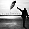
#3: (+3) = 3
+ Like the composition here, you put the text really well too.
+ the lines in teh image work really well. i mean the lines of the horizontal of the horizon opposed to the line of the angled umbrella. hope this makes sense. i think using the silhouette of the person works really well here. the text is just right here also.
+ love the crop and lighting
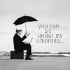
#4: (-3) = -3
- the text makes no sense unless you've seen the entire original image.
- the text overpowers gwen
- The font/text doesn't fit the icon. It is too rough.
#5: (-4) + (+4) = 0
- I like the crop and the empty space, but why cluttering almost half of the icon full with tiny text? That's too much, a few rows would be enough.
- the tiny text would have worked better here if in black or dark grey and if they didn't overrun the girl in the icon. i think if you'd have put the tiny text more in the upper right it would have provided a balance of color use and content in the pic.
- the crop isn't my favorite not quite profile and not exactly flattering, but the text is nice
- the image is too blurry
+ nice crop and placement of text
+ love the positioning of the text brush and text; also the crop is fantastic
+ Nice use of textures:)
+ Nice cropping, use of text & tiny text.
#6: (-3) + (+2) = -1
- I don't think the contrast is very good. It seems a bit boring with all the grey and no extreme blacks or whites.
- The crop is rather awkward and the image quality a bit smushy.
- interesting crop, just a bit washed out, higher contrast would be nice
+ good use of texture, well contrasted
+ good cropping
People's Choice: sidhex3
Mod's Choice: girl_interrupt
Eliminated:
kala_way
w/ -10 votes
jessieflower
w/ -3 votes
People's Choice:
Mod's Choice:
sidhex3
w/ +3 votes
girl_interrupt
If anyone would like a banner, please let me know.
ICON COMMENTS (Icon # here)
#1: (-4) + (+3) = -1
- the font type doesn't fit, the crop is a bit too undramatic
- i really like the crop but the text looks a bit pixelated
- Everything about this icon is excellent but the text lets it down. Would have been better without it or with it a different font and smaller.
- the font doesn't fit the image
+ I think the contrast is really nice and the text placement is absolutely superb.
+ Very cute
+ nice concept and execution, only one of the group I'd probably use
#2: (-10) = -10
- seems unfinished (too much unused white space), the stroke around her is too bold and too close to her
- While I think there is good contrast within the icon something seems a little off. I think the outline of the woman is the problem it seems too sharpened and left without that outline I think it would have been better.
- It's too "far" cropped, the lines are so overpowering that those take away from the actual main point. A closer crop and thinner lines would fit the topic better
- luv what you did with the text, but the lines around the image don't work well. maybe if the lines were antiliased or made softer they'd work better and in shades of grey.
- outline around the woman is highly distracting...would be much better without it.
- Great idea, but I think they went a little overboard with the pencil tool. It would have been perfect without the outline.
- icon appeared a bit blurry in some places and the amount of white space makes the icon seem lacking
- The black lines around the lady and the text is too overpowering and takes the whole attention in the icon.
- There's too much white space in the icon and the black border around the woman looks unnecessary.
- the outline doesn't enhance the image and its hard to make the image out
#3: (+3) = 3
+ Like the composition here, you put the text really well too.
+ the lines in teh image work really well. i mean the lines of the horizontal of the horizon opposed to the line of the angled umbrella. hope this makes sense. i think using the silhouette of the person works really well here. the text is just right here also.
+ love the crop and lighting
#4: (-3) = -3
- the text makes no sense unless you've seen the entire original image.
- the text overpowers gwen
- The font/text doesn't fit the icon. It is too rough.
#5: (-4) + (+4) = 0
- I like the crop and the empty space, but why cluttering almost half of the icon full with tiny text? That's too much, a few rows would be enough.
- the tiny text would have worked better here if in black or dark grey and if they didn't overrun the girl in the icon. i think if you'd have put the tiny text more in the upper right it would have provided a balance of color use and content in the pic.
- the crop isn't my favorite not quite profile and not exactly flattering, but the text is nice
- the image is too blurry
+ nice crop and placement of text
+ love the positioning of the text brush and text; also the crop is fantastic
+ Nice use of textures:)
+ Nice cropping, use of text & tiny text.
#6: (-3) + (+2) = -1
- I don't think the contrast is very good. It seems a bit boring with all the grey and no extreme blacks or whites.
- The crop is rather awkward and the image quality a bit smushy.
- interesting crop, just a bit washed out, higher contrast would be nice
+ good use of texture, well contrasted
+ good cropping