Round Four: Challenge Three Results
Eliminated: hpnarnia and mayush17
People's Choice: eryslash
Eliminated:
hpnarnia
w/ -6 votes
mayush17
w/ -5 votes
( Please stick around for voting and/or check out bwchallenge for challenge-based black and white icon making )
People's Choice:
eryslash
w/ +4 votes
If anyone would like a banner, please let me know.
ICON COMMENTS (Icon # here)
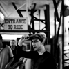
01: (-01)
- the tiny text is much too sharp, and there's just too much focus on the text, because it's total white, while the whitest light on Hermione's face is not: it makes it stand out so much it looks out of place.
02: NONE
03: (-01)
- Lovely cropping, but the image is just too ragged/oversharpened.
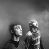
04: (-05)
- The fog effect is not well-done. It's too unreal on Harry. Ron is too bright
- although a nice idea, the heads and the surrounding area are a bit too blurry and the area above and between Ron and Harry could have used a bit more structure
- the blurred cloud texture encroaches on the boys heads too much and there's too much 'texture' contrast between the excessively blurred cloud and the sharper cloud texture to the right...it confuses the eye.
- clouded effect messes with their heads
- The backgroud doesn't blend well with the subjects, the edges are too blurry.
05: (-04)
- The light effect is too strong and mask Hermione's face.
- I really do like this one, but beside the others the crop is less than ideal and the lighting isn't balanced well.
- The cropping along the edge of the nose creates a strange shape (the shadow) at the edge of the icon.
- crop cuts off too much of hermione
06: NONE
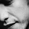
07: (-01)
- the cropping is creative and good but the texture doesn't go well with the border, plus the contrast is unbalanced: his face is too dark.
08: (+04)
+ The cropping is really good and the shadows setting are beautiful!
+ very well cropped
+ LOVE the crop, black and white tones look fabulous
+ Awesome crop and contrast.
09: (-02)
- the crop is unflattering and the icon could have used a bit more contrast.
- An interesting crop, but the brightness works against the mood, has a very raw feel.
10: (-06)
- The cropping is nice but the icon is too dark
- the background is overwhelming the icon, making it hard to spot the person on it
- the cropping of the icon leaves the icon too busy
- The background is very busy, and the subject gets lost.
- there is no place to focus on in the icon, at first you can't find where the subject is
- The image is too dark.
11: (-03)
- The crop is rather dull and the border is unnecessary. It doesn't have any real emotion.
- the contrast is good, but she's badly cut-out from the background and in such a close-up it's too noticeable
- Her hair are cut badly on the left side.
12: (+01)
+ gorgeous lightness, great use of tiny text to balance the crop
13: (-01) + (+03) = +02
- great cropping and text placement, but the choice of font completely ruins the icon
+ interesting crop and text placement
+ I'm a sucker for these kind of icons and you did it perfectly. Lighting and text are excellent! If I liked James McAvoy more I'd snag the icon, lol
+ Brilliant use of text!
CHALLENGE FOUR HAS BEEN POSTED!!
actorlims is having sign ups for round three. It's a lims. about actors. really hot, attractive, good-looking actors. guh.
People's Choice: eryslash
Eliminated:
hpnarnia
w/ -6 votes
mayush17
w/ -5 votes
( Please stick around for voting and/or check out bwchallenge for challenge-based black and white icon making )
People's Choice:
eryslash
w/ +4 votes
If anyone would like a banner, please let me know.
ICON COMMENTS (Icon # here)
01: (-01)
- the tiny text is much too sharp, and there's just too much focus on the text, because it's total white, while the whitest light on Hermione's face is not: it makes it stand out so much it looks out of place.
02: NONE
03: (-01)
- Lovely cropping, but the image is just too ragged/oversharpened.
04: (-05)
- The fog effect is not well-done. It's too unreal on Harry. Ron is too bright
- although a nice idea, the heads and the surrounding area are a bit too blurry and the area above and between Ron and Harry could have used a bit more structure
- the blurred cloud texture encroaches on the boys heads too much and there's too much 'texture' contrast between the excessively blurred cloud and the sharper cloud texture to the right...it confuses the eye.
- clouded effect messes with their heads
- The backgroud doesn't blend well with the subjects, the edges are too blurry.
05: (-04)
- The light effect is too strong and mask Hermione's face.
- I really do like this one, but beside the others the crop is less than ideal and the lighting isn't balanced well.
- The cropping along the edge of the nose creates a strange shape (the shadow) at the edge of the icon.
- crop cuts off too much of hermione
06: NONE
07: (-01)
- the cropping is creative and good but the texture doesn't go well with the border, plus the contrast is unbalanced: his face is too dark.
08: (+04)
+ The cropping is really good and the shadows setting are beautiful!
+ very well cropped
+ LOVE the crop, black and white tones look fabulous
+ Awesome crop and contrast.
09: (-02)
- the crop is unflattering and the icon could have used a bit more contrast.
- An interesting crop, but the brightness works against the mood, has a very raw feel.
10: (-06)
- The cropping is nice but the icon is too dark
- the background is overwhelming the icon, making it hard to spot the person on it
- the cropping of the icon leaves the icon too busy
- The background is very busy, and the subject gets lost.
- there is no place to focus on in the icon, at first you can't find where the subject is
- The image is too dark.
11: (-03)
- The crop is rather dull and the border is unnecessary. It doesn't have any real emotion.
- the contrast is good, but she's badly cut-out from the background and in such a close-up it's too noticeable
- Her hair are cut badly on the left side.
12: (+01)
+ gorgeous lightness, great use of tiny text to balance the crop
13: (-01) + (+03) = +02
- great cropping and text placement, but the choice of font completely ruins the icon
+ interesting crop and text placement
+ I'm a sucker for these kind of icons and you did it perfectly. Lighting and text are excellent! If I liked James McAvoy more I'd snag the icon, lol
+ Brilliant use of text!
CHALLENGE FOUR HAS BEEN POSTED!!
actorlims is having sign ups for round three. It's a lims. about actors. really hot, attractive, good-looking actors. guh.