Round Three: Challenge Ten Results
Eliminated: americangrl69 & sjlnechnaia
People's Choice: dallowayward
Eliminated:


americangrl69
w/ -5 votes
sjlnechnaia
w/ -4 votes
People's Choice:

dallowayward
w/ +4 votes
If anyone would like a banner, please let me know.
ICON COMMENTS (Icon # here)
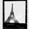
01: (-01) + (+05) = +04
- The setup makes the photo look like a poor snapshot or discarded proof. I appreciate the creativity, and I think without the light flare it would have been better.
+ great texture use
+ great composition and texture use
+ Great use of texture. Simple and classic.
+ really good use of texture, it really fit the image.
+ Lovely proportions, lovely use of a frame, lovely light texture -- a very arty icon.
02: (-02) + (+01) = 0
- the text is nice, but the image feels too sharp to me.
- It's slightly oversharpened. And the cropping isn't effective; having part of the other eye seen makes it look choppy.
+ Fantastic crop and text choice and placement.
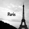
03: (+01)
+ Lovely use of text against the silhouetted skyline.
04: (-02)
- it looks flat and lacks contrast.
- the sparkles are out of place, it would be a lovely b&w icon otherwise
05: (-06) + (+01) = -05
- text draws too much attention, could use some decorations
- The text pops a bit too much and takes the focus completely off the image.
- awkward text placement, much too dark color for the text.
- The text seems too bold for such a delicate image, and a bit oddly placed (kind of towards the center, but not quite..).
- Text is too bold, look a bit pixelarated.
- The cropping, the text and the choice of font are all a bit predictable.
+ nice and simple
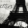
06: (-05) + (+01) = -04
- too full, sharp text
- awkward cropping, oversharpened, overcrowded because of the textures
- There's too much going on in the icon, and the text (whatever it is) doesn't fit.
- unnecessarily busy
- It looks rather too busy with so many brushes and text bits. I don't think letting the 'L' fall completely off the side works. I thought for a moment that 'etters' was some French word :)
+ Nice work with text/texture, and beautiful job with the black & white -- the Eiffel Tower looks almost lacy!
07: (-04)
- There's some weird pixelation around the chin, plus the crop doesn't quite work with that amount of negative space.
- The dark overlay combined with the low contrast on the image itself, make the icon seem a bit muddy.
- a bit blurry, too dark.
- The icon just needed another element to give it life.
People's Choice: dallowayward
Eliminated:
americangrl69
w/ -5 votes
sjlnechnaia
w/ -4 votes
People's Choice:
dallowayward
w/ +4 votes
If anyone would like a banner, please let me know.
ICON COMMENTS (Icon # here)
01: (-01) + (+05) = +04
- The setup makes the photo look like a poor snapshot or discarded proof. I appreciate the creativity, and I think without the light flare it would have been better.
+ great texture use
+ great composition and texture use
+ Great use of texture. Simple and classic.
+ really good use of texture, it really fit the image.
+ Lovely proportions, lovely use of a frame, lovely light texture -- a very arty icon.
02: (-02) + (+01) = 0
- the text is nice, but the image feels too sharp to me.
- It's slightly oversharpened. And the cropping isn't effective; having part of the other eye seen makes it look choppy.
+ Fantastic crop and text choice and placement.
03: (+01)
+ Lovely use of text against the silhouetted skyline.
04: (-02)
- it looks flat and lacks contrast.
- the sparkles are out of place, it would be a lovely b&w icon otherwise
05: (-06) + (+01) = -05
- text draws too much attention, could use some decorations
- The text pops a bit too much and takes the focus completely off the image.
- awkward text placement, much too dark color for the text.
- The text seems too bold for such a delicate image, and a bit oddly placed (kind of towards the center, but not quite..).
- Text is too bold, look a bit pixelarated.
- The cropping, the text and the choice of font are all a bit predictable.
+ nice and simple
06: (-05) + (+01) = -04
- too full, sharp text
- awkward cropping, oversharpened, overcrowded because of the textures
- There's too much going on in the icon, and the text (whatever it is) doesn't fit.
- unnecessarily busy
- It looks rather too busy with so many brushes and text bits. I don't think letting the 'L' fall completely off the side works. I thought for a moment that 'etters' was some French word :)
+ Nice work with text/texture, and beautiful job with the black & white -- the Eiffel Tower looks almost lacy!
07: (-04)
- There's some weird pixelation around the chin, plus the crop doesn't quite work with that amount of negative space.
- The dark overlay combined with the low contrast on the image itself, make the icon seem a bit muddy.
- a bit blurry, too dark.
- The icon just needed another element to give it life.