Round Two: Challenge Eight Results
Eliminated: summer_kisses89
People's Choice: dance_the_dance
Don't think of it as being eliminated. Winning fourth place sounds much better :D
Eliminated:
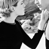
summer_kisses89
w/ -7 votes
People's Choice:
dance_the_dance
w/ +2 votes
If anyone would like a banner, please let me know.
ICON COMMENTS (Icon # here)
#1: (-3) = -3
summer_kisses89
- There is no contrast and it's a bit too light.
- the black shirt overpowers the icon
- The contrast is a bit too strong, and the icon could use something more, like text or something..
#2: (-2) = -2
kala_way
- The text distracts form the image.
- the effect on the text is really distracting to the image
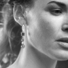
#3: (-3) + (+2) = -1
dance_the_dance
- it's too pale and it also needs to be sharpened a bit
- rather than a nice soft focus glow, the icon just looks fuzzy
- Good cropping but the image needs more saturation.
+ excellent lighting and crop
+ The cropping is interesting. The brightness and contrast levels are just right. The sharpness makes the icon look crisp and clear. It all just works very well with this icon.
#4: (-3) + (+1) = -2
ningloreth
- The coloring looks off compared to the rest. It's also slightly oversharpened in spots.
- The text doesn't fit in.
- oversharpened
+ nice use of text and cropping. could use a touch more contrast though.
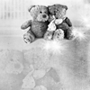
#5: (-4) = -4
summer_kisses89
- The subject seems misplaced and off center. The screened layer of the subject at the bottom of the icon doesn't work well and makes it seem a little crowded.
- the background is too faint compared to the bears
- the sparkly texture is quite distracting and the double image could be a bit bolder.
- nice icon over all but the top two need more contrast and a bit more black and the ones below need to show a touch more beneath the haze
#6: (+2) = 2
kala_way
+ great crop and contrast
+ great cap choice and contrast! Lovely.
#7: (-3) = -3
ningloreth
- the frame makes it look dark and it needs some sharpening
- the heart brush is awkwardly placed, and it's a bit dark overall.
- Black border doesn't work with the icon idea, the heart brush too much.
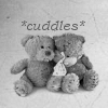
#8: (-2) + (+5) = 3
dance_the_dance
- the icon is really dark and the texture doesn't really add anything to the image
- very cute but the teddie bears need a bit more detail and contrast
+ Wonderful composition...and incredibly adorable!!
+ great cropping, the text fits and this texture makes it look even better
+ Very nice composition.
+ nice contrast, well put together with text and texture.
+ Very cute icon, it really captures what it is trying to express.
dance_the_dance: [(-3) + (-2)] + [(+2) + (+5)] = 2
kala_way: [(-2) + (0)] + [(0) + (+2)] = 0
ningloreth: [(-3) + (-3)] + [(+1) + (0)] = -5
summer_kisses89: [(-3) + (-4)] = -7
THE FINAL CHALLENGE HAS BEEN POSTED!
People's Choice: dance_the_dance
Don't think of it as being eliminated. Winning fourth place sounds much better :D
Eliminated:
summer_kisses89
w/ -7 votes
People's Choice:
dance_the_dance
w/ +2 votes
If anyone would like a banner, please let me know.
ICON COMMENTS (Icon # here)
#1: (-3) = -3
summer_kisses89
- There is no contrast and it's a bit too light.
- the black shirt overpowers the icon
- The contrast is a bit too strong, and the icon could use something more, like text or something..
#2: (-2) = -2
kala_way
- The text distracts form the image.
- the effect on the text is really distracting to the image
#3: (-3) + (+2) = -1
dance_the_dance
- it's too pale and it also needs to be sharpened a bit
- rather than a nice soft focus glow, the icon just looks fuzzy
- Good cropping but the image needs more saturation.
+ excellent lighting and crop
+ The cropping is interesting. The brightness and contrast levels are just right. The sharpness makes the icon look crisp and clear. It all just works very well with this icon.
#4: (-3) + (+1) = -2
ningloreth
- The coloring looks off compared to the rest. It's also slightly oversharpened in spots.
- The text doesn't fit in.
- oversharpened
+ nice use of text and cropping. could use a touch more contrast though.
#5: (-4) = -4
summer_kisses89
- The subject seems misplaced and off center. The screened layer of the subject at the bottom of the icon doesn't work well and makes it seem a little crowded.
- the background is too faint compared to the bears
- the sparkly texture is quite distracting and the double image could be a bit bolder.
- nice icon over all but the top two need more contrast and a bit more black and the ones below need to show a touch more beneath the haze
#6: (+2) = 2
kala_way
+ great crop and contrast
+ great cap choice and contrast! Lovely.
#7: (-3) = -3
ningloreth
- the frame makes it look dark and it needs some sharpening
- the heart brush is awkwardly placed, and it's a bit dark overall.
- Black border doesn't work with the icon idea, the heart brush too much.
#8: (-2) + (+5) = 3
dance_the_dance
- the icon is really dark and the texture doesn't really add anything to the image
- very cute but the teddie bears need a bit more detail and contrast
+ Wonderful composition...and incredibly adorable!!
+ great cropping, the text fits and this texture makes it look even better
+ Very nice composition.
+ nice contrast, well put together with text and texture.
+ Very cute icon, it really captures what it is trying to express.
dance_the_dance: [(-3) + (-2)] + [(+2) + (+5)] = 2
kala_way: [(-2) + (0)] + [(0) + (+2)] = 0
ningloreth: [(-3) + (-3)] + [(+1) + (0)] = -5
summer_kisses89: [(-3) + (-4)] = -7
THE FINAL CHALLENGE HAS BEEN POSTED!