Round One: Challenge 7: Results
If the finalists don't mind, I'm going to take a week off. This flu I've caught is really debilitating and is making everything a thousand times harder than usual.
Everything should be back up and okie-dokie next monday with the final challenge posted. Until then, enjoy your good health. :P
Eliminated: girl_interrupt
People's Choice: dallowayward
Eliminated:

girl_interrupt
w/ -5 votes
People's Choice:

dallowayward
w/ +5 votes
If anyone would like a banner, please let me know.
ICON COMMENTS (Icon # here)
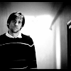
#1: (-6) + (+1) = -5
- seems a bit oversharp and overcontrasted; the black stripes at the top and the bottom don't fit
- The black borders look like they're from the cap and that makes the crop seem somewhat mistaken and the image feels oversharpened.
- the icon is too sharp
- the black and white is too contrasted. The cropping does not quite draw focus to the subject. The image itself is too sharp and almost unrecognizable.
- the excessive negative space around the image doesn't do anything for the icon. as much as i don't really like text, i think that text or tiny text or a brush to break up the unused area would be good.
- The black border around the icon is not doing the icon any good, it would have looked much better without it, and also I think the icon looks a little oversharpened.
+ good cropping
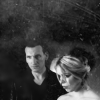
#2: (-2) + (+1) - -1
- needs more contrast
- It is more or less impossible to make out the picture.
+ Great crop and cloudiness.
#3: (+1) = 1
+ I like the lightness to it
#4: (-1) + (+6) = 5
- there's a brush or something on it that's obscuring the image too much
+ great use of textures
+ I just love how it's done. The texture and the picture together. Wow. =)
+ the icon has a nice "soft" effect and great use of texture
+ the image placement is well done, the images themselves are clear with out being sharp. The black and white is well contrasted and the subtle use of texture really adds to the overall icon.
+ Nice use of texture and nice cropping. Needs a bit more brightness and contrast.
+ Great use of textures and crop.
Everything should be back up and okie-dokie next monday with the final challenge posted. Until then, enjoy your good health. :P
Eliminated: girl_interrupt
People's Choice: dallowayward
Eliminated:
girl_interrupt
w/ -5 votes
People's Choice:
dallowayward
w/ +5 votes
If anyone would like a banner, please let me know.
ICON COMMENTS (Icon # here)
#1: (-6) + (+1) = -5
- seems a bit oversharp and overcontrasted; the black stripes at the top and the bottom don't fit
- The black borders look like they're from the cap and that makes the crop seem somewhat mistaken and the image feels oversharpened.
- the icon is too sharp
- the black and white is too contrasted. The cropping does not quite draw focus to the subject. The image itself is too sharp and almost unrecognizable.
- the excessive negative space around the image doesn't do anything for the icon. as much as i don't really like text, i think that text or tiny text or a brush to break up the unused area would be good.
- The black border around the icon is not doing the icon any good, it would have looked much better without it, and also I think the icon looks a little oversharpened.
+ good cropping
#2: (-2) + (+1) - -1
- needs more contrast
- It is more or less impossible to make out the picture.
+ Great crop and cloudiness.
#3: (+1) = 1
+ I like the lightness to it
#4: (-1) + (+6) = 5
- there's a brush or something on it that's obscuring the image too much
+ great use of textures
+ I just love how it's done. The texture and the picture together. Wow. =)
+ the icon has a nice "soft" effect and great use of texture
+ the image placement is well done, the images themselves are clear with out being sharp. The black and white is well contrasted and the subtle use of texture really adds to the overall icon.
+ Nice use of texture and nice cropping. Needs a bit more brightness and contrast.
+ Great use of textures and crop.