Tutorial #2: Gwen Stefani!
From: Image, image 2.
To: Header, Icon, Banner and Banner v2.
Level: Photoshop Newbies But you have to have read my first tutorial.
Extra Notes: If you like to use these banners, header, and icons, let me know in this post and give me credit in your keywords or in your userinfo.
Before I get into the tutorial, a bit of terminology.
Letter Box/Letterbox/Letter Boxing Is where they add black bars to the top and bottom of the screen to make a widescreen image appear on a conventional TV. Well, thanks to the F-List: Don't belive the Hype, episode where they count down the top 5 Hype Williams videos, they mentioned Letter Boxing. Hype does this in some of the videos he directed and even added an image behind the front image, so that the usually black bars are a video image behind the actual video. Following me so far?
All though Letterbox seems not to be needed so much on computers, Here is an example of my letterboxing with round corners: this.
First is round corners which I did with a brushes I made, which you can find here: Round Corner Brushes by Bunnymix at deviantart. After that will be adding a Round Corner speech bubble, using Photoshop's shapes. Then Letter Boxing. I suggest if you have alredy downloaded my corner brushs you redownload them because I have added more brushes. All though I only mention round corner speech/text bubble. In my brushes are two icon sized round corners so you can give the image of your icon the round corner treatment. There is also a heart with around corner brush that I was going to use for animation, sadly my animation techniques suck so I never got to use it. But if you have the ability to animate, you can freely use it. :D The zip file comes with .abr file. If it doesn't work go properties on the file and change the 'a' to a 'j' so it's a .jbr file. You should be able to open it into your brushes. If you don't have photoshop or the jbr/abr filing doesn't work there are the round corner brushes in Jpg for and you have to 'define' or 'add brush'.
IMAGE HEAVEY
PART 1: Header; Using brushes to create a round corner.
Start with your base. Do what ever you want to do with it resize it. Don't matter. I change the color of the image and extended it by bluring the edge out. I also left a 10 pixel width border around my image. I do suggest that when you work with round corners you leave a 1pixel widhth space between the edge of the image, and the edge of the background image so when you use the magic wand to cut the image, the mask marquee goes around the whole image. So it cuts one peice insted of going to every corner and using the wand. If you were to go to every corner and cut it , it would not cut the corner properly and you would be left with jagged corners.
When you are done with your base create a new layer like so:
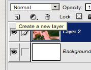
So here is my base, but oh look the brush is too small for the image! OHNOES WHAT AM I GOING TO DO!!!!1one@!! LOLZ!
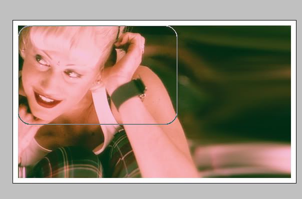
If the brush matches your image size perfectly, congradulations! You don't have to read this part! Unless you want too.. but I suggest you do.
On the new blank layer, you notice the above image my brush is on the edges in the corner. Paint the brush there. Start in any corner you want though. Just as long as the lines match up after painting the brush in every corner. With me so far?
This is what you should have sorta, depending on your image:
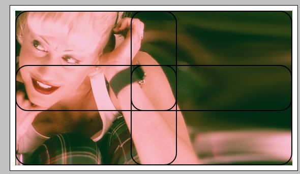
Now lets say your image is way bigger than that. Just paint the brush in every corner like before using the edges of the image as a guide.
Then take the same brush, align it's straight edge with the straight edge of the already painted brush marks and paint, filling in the missing line space.
Like this:
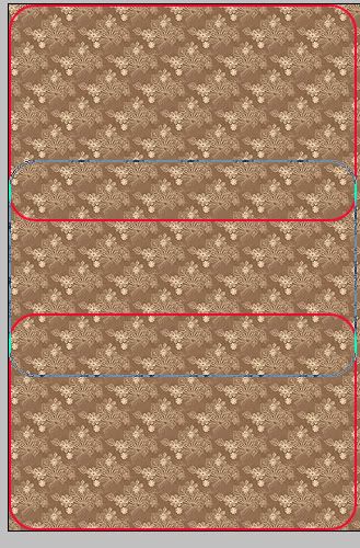
You may have to do that many times. Just make sure the line is even or you can take your pencil brush and paint the line from the top corner brush to the bottom one. But you have to magnify into the image to do that. It's alright if you want to though.
If it's smaller than the brush.
Paint the brush in the corner
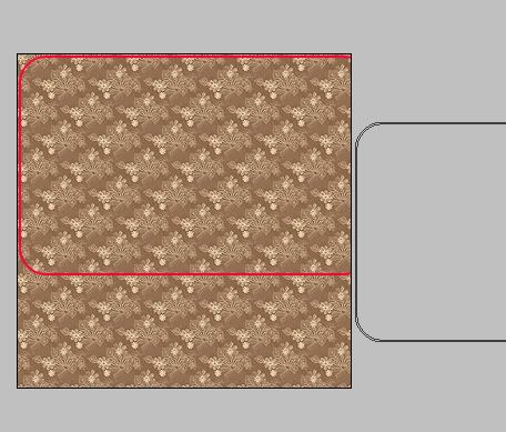
Erase most of it so you only have one corner of the brush. Like this:
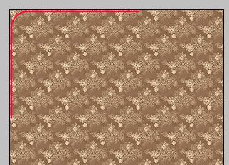
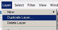
Then duplicate the layer
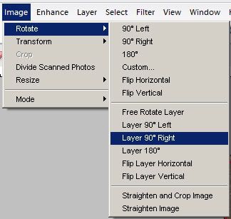
Rotate the LAYER ONLY. Hopefully you have this option if not you have to rotate the whole image wich takes a lot of memory, and select the duplicated layer with the square box mask marquee, copy, then undo the image rotate and paste. Hopefully doing that will give you duplicate image rotated. But I do hope you have the option to rotate the individual layer.
I rotated 90 degrees to the right by accident, I wasn't thinking but you could also rotate (aka: flip) it horizontally.
Onece that is done you should have this:
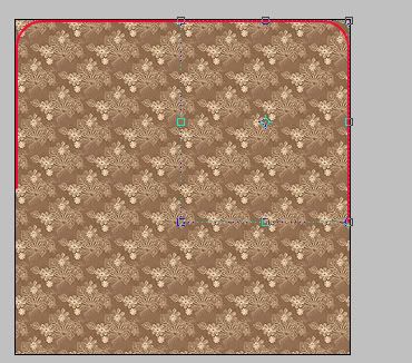
Merge the duplicate image to the original
Layer> Merge Down
or key command
Ctrl + E
Then duplicate the newly merged image and rotate the layer only, but rotate it (aka: flip) vertically.
and move it into postion. Now cause it's small you'll have excess lines, that are in the corners:
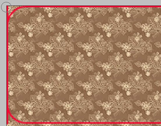
So before you merge the duplicate and original go to the duplicate and erase the excess, and then do the same on the original. THEN merge.
You should have this now:
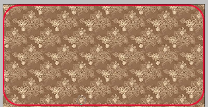
I sould warn you I had it blown up in my photoshop when I took the screen shots. Not that you didn't notice.
BACK TO THE GWEN HEADER!
Take your magic wand:
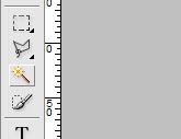
Click it in any corner of the painted brush layer, hopefully you will have left space so the mask can get all around the image like so:
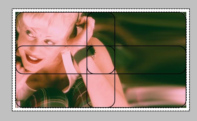
Then select your base image:
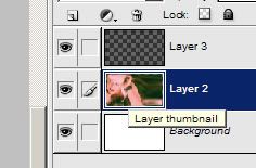
Go to:
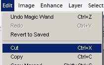
Edit>Cut
or key command
Ctrl + x
Delete your painted/round corner layer
You should be left with this:
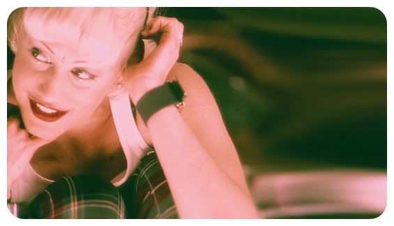
Finish it any way you want. I personally changed the levels, and added text. FINISHED
-----------------------------------------------
PART 2: The Icon's speech bubble/text bubble
Go to the custom shape tool. On my photoshop it looks like this. It might ook different on whatever you are using... or it's part of your regular shape tool or your mask.

If it's part of your mask tools it still follows on the same principal as the custom shape tool.

For both mask and custom shape tools please set the corner radius. If you have a mask create a new layer before you drag the tool. Here I set it at 10, but depending on how big you make it you need to chage it to a different number. Usually and even number (40, 46, 34, 22) works, or a half number (45, 55, 65, 25).
Choose your color. I choose white/#ffffff. For mask you have to add color after draging by filling the selected mask area with the color.
Now drag and create. For mask: make sure your draging on the new layer.
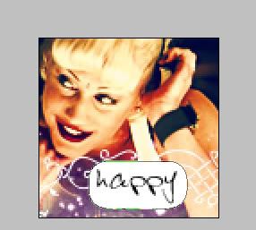
After filling with the new color deselect by going Mask> deselect or Select or Selection> deselect
And your basically done, but it will look pixilated. I never figured out how to change that, but you could lightly erase around the edged with a soft brush.
For those who have custom shape tool.
You have drag now go to the costume shape tool toolbar, and hit simplify:

And your done.

Note:
I had already made the icon, so the original text/speech ballon is smaller than what I dragged in the image for this tutorial.
-------------------------------------------------------------------------------
PART 3: Banner and Banner v2; Letter box or making a image look like a side screen image.
Okay so start with your base, everything you want to do with it. I flipped the image. It's probally best to just resize and filp or whatever first then add effects later. Specially if you can't extend the crop tool.
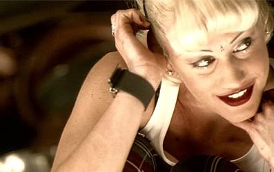
Now to get the letter box and make add hieght to the base image I use the crop tool to extend the image. If you can't do this, take the size of your base, go to make a new image and add 100 pixels to the height of your base image and click okay. take your base and transfer it to the new image and center it. If you have mutible layers lock your layers together before movie it. Like I said above, it was probally wise to add effect later if this is your problem.
Here's the crop tool on my phtoshop:
Note: We are only changing hieght. Width will always stay the same. Thank you.
If your like me the crop tool will first select the width and hight of the image, I just take the center square/bracket and extend it up from the actual high of the image.
When you extend it, use the ruler for help. Hopefully your ruler is set at pixels and not inches. It should if you chose pixels when you created a new image. You may actually have to go into your image editing programs presets, and change them.
Now you extend your crop tool.
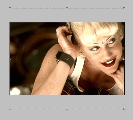
Extend it to 50 pixels on top and 50 pixels on bottom. Hit the check mark or 'ok' button. So you should see a white bar on top and a white bar on bottom, unless your background image color is different. Then you will see that color.
Now magnify. On your background layer mark and the 50 pixel point.
Note: From this point you have to stay magnified till I tell you. Okay?
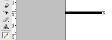
I relize it's not exact, I never really check cause when I go out and see the image at it's actuall size I can't really tell the difference between a pixel or two pixel difference.
Now I move the image to be on top of the line:
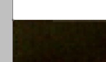
See no line!
Now I goto the bottom of the image. Going to where the hieght and width rullers meet I click and drag the rulers to the bootom of the image and the black line.
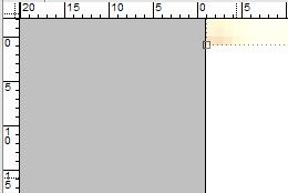
It didn't show the lines and my cursor so use your imagination on this image. But the 0 on top should be on the black line and the 0 on the side should be at the bottom of the image. So now go to 50 pixels on the side ruler and mark it off like we did before. If the image if afer that line the image size is bigger take your crop tool from that line all the way to the very top of the top white bar. Keeping the same width as the image remeber!
Okay. So after cropping and getting rid of that excess. Go to the actual size of the image. Open your second image and select what you want, copy it and past it in the graphic your working on. In the layer section move the newly pasted image to the back of your graphic image so it looks like this:
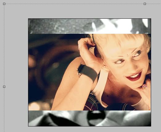
Are you still with me? Good. :D
Now it's time to resize the back image. This is really your choice. You can keep it the same size and move it a around a bit then your done. Or like me you can shrink it down a bit and move it.
So this is what I got after the resize:
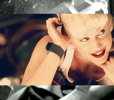
Now you can combine what you learned in PART 1, with this part and do this:
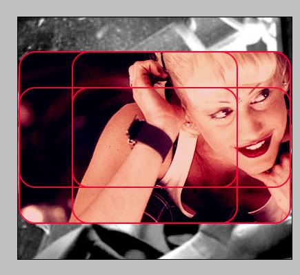
Yes I did this after I messed with the images color and stuff. But you get the idea right?
So now I either have THIS or THIS.
Also you can fill the background layer with any color of your choice you don't have to use an image, but you do have to remove the lines you drew to let yourself know the 50 pixel marks. So you can have a traditional wide screen look or you can rip off Hype Willams like I did. Also it doesn't have to be 50pixels on top and bottom, it can be 20 pixels on top or bottom. It's all up to you. Hopefully you are willing to experiment with what you have learned and hopefully you know what I have been babbling about this whole time.
THE END
If you have any questions?
Just ask, I don't bite. :D
-Katy