His Dark Materials Cover Art!
You may have noticed we’ve been giving away the new UK editions of His Dark Materials! Our current August contest gives you the chance to win a signed copy of The Amber Spyglass. Make sure you enter by August 21st! This week, we talked to one of the cover designers of these editions, and we’re asking you to tell us what your favourite His Dark Materials covers are. Our nifty Cover Art Gallery is back up and running, so have a look!
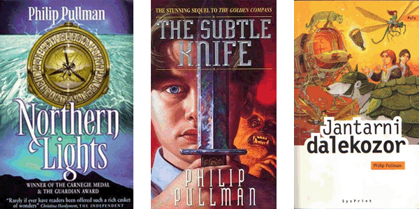
Since its publication, His Dark Materials has been published in 39 languages and has had a whole variety of cover designs. From the widely recognised alethiometer, to the somewhat creepy depiction of Will and the golden monkey, to the detailed Croatian The Amber Spyglass (which I can only assume contains Daleks in place of angels) - the cover art of the trilogy has varied widely. We want you to tell us your favourites: comment on this post, tweet us, facebook us, or post in our forum thread!
Designer Helen Crawford-White of Crush Creative answered BridgeToTheStars.net’s questions about just what it’s like to redesign the covers for such a well-known series of books.
Firstly, one of the most important questions for us...did you read the books?
Luckily for me I was a bit of a fan of Northern Lights when the book first came out and had read all three books more than once so I pounced on the job when it came in. It is one of my favourite books (and I'm not just saying that) and has been since I was about 14! So it was a bit of a dream project.
I think in general most designers do try and read at least part of the books they design covers for... if anything it makes it easier to get them right!
How do you go about designing for something that’s already so well-known? How does that factor into the decisions you make?
Well, it obviously adds a certain amount of pressure! But also you just want to make it good and not alienate any current fans. We have done a few books like that in the studio (The Hitchhiker’s Guide to the Galaxy being one of them) and they are always pretty daunting, but so far I think we have had a good reaction. At the end of the day you just have to do something you love and hope other people will too!
There have been so many previous incarnations of the His Dark Materials covers....how are these ones different? Did any of the previous covers influence you?
We did look at lots of the previous covers, ones from around the world and also covers that fans or illustrators had created for the series just for fun. It seemed to us that a lot of the recent covers were very slick and photorealistic style imagery so we knew we wanted to do something a bit different from that. There was a set of covers we found online that were very hand crafted wood cut style illustrations that we liked the aesthetic of; they seemed a bit more mysterious and intriguing. I think we consciously knew we wanted to create something that felt a bit more special and collectable, and not just resort to a big image of Iorek!
Did you intentionally use the same colour for the books as the early British paperbacks? What do you think these colours say about the books?
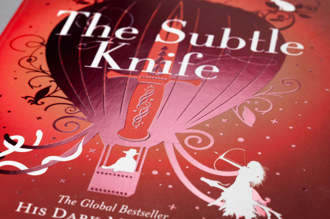
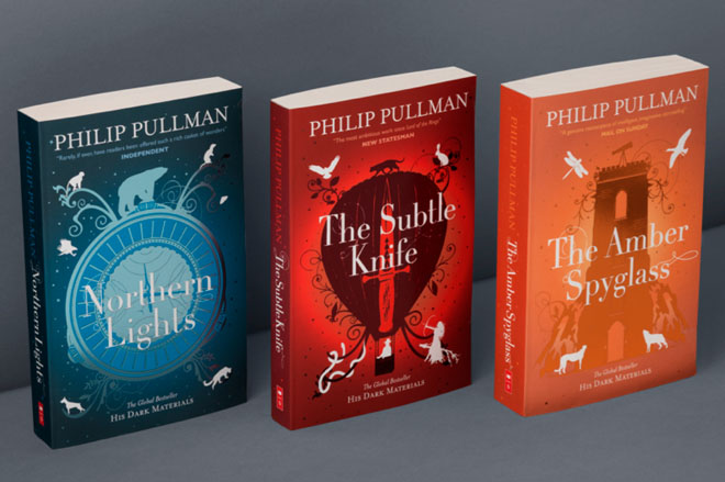
The blue, red and orange wasn't our original colour palette, we actually had the whole series in a very bluey, silver colour range. The publishers decided we should stay in line with the original paperbacks and I think this was a good call, the colours work well and are relevant to the titles whilst keeping them distinct from each other. I think the original colours were well chosen to reflect the scenes and landscapes from each book.
Why did Crush choose the design aesthetic they did? Did you think a less modelled look suited the texts better? How did you decide on the final designs?
We tried lots of different styles and covers to begin with, some were very dramatic detailed animal faces, some more hand drawn landscapes. We showed Scholastic five different designs, before they chose the illustrative route we ended up exploring.
I have always felt that there was something defiant about the books, the characters and the content, and I guess I always thought the more commercial, mass-market style didn't reflect the uniqueness of the books. So yes, I guess I did think a less modelled look would suit them better. As we were designing the covers as part of the world book day celebrations as well, I knew we had to choose an aesthetic that made the books more special or unique looking. Personally, I love illustration for being able to communicate something more evocative than you can with slicker executions.

How did you go about choosing the images and deciding on the final design?
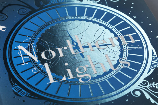
We tried lots of different styles and covers to begin with, some were very dramatic detailed animal faces, some more hand drawn landscapes. We showed Scholastic five different designs, before they chose the illustrative route we ended up exploring. The main object on each cover ended up there by a process of elimination and by drawing a few things and seeing what looked best. The first two covers were quite easy to choose (the alethiometer and the balloon) but The Amber Spyglass was tricky because everything we drew was long and thin and looked a bit odd!
Did Pullman have any input, and if so, what?
Yes he did actually, he was quite specific! I don't think he particularly loved the covers to begin with but I hope we managed to win him over. He was concerned with the illustrations of the animals and their shapes and positions, so we did get some wonderful notes from him describing changes to tails that should be longer, stances that should be different etc. It was a little nerve racking knowing he was paying such close attention to the details but great that he was directly involved.
The result should hopefully be better for that reason.
What parts of the design(s) are your favourites, and why?
I love the little animal silhouettes, and I love the fact that you might be able to look at the cover for a while and notice more details about it.
It really was a great series to work on with loads of great visual material to include. I just hope the covers go down well with new and current fans.
Crush Creative is a creative design agency based in Brighton, England.

Since its publication, His Dark Materials has been published in 39 languages and has had a whole variety of cover designs. From the widely recognised alethiometer, to the somewhat creepy depiction of Will and the golden monkey, to the detailed Croatian The Amber Spyglass (which I can only assume contains Daleks in place of angels) - the cover art of the trilogy has varied widely. We want you to tell us your favourites: comment on this post, tweet us, facebook us, or post in our forum thread!
Designer Helen Crawford-White of Crush Creative answered BridgeToTheStars.net’s questions about just what it’s like to redesign the covers for such a well-known series of books.
Firstly, one of the most important questions for us...did you read the books?
Luckily for me I was a bit of a fan of Northern Lights when the book first came out and had read all three books more than once so I pounced on the job when it came in. It is one of my favourite books (and I'm not just saying that) and has been since I was about 14! So it was a bit of a dream project.
I think in general most designers do try and read at least part of the books they design covers for... if anything it makes it easier to get them right!

How do you go about designing for something that’s already so well-known? How does that factor into the decisions you make?
Well, it obviously adds a certain amount of pressure! But also you just want to make it good and not alienate any current fans. We have done a few books like that in the studio (The Hitchhiker’s Guide to the Galaxy being one of them) and they are always pretty daunting, but so far I think we have had a good reaction. At the end of the day you just have to do something you love and hope other people will too!
There have been so many previous incarnations of the His Dark Materials covers....how are these ones different? Did any of the previous covers influence you?
We did look at lots of the previous covers, ones from around the world and also covers that fans or illustrators had created for the series just for fun. It seemed to us that a lot of the recent covers were very slick and photorealistic style imagery so we knew we wanted to do something a bit different from that. There was a set of covers we found online that were very hand crafted wood cut style illustrations that we liked the aesthetic of; they seemed a bit more mysterious and intriguing. I think we consciously knew we wanted to create something that felt a bit more special and collectable, and not just resort to a big image of Iorek!

Did you intentionally use the same colour for the books as the early British paperbacks? What do you think these colours say about the books?
The blue, red and orange wasn't our original colour palette, we actually had the whole series in a very bluey, silver colour range. The publishers decided we should stay in line with the original paperbacks and I think this was a good call, the colours work well and are relevant to the titles whilst keeping them distinct from each other. I think the original colours were well chosen to reflect the scenes and landscapes from each book.
Why did Crush choose the design aesthetic they did? Did you think a less modelled look suited the texts better? How did you decide on the final designs?
We tried lots of different styles and covers to begin with, some were very dramatic detailed animal faces, some more hand drawn landscapes. We showed Scholastic five different designs, before they chose the illustrative route we ended up exploring.
I have always felt that there was something defiant about the books, the characters and the content, and I guess I always thought the more commercial, mass-market style didn't reflect the uniqueness of the books. So yes, I guess I did think a less modelled look would suit them better. As we were designing the covers as part of the world book day celebrations as well, I knew we had to choose an aesthetic that made the books more special or unique looking. Personally, I love illustration for being able to communicate something more evocative than you can with slicker executions.

How did you go about choosing the images and deciding on the final design?
We tried lots of different styles and covers to begin with, some were very dramatic detailed animal faces, some more hand drawn landscapes. We showed Scholastic five different designs, before they chose the illustrative route we ended up exploring. The main object on each cover ended up there by a process of elimination and by drawing a few things and seeing what looked best. The first two covers were quite easy to choose (the alethiometer and the balloon) but The Amber Spyglass was tricky because everything we drew was long and thin and looked a bit odd!
Did Pullman have any input, and if so, what?
Yes he did actually, he was quite specific! I don't think he particularly loved the covers to begin with but I hope we managed to win him over. He was concerned with the illustrations of the animals and their shapes and positions, so we did get some wonderful notes from him describing changes to tails that should be longer, stances that should be different etc. It was a little nerve racking knowing he was paying such close attention to the details but great that he was directly involved.
The result should hopefully be better for that reason.

What parts of the design(s) are your favourites, and why?
I love the little animal silhouettes, and I love the fact that you might be able to look at the cover for a while and notice more details about it.
It really was a great series to work on with loads of great visual material to include. I just hope the covers go down well with new and current fans.
Crush Creative is a creative design agency based in Brighton, England.